Public Relations & Social Marketing Insight
444.5K views | +5 today
Follow
Public Relations & Social Marketing Insight
Social marketing, PR insight & thought leadership - from The PR Coach
Curated by Jeff Domansky
Your new post is loading...
Scooped by Jeff Domansky
Scoop.it!

5 Parallax Scrolling Websites That Will Blow Your Mind - Design Reviver

5 Parallax Scrolling Websites That Will Blow Your Mind - Design Reviver | Public Relations & Social Marketing Insight | Scoop.it

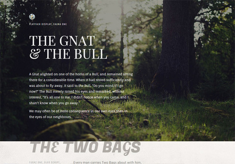
Parallax scrolling is a great way to tackle this tricky problem. It serves as a tasteful design element while also remaining fun and engaging. Parallax scrolling animations can work seamlessly to compliment a variety of designs and with modern web design platforms, they’ve never been easier to implement.


But what’s the best way to plug them into your own projects?


We’ve put together a list of five exceptionally creative uses of this technology to demonstrate the power of parallax done right....

Jeff Domansky's insight:

Creativity with your coffee. These websites rock!

No comment yet.
Scooped by Jeff Domansky
Scoop.it!

Web Design Principles You Should Know As A Designer

Web Design Principles You Should Know As A Designer | Public Relations & Social Marketing Insight | Scoop.it
User centered design, or usability means that the designer will build the website around the users needs and requirements, considering at every stage how to give them a more effective and enjoyable experience.When designing a website it is a good idea to take conversions into account properly. Even a very good conversion booting tactic wont have much effect if the overall website looks awful....
Jeff Domansky's insight:
Successful website design requires a fine balance of creative talent and technical ability making a it a highly skilled process. Take a look at this good collection of solid design fundamentals for non designers.
Marco Favero's curator insight, April 9, 2015 10:22 AM

aggiungi la tua intuizione ...

Scooped by Jeff Domansky
Scoop.it!

15 Best Free eBooks for Web Designers

15 Best Free eBooks for Web Designers | Public Relations & Social Marketing Insight | Scoop.it
If you’re looking into learning, studying, broadening your knowledge of web design then reading an eBook is great place to start. Within this article we have composed the 15 best eBooks for web designers that we think are great and even better, they’re all free!...
Jeff Domansky's insight:
Wowza! What an awesome design resource! Highly recommended. 10/10
Marco Favero's curator insight, March 29, 2015 5:27 PM

aggiungi la tua intuizione ...

Wanderer Jack's curator insight, March 30, 2015 5:31 AM

Inspiration from E-books !

Isabel Da Guerra's curator insight, April 7, 2015 8:26 PM

Love this colorful design and ease of use... concept

Scooped by Jeff Domansky
Scoop.it!

20 Best Color Palette Tools for Web and Graphic Design

20 Best Color Palette Tools for Web and Graphic Design | Public Relations & Social Marketing Insight | Scoop.it

As a web or graphic designer you must have a keen sense of color combinations and feel which colors look good together and which don’t. Anyway, even with this great skill in color combining, you may find yourself in situations when you just feel less inspired. That’s when these best color palette tools come in handy!


These 20 best color palette tools will help you choose and create the best color palettes for your graphic or web designs. Choose the one that is perfect for you and start using it! Enjoy

Jeff Domansky's insight:

Bloggers, marketing and PR pros will also appreciate these excellent color palette tools.

Scooped by Jeff Domansky
Scoop.it!

52 Of The Very Best Web Designs from 2014 - Admire The Web

52 Of The Very Best Web Designs from 2014 - Admire The Web | Public Relations & Social Marketing Insight | Scoop.it

Yes, we are a tad late, but it’s always a great post to see how trends have moved forward, or how designs last year are now this years trends.


It’s interesting to look at where 2015 will take us. Is the trend of flat web design over? We certainly won’t be missing responsive web design this year, with more and more devices being created and used to surf the web. Or will go back to mobile only websites. Only time will tell.


We would love to pull our favourite out from this lot posted below, but we simply cannot, there are too many great designs in all shapes and sizes, what is your favourite ?...

Jeff Domansky's insight:

Creativity with your coffee. These 52 web designs are definitely worth viewing.  9/10

No comment yet.
Scooped by Jeff Domansky
Scoop.it!

My 3 "Go-to" Websites for Design Inspiration

My 3 "Go-to" Websites for Design Inspiration | Public Relations & Social Marketing Insight | Scoop.it

It’s no secret that designers have their special “go-to” places for inspiration and I was recently asked me what mine are.


When looking for inspiration with typography and design, these are the websites that I highly recommend bookmarking. It’s good stuff, really it is....

Jeff Domansky's insight:

Brian Gardner shares three sources of his design inspiration.

Studionews24's curator insight, October 12, 2014 6:24 AM

Thanks for shearing your go-to sites :)!

Rescooped by Jeff Domansky from Designer's Resources
Scoop.it!

The 20 best tools for choosing a colour scheme | Creative Bloq

The 20 best tools for choosing a colour scheme | Creative Bloq | Public Relations & Social Marketing Insight | Scoop.it

Creating a colour scheme is essential to good design. We’ve gathered together 20 fantastic tools to help you perfect your colour choices.


Via Mark Strozier
Jeff Domansky's insight:

Valuable collection of design and social media tools.

Shirley Moody's curator insight, January 28, 2013 7:46 AM

Color for PS, Illustrator, & InDesign

Claudio Mosquera's curator insight, September 12, 2015 8:38 PM

añada su visión ...

Willem Kuypers's curator insight, September 15, 2015 3:34 AM

Pour toute présentation il est essentiel de choisir des couleurs qui vont ensemble. Voici une petite aide pour faire cela.

Scooped by Jeff Domansky
Scoop.it!

10 Inspiring Font Pairing Resources

10 Inspiring Font Pairing Resources | Public Relations & Social Marketing Insight | Scoop.it
Choosing harmonious font combinations is a key part of typography. Good font pairings will lead to beautiful designs that are also easy to read.For font-pairing ideas and inspiration, check out the following resources....
Jeff Domansky's insight:
What's your type? When it comes to beautiful design and great reading experience, type makes the difference.
No comment yet.
Scooped by Jeff Domansky
Scoop.it!

Graphic Design for Print vs The Web: 15 Vital Differences | Canva

Graphic Design for Print vs The Web: 15 Vital Differences | Canva | Public Relations & Social Marketing Insight | Scoop.it
Though print and web designers have a lot in common, there are some important variations that people (both outside and inside the industry) often don’t understand — ranging from workflow and file formats to tools and terminology. While certainly not extensive, the following guide offers a brief overview of some of the biggest (and often, the most confusing) differences between the two disciplines.....
Jeff Domansky's insight:
A must-read before starting a new design project for print or web.
Sonia Santoveña's curator insight, April 10, 2015 4:35 AM

añada su visión ...

Scooped by Jeff Domansky
Scoop.it!

The Complete Guide to an Effective Card-Style Interface Design | Design Shack

The Complete Guide to an Effective Card-Style Interface Design | Design Shack | Public Relations & Social Marketing Insight | Scoop.it
Card-style architecture is one of the biggest things in web design, and mobile design in particular. From apps to responsive websites, the card-style format is popping up everywhere.

And for good reason. Mobile card design looks nice, works well on a variety of devices and creates distinct organization and a method for content delivery. That’s why many large, well-known brands are using the card format and many smaller design and development groups are following suit.
Jeff Domansky's insight:

Pick a card... design. Cool trend and versatile for multi-platforms.

No comment yet.
Scooped by Jeff Domansky
Scoop.it!

10 Web Design Galleries You May Not Know About

10 Web Design Galleries You May Not Know About | Public Relations & Social Marketing Insight | Scoop.it
There’s a great abundance of web design galleries, and you probably already know about the popular ones. But in this roundup I’d like to share 10 web design galleriesthat I recently discovered.
Jeff Domansky's insight:
10 Web design galleries for your web and blogging inspiration. Recommended viewing. 9/10
Nedko Aldev's curator insight, February 20, 2015 8:30 AM


456
Gary Campbell's curator insight, February 20, 2015 9:24 AM

I must say when you find a aesthetically pleasing website, it makes you just want to stay there, at least for a few minutes regardless of the content of the site. It is like a new place of refuge for the Internet traveler.

Lori Wilk's curator insight, February 20, 2015 3:09 PM

Thanks for this great resource list of #design galleries. 

Rescooped by Jeff Domansky from Must Design
Scoop.it!

5 Killer & Easy To Forget Web Design Basics

5 Killer & Easy To Forget Web Design Basics | Public Relations & Social Marketing Insight | Scoop.it

Web Design Basics
Love these five web design basics:

* Learn TYPE Design.
* Pick Great Fonts That Fit Your TONE.
* Pick 3 Color Palette & STICK TO IT.
* Photos = RIGHT SIZE.
* When In Doubt, Give It SPACE.

This last tip is our favorite. Nothing we hate more than claustrophobic web design. Problem is claustrophobia is easy to create. We all WANT to do so much.

When I was an Ecommerce Director we studied our links carefully. We found that 5% of our links received 90% of the clicks. That equation turned out to be a fractal. No matter how small we cut it, no matter how we shifted the design, a small % of the links dominated.

This means MOST of what WE, as designers, think is important isn't. We learned to be Google - Vicious about what we added. Adding meant something had to COME OFF the design. This strange User Interface math means you have more ROOM than you realize.

Find what matters and LINK IT. Design what matters and eliminate the flotsam and jetsam so you have SPACE around what matters since it is that SPACE that signals IMPORTANCE to your visitors.  .


Via Martin (Marty) Smith
Jeff Domansky's insight:

Awesome web design advice. Highly recommended.  9/10

Lori Wilk's curator insight, November 11, 2014 9:04 PM

Fabulous#design #advice from Marty Smith. It reminds me that when you are not an #expert in something, get someone who is to help guide your #success

Scooped by Jeff Domansky
Scoop.it!

Why Every Media Website Redesign Looks the Same

Why Every Media Website Redesign Looks the Same | Public Relations & Social Marketing Insight | Scoop.it

The media website you keep seeing again -- and again, and again...


Responsive design is still a new concept that is changing as designers and developers figure new ways to marry form and multi-function. Dan Mall, founder of web design firm SuperFriendly, noted that while responsive design is only about four years old, many of the programs being used to build new site are much olderz.“


I think there are really great tools that are coming out, but I think that we as an industry are still wrapping our heads around what it means to design for different context,” Mall said. “I think as the tools become more intuitive and the process becomes more intuitive, it will free us up to start thinking about these things in different ways.”


The designers that Mashable spoke with pointed to a variety of sites as examples of forward-thinking responsive websites, including blog publishing platform Medium, gaming site Polygon and digital magazine The Great Discontent....

Jeff Domansky's insight:

From 80-inch big screen TVs to the new Apple Watch - what's a designer to do? Here's a good look at responsive design and the challenges and trends in social media design.

No comment yet.