Public Relations & Social Marketing Insight
443.6K views | +2 today
Follow
Public Relations & Social Marketing Insight
Social marketing, PR insight & thought leadership - from The PR Coach
Curated by Jeff Domansky
Your new post is loading...
Scooped by Jeff Domansky
Scoop.it!

Why infographics are so important to your content marketing strategy | Inspired Magazine

Why infographics are so important to your content marketing strategy | Inspired Magazine | Public Relations & Social Marketing Insight | Scoop.it

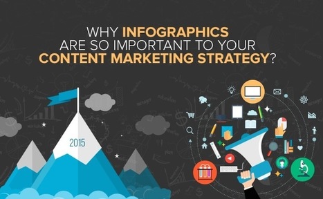
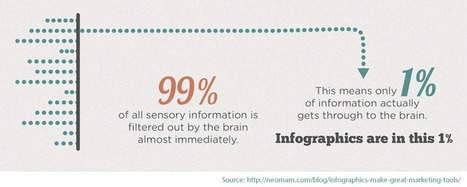
Your infographics are effective marketing tools to build brand awareness. This is due to the fact that visuals used in the illustration of content can convey your business message to the audience easily and so your brand stays in the memory of the audience for a longer time.

You can also use infographics offline for marketing activities. For example, you can take out printed versions of infographics to distribute them on the sidelines of an event or use them on brochures and leaflets to promote your products and services....

Jeff Domansky's insight:

Here are the infographics tips you need get started quickly.

No comment yet.
Scooped by Jeff Domansky
Scoop.it!

Data Visualization: How to Merge Form & Function & Make Great #Infographics

Data Visualization: How to Merge Form & Function & Make Great #Infographics | Public Relations & Social Marketing Insight | Scoop.it

The following infographic, created by Zhenia Vasiliev, breaks down the basics of data visualization. It shows how beginners can merge form and function, and design meaningful infographics.


Key highlights:

-  Analyse your data: Analysis is the key. Before we can visualize the data we need to understand it.

-  Come up with a story: Story is finding a single strand of meaning in an endless sea of information. It has a beginning, middle and end.

-  Make it visible: Visualization is a creative act of making. Making the data visually elegant evident and engaging.

-  Entertain to educate: Good data design need to illuminate and inform the viewer, elucidate and illustrate the facts and stats....

Jeff Domansky's insight:

Useful tips on how to turn data into compelling content.

Jeff Domansky's curator insight, June 9, 2015 1:56 AM

Useful tips on how to turn data into compelling content.

Scooped by Jeff Domansky
Scoop.it!

Make a boring business beautiful with infographic marketing

Make a boring business beautiful with infographic marketing | Public Relations & Social Marketing Insight | Scoop.it

I’ve never met anyone who dreamed of integrating EHR software or auditing SOX compliance as a child. And I certainly don’t recall my mother sewing together a B2B content marketer costume for my first Halloween.*


But we’re actually in excellent company. The trouble is, however, your business can no longer rely on boring, boilerplate text to fill its funnel. That’s why I’d encourage you to spice up your content cookbook with a bit of infographic marketing.

,*It was a Peter Pan costume, and it was flawless.


Why do infographics outperform vanilla text?...

Jeff Domansky's insight:

Infographic marketing can help any business - no matter how technical or niche - spice up its web presence with attractive visuals that tell an interesting story.

Jeff Domansky's curator insight, April 16, 2015 6:39 PM

Infographic marketing can help any business - no matter how technical or niche - spice up its web presence with attractive visuals that tell an interesting story.

Scooped by Jeff Domansky
Scoop.it!

How to Give a Bad Infographic a Makeover | HubSpot

How to Give a Bad Infographic a Makeover | HubSpot | Public Relations & Social Marketing Insight | Scoop.it
Given the popularity and effectiveness of visual content for marketing, it's no surprise that today's marketers are creating more and more infographics. They're a more enjoyable way of digesting statistics, data sets, and timelines, and they can drive more traffic and engagement than plain text.

Even though there are a lot of good infographics out there, there are still a ton of bad infographics out there, too. You usually know one when you see one: Either it's jam-packed with information, or it hardly shows any useful information at all. Sometimes it's loud with clashing colors; other times, it's plain and boring.

But "knowing it when you see it" doesn't help you prevent from making a bad infographic. Here to dissect what a bad infographic looks like is an infographic from Vertical Measures. Check it out below.
Jeff Domansky's insight:

Here's an infographic with a couple of basic tips on, what else, how to make a bad infographics good.

No comment yet.
Scooped by Jeff Domansky
Scoop.it!

The 15 Best Infographics of 2014

The 15 Best Infographics of 2014 | Public Relations & Social Marketing Insight | Scoop.it

Every year people proclaim the death of something or other in marketing -- and the death of the infographic doesn't escape conversation. It's probably because while more people have caught on to the power of infographics for communications or marketing initiatives, not all of them are doing it well -- so it's hard to separate the wheat from the chaff.


These 15, however, managed to stand out. My criteria here were not scientific. I looked for infographics that I simply could not stop reading til the very end -- or in the case of the interactive ones in the latter half of this post, the ones I couldn't stop exploring. Enjoy perusing the best of what 2014's infographics had to offer, ranked in no particular order (except for #1 -- I love #1)....

Jeff Domansky's insight:

Take a look at the top static and interactive infographics of 2014. They are simply amazing from design to content and impact! They must read for marketing, design and PR pros. 11/10 LOL

Jeff Domansky's curator insight, December 18, 2014 10:23 AM

Truly amazing content, creativity and inspiration. You'll learn and enjoy these infographics hugely. Recommended viewing. 10 / 10

MNY's curator insight, December 23, 2014 6:29 AM

#infographie

Scooped by Jeff Domansky
Scoop.it!

14 best data visualization tools for better storytelling |

14 best data visualization tools for better storytelling | | Public Relations & Social Marketing Insight | Scoop.it

The growth of data visualization says a mix of data and narrative is now s better way for businesses to tell their story.

Which tools ae best to tell your story? While price and software sophistication play a role, the more important criteria are:
-  How you define success?
-  What measures are most important to manage?


Once you’ve answered these questions, here are 14  of the best data visualization tools. They are grouped by categories to help you be a better storyteller with data,...

Jeff Domansky's insight:

Useful overview of the best data visualization tools.

Matt Green's curator insight, December 8, 2014 1:08 PM

These are some good ideas for how to use visualization tools.

Scooped by Jeff Domansky
Scoop.it!

Rated I: For Strong Infographic Content | Marketo

Rated I: For Strong Infographic Content | Marketo | Public Relations & Social Marketing Insight | Scoop.it

At Marketo we have a pretty interesting and diverse set of infographics – covering topics from marketing automation and social networks, to kittens and bacon. But those are just examples of how versatile infographics can be as a content medium. So why aren’t all marketers leveraging the blockbuster power of infographics?


Infographics for everyone!


Unless your target market hates visual content (we’re not judging!) then infographics are probably something you can add to your content repertoire. They are an awesome way to clearly present complex information. For example, if you have an interesting but dense report that you’d like more people to engage with, try translating that information into an infographic. People absorb visual content faster and with greater ease than reading the same information....

Jeff Domansky's insight:

Get the picture? Visuals work and infographics are still a valuable social marketing tool.

No comment yet.
Scooped by Jeff Domansky
Scoop.it!

The Process of Infographic Design simplified | Visme

The Process of Infographic Design simplified | Visme | Public Relations & Social Marketing Insight | Scoop.it

The mere thought of creating your own infographic can be scary and often is thought of as a complex task that can entail tens of hours.

Visme is about simplifying the infographic creation process, so we thought: why not use our own tool to show you how to create your own infographic?

We collaborated with Randy Krum of Cool Infographics, an expert in data visualization and author of the book “cool Infographics”  to create a simple interactive infographic that breaks down the process of designing an infographic into 5 easy to understand steps.

Check it out and rollover each section for more information....

Jeff Domansky's insight:

The 1-2-3's of creating infographics in - what else - an infographic from Visme.

Jeff Domansky's curator insight, June 24, 2015 10:59 PM

The 1-2-3's of creating infographics in - what else - an infographic from Visme.

Marco Favero's curator insight, June 25, 2015 4:04 AM

aggiungi la tua intuizione ...

Scooped by Jeff Domansky
Scoop.it!

7 Steps to turn data into a clear, concise infographic

7 Steps to turn data into a clear, concise infographic | Public Relations & Social Marketing Insight | Scoop.it

This infographic about infographics utilizes a cool blueprint flowchart concept.. something you’d think of as stereotypical for a blueprint. It’s cool, but it might be a tad ironic – it’s harder to read than you’d like it to be. Let’s jump into the things that you should focus on to make sure your infographic looks simple, readable and beautiful.

Jeff Domansky's insight:

Not sure where to start with your first infographic? Follow these simple 6 steps to transform your information into a clear and concise infographic.

Jeff Domansky's curator insight, June 9, 2015 1:58 AM

Usefl tips for better Infographics.

Scooped by Jeff Domansky
Scoop.it!

Content Marketing, the Infographic Way.

Content Marketing, the Infographic Way. | Public Relations & Social Marketing Insight | Scoop.it

Infographics are a fun way to present information on the internet. The random visitor might just click the x sign at the right corner of the page and contribute to your bounce rate if he encounters a business blog that has annals of text. But give him an infographic and he stays. Simple, he thinks (and he’s right there) that it’s easier to lift information off an infographic than from a text post. Information, numbers, ideas, statistics and conclusions pop out in an infographic. It is tough to miss important information in an infographic presentation. But write a well researched article on a Word document and publish that on your blog- well, the results might not quite match up to an infographic built from the same data. Less is more. Indeed!...

Jeff Domansky's insight:

Infographics. Get the picture?

Marco Favero's curator insight, March 25, 2015 4:33 AM

aggiungi la tua intuizione ...

Louise Fletcher's curator insight, March 25, 2015 6:44 AM

This article makes a valid point about Infographics not being a suitable medium for every type of communication.  There is a temptation sometimes to try and make it fit when there could be a better way.  However, when done well I think they are a great way to capture and convey the salient points. 

Yukitoshi Fujimoto's curator insight, March 28, 2015 10:33 PM

ワンビジュアルで「インフォグラフィックとは」を誰かに説明するのに便利そう。

Scooped by Jeff Domansky
Scoop.it!

Tools to Create Infographics | Listly List

Tools to help you create infographics on your own.

Robinson Jimenez Medina's curator insight, December 22, 2014 4:51 PM

Como hacer infografias

Stéphane Desbois's curator insight, December 23, 2014 7:55 AM

Outils

Marta Ciesielska's curator insight, December 25, 2014 3:59 PM

Some good tools for infographics design.

Scooped by Jeff Domansky
Scoop.it!

How To Create Infographics Using PowerPoint | PowerPoint Presentation

How To Create Infographics Using PowerPoint | PowerPoint Presentation | Public Relations & Social Marketing Insight | Scoop.it

Aside from being time-saving, using PowerPoint for infographics is easy. To start with, you can create infographics using hundreds of readily available PowerPoint templates and infographic templates from our website. All you have to do is look for a template that best matches your theme, subject, topic or idea and you can easily work around that template. For more specific needs, you can read on and follow the instructions on how to create infographics using PowerPoint....

Jeff Domansky's insight:

This is a smart little tutorial on infographics created from PowerPoint.

CTD Institute's curator insight, December 1, 2014 11:34 AM

reliable tool available to anyone with a computer.

John O'Connor's curator insight, December 2, 2014 2:41 AM

Haven't tried it yet but worth a go...

Scooped by Jeff Domansky
Scoop.it!

5 Great Online Tools for Creating Infographics | Cool Infographics

5 Great Online Tools for Creating Infographics | Cool Infographics | Public Relations & Social Marketing Insight | Scoop.it
Creating infographics using online tools has never been easier. In the last few years a number of online tools have emerged that allow anyone to create great visual content.  Whether you are working on a project for work, personal use, or social media, each new project starts with a template. With the dimensions laid out for you, you can focus your attention on quickly creating effective designs. Search, drag, and publish - it can be that simple.

These new tools are vector graphics applications that run in your browser as a replacement for using an expensive professional desktop application like Adobe Illustrator to put your infographic design together.  Each one offers different tools, image libraries, charts, fonts and templates as a starting point.  None of these have the full capabilities of a professional desktop application, but you probably don’t need that much power to create a simple infographic.

In this article, we take a quick look at 5 of the best online tools for creating infographics: Visme, Canva, Easel.ly, Piktochart, and Infogr.am. All of these tools are evolving quickly, and this is just a snapshot of their current capabilities.
Jeff Domansky's insight:

My favorite - Piktochat - gets a well-deserved positive review from Randy Krum at Cool Infographics.

Jeff Domansky's curator insight, October 19, 2014 9:58 PM

My favorite - Piktochat - gets a well-deserved positive review from Randy Krum at Cool Infographics.

Sean Hutchinson's curator insight, October 20, 2014 5:20 AM

A guide provided by www.coolinfographics.com. Proven to be the most highly effective way to grab the attention of your audience. 

Scooped by Jeff Domansky
Scoop.it!

Infographics: Everything You Need to Know

Infographics: Everything You Need to Know | Public Relations & Social Marketing Insight | Scoop.it

Are you ready to use infographics in your social media marketing?


Do you know how to get started?


Creating infographics is getting easier. When you illustrate a concept with images, you’re likely to find a bump in social media visibility.


In this article you’ll discover how to create and promote infographics to put your content front and center....

Jeff Domansky's insight:

Valuable infographics tips and advice. Recommended reading 9/10

Jeff Domansky's curator insight, September 26, 2014 10:11 AM

Awesome tips. Recommended reading 9/10