

![2013 The Year of Responsive Design [Infographic] | Public Relations & Social Marketing Insight | Scoop.it](https://img.scoop.it/_amQFrkyVgwvjDhX4Ia9lTl72eJkfbmt4t8yenImKBVvK0kTmF0xjctABnaLJIm9)

With a multitude of mobile devices coming out almost every week, how can marketers ensure that their content is optimized for different device types, screen sizes, and capabilities?
Via Martin (Marty) Smith
Get Started for FREE
Sign up with Facebook Sign up with X
I don't have a Facebook or a X account


 Your new post is loading...
 Your new post is loading...
Your new post is loading...
With a multitude of mobile devices coming out almost every week, how can marketers ensure that their content is optimized for different device types, screen sizes, and capabilities? Via Martin (Marty) Smith
Jeff Domansky's insight:
Useful insight into Responsive Design and why it’s the going to be one of the biggest marketing trends in 2013. 

Today I’d like to tell you about orange color websites. Lots of people say that orange can look sticky and cheap as it’s known to be a polarizing color.
Continuing our series of articles on the anatomy of colors, today I’d like to tell you about orange. Lots of people say that orange can look sticky and cheap as it’s known to be a polarizing color. It seems like a fair assessment, remembering the orange color of price stickers, prison uniforms and traffic cones. But the correct using of orange color in web design can give you a range of advantages. Depending on the applying it, orange can cause associations with autumn, flickering fire, and certainly, fruit itself. It all depends on why and how you apply it....
[Fresh design ideas and inspiration ~ Jeff]
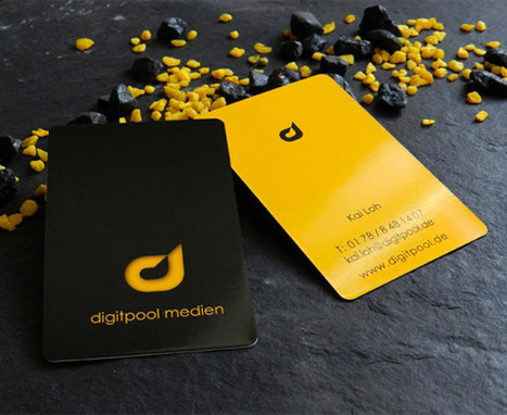
One of the great things about writing posts on business cards is that there is no shortage of great business card designs.
Talented graphic artists are coming up with new brilliant designs every day. In this post you will see business card designs ranging from really creative to very simple and slick. I hope that these business card designs will inspire you to create your own masterpiece. Enjoy!...
[Fresh thinking, creative biz cards ~ Jeff]

New research identifies logo trends in the United States, including color, geography, and more.
Thinking of using a leaf in your brand’s new logo design? You might want to think twice about that decision, because it’s not unique. That’s according to data from the U.S. Patent and Trademark Office as analyzed in James I. Bowie’s new blog, Emblemetric, which uses quantitative analysis from USPTO data to decipher and report logo design trends.

Drawing by Numbers is a resource on data visualization for activists, created by Tactical Tech. It features visualization tools, infographic ideas, as well as advice on working with data and information in campaigning and independent journalism.
...The possibilities outlined above open up a wide range of ways to represent ideas, designs and information about an issue. To simplify this, the most useful starting point in deciding how to use visualisation is to think about what it is you are trying to help audiences do. You can help audiences to:
Using a wide variety of different examples we'll walk through these three approaches and give helpful hints about the key challenges and creative tactics involved in their successful use....
[Great tips to help you tell better stories by using better visuals - JD]
|

Creating a colour scheme is essential to good design. We’ve gathered together 20 fantastic tools to help you perfect your colour choices. Via Mark Strozier
Jeff Domansky's insight:
Valuable collection of design and social media tools.

Willem Kuypers's curator insight,
September 15, 2015 3:34 AM
Pour toute présentation il est essentiel de choisir des couleurs qui vont ensemble. Voici une petite aide pour faire cela.

Typography is that kind of regular things. When everything is fine with it, you don't pay much attention to the text style. But when the designer used a bad typography, you immediately notice that its hard to read, its looks bad and so on.
What happens if we strip all the text out of any layout design? Right, in 95% of cases you’ll not understand what this design was all about. And one more question, what can you say about minimal style of design where “Text is the interface“? I’m sure, today we can confidently say that typography is one of the cornerstones of web design.
Typography is such an addictive thing! It is like a delicious dish – you taste it and want it over and over. Stunning typography examples easily can blow your mind and make you a typography maniac in seconds. Don’t believe me? So how will you explain a huge list of typography related websites? Different galleries, typography blogs, font sources – all these resources will bring you useful knowledge, inspiration and attractive, creative typography examples....
[These typography blogs will inspire you! ~ Jeff]

If you want a seamless guest experience your hotel needs to have a story Heres an example how to turn story ...
This is a quick yet very insightful article linking the interior design of a hotel, storytelling, and women's liberation.
"Whaaaaattttt??!!" you say. Yep. It's a perfect example of how a hotel got creative and leveraged storytelling in order to market themselves more effectively, and increase sales.
The post about a New York City hotel that originally opened as the Hotel Martha Washington. It was the first hotel in the country specially designed for women only. Based on the the building's history, the new owners of the hotel created a persona that typified women who stayed at the hotel.
From there they created interior designs that connected together its history, the contributions of 12 women to our world, their identified persona, and their marketing efforts. Brilliant!
I love how this company translated storytelling into the physical world through its interior designs. More companies need to be doing this for enhancing both employee and customer experiences/engagement.
For all the details, go read this article. Like a chocolate truffle, it's small but rich with a lasting impression!
This review was written by Karen Dietz for her curated content on business storytelling at www.scoop.it/t/just-story-it ; [Very creative storytelling for business ROI ~ Jeff]

PowToon aims to enable you to create cartoon-style, animated presentation and video clips without professional illustration and motion graphics software. I test drove the beta version.
When you look at many cartoon-style videos you see that they are actually not that complicated from a graphics point of view. Usually they involve a number of scenes (slides), they use static characters, basic entrance, exit, and emphasize animations and sometimes a cute hand that puts items on the slide, all accompanied by some simple music....
[Cool tool worth a test drive - JD]
|


43% planning a trip! VIOLA! I am on right track!