 Your new post is loading...
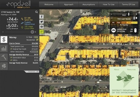
...Because of its ease of use and aesthetic appeal, developers and editors at The Post began clamoring for content built with Pagebuilder, Franczyk said. A makeover of The Post’s recipes section came next, followed by Post TV, the paper’s video initiative. The platform was then used to build custom articles for the paper’s Olympic coverage and spin off a couple of standalone pages.
Now, what began as a simple experiment to improve the site’s author pages has evolved into the beginnings of a completely new content management platform for The Post. By this time next year, the paper plans to build the platform out into a suite of Web applications that encompass a variety of functions, including writing stories, planning editorial content and displaying it with a variety of page templates....
Designing a home for a slopeside site alongside the main ski lift at Aspen Highlands presented architect Rob Sinclair with a variety of challenges.Chief among them was a logistical challenge: fit a 10,000-square-foot, four-story home on a steep quarter-acre lot, while considering city and county setback zoning restrictions and the additional constraints imposed by the presence of a ski lift just a stone’s throw away....
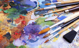
Design isn't something that every marketer feels comfortable doing, but the reality is every one of us will need to design something at some point in our careers. Whether it's a website, some sales collateral, or an ebook, there will be some design expertise required to finish the project.
The reason why we often get bogged down in it all is because often, we don't know how to use the tools at our disposal to get high-quality designs. But here's a little secret, marketers: You don't need Photoshop to create great designs. Below are 10 design tools even the most design-phobic marketers can use to create gorgeous visual content....
Great fonts (like most excellent things on the Internet) are generally handcrafted by independent designers. Making a font takes an incredible amount of effort, which is usually reflected in the price tag. On rare occasions, though, kind and generous designers will give out a few fonts for free, as a way of advertising the rest of their collection. If you like any of the fonts below, please consider supporting their creators.
I’ve compiled the following list of 25 must-have free fonts for entrepreneurs, designers and anyone else looking to impress. Enjoy!...
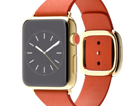
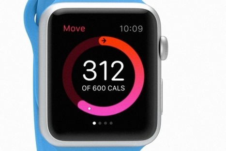
Like other smartwatches, Apple's Watch is embracing skeuomorphism.
But that's okay: It needs to.
Whatever the Apple Watch is, it's not a watch. Not really. Nor is any smartwatch: the Moto 360, the Pebble, or the Samsung Gear Live. It's an entirely new class of device. But it doesn't look like a new device. It mostly resembles a watch. That's because Apple (and other gadget makers) are turning to an old frenemy to help wrap their heads around these things: skeuomorphic design.
What is skeuomorphism? In the software world, it's all those buttons, shadows, gradients, chrome, and textures that designers use to make digital software resemble the real-world objects they're meant to replace. It's the calendar app bound in virtual cowhide, or the podcast app that looks like an ancient reel-to-reel tape recorder. It's a design language of digital fakery that Apple stuck to until Jony Ive blew out of the airlock with iOS 7. In the case of the Apple Watch, it's the wrist-based computer that resembles an analog timepiece in form alone.
But despite Apple's big move away from these principles last year, it had hood reason to follow along with other smartwatch makers and revisit the concept with its watch: Skeuomorphism is good at teaching people how to use new technology. In the words of our own John Pavlus, the iPhone's use of skeuomorphism was "a canny and monstrously effective solution to a daunting problem: how to make an input method once only seen in science fiction movies seem as normal and friendly as... well, as dialing a phone."...
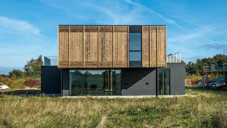
The modern family is always in flux. That's why this house--with flexible walls, sliding cabinets, and moveable outlets--is easily reconfigured to meet the changing needs of our lives.
Americans spend around $300 billion each year on home renovations, adding to the construction industry's giant carbon footprint. But what if houses could reshape themselves as needed, so people could add a room or change the size of a kitchen without bringing in bulldozers or building new walls?
The Adaptable House, part of a new development in Denmark, is designed to change over time. If a family has kids and wants to add a room or make a living room bigger, the house can expand. If a grandparent moves in, the family can slide walls around to add another room. The house is even designed to split in two in the case of divorce....
Decisions, decisions, decisions! Every day we are faced with a constant series of decisions. Whether it is deciding to eat that piece of cake, or make a career change, the decisions we make shape our lives and who we are.
We like to think that all of our decisions are rational and that we are in control, however our unconscious mind, drives how we respond to advertising, brands, products, and in the end determines all of our buying decision. As a result, our landing page design plays an integral role in how our brains make a decision to buy a product or not. The reasons unconscious triggers determine our decisions can be found in the structure of our brain. We can break our mind into three separate parts....
Do you tire of using illustrative patterns as backgrounds in your designs, but not sure where to start with using an image instead? With the array of photographs available, combined with fantastic filters - the versatility that the image offers is quickly making it the competing gladiator to vector backgrounds of yesteryear! Here we show you some of the awesome ways you can use images as a background in your design....
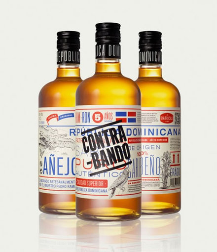
Today, we thought we would highlight some of the amazing packaging designs featured in Andrew Gibbs’ Box Bottle Bag: The World’s Best Package Designs from TheDieline.com – one of our favorite recent design books.
Gibbs does a great job seeking out and discovering the “very best” packaging designs out there, which he categorizes as one of six style types: Luxe, Bold, Crisp, Charming, Casual, and Nostalgic. Let’s take a look at each of these categories and try to find out why they work....
Stashed inside closets in his Brooklyn apartment, Scott Wiener has exactly 652 pizza boxes. It’s the Guinness World Record for pizza box collections, and proof of Wiener’s bigger pizza obsession--he also runs a company that takes people on pizzeria tours of New York, writes a blog on pizza, and recently published a book about pizza boxes. “Everything I do is pizza-related,” Wiener says.
What makes the perfect pizza box? Though most are still a simple cardboard square, Weiner says a few innovators have tried to solve some of the design’s basic flaws. “Boxes are notoriously bad at impacting the flavor of a pizza,” he explains. “Normally you get a pizza in a box, you lift open the box, and the box has trapped so much steam that the pizza is gross and soggy.”...
While the WordPress community continues to grow and expand every day, so does the craft beer scene. So it only makes sense that a growing number of craft breweries are choosing to build their websites on WordPress. After all, WordPress and craft beer have a lot in common: enthusiasm, loyalty, broad appeal, no shortage of strong opinions and a community of contributors of every stripe.
Craft brewers often share many of the same ideals found in open source culture, including the cheerful sharing of knowledge, skills, recipes and the strong support of each other’s work. You might even say that craft brewing culture is the open source version of the beer industry. With that in mind, here are 30 beautiful brewery websites that have been built with WordPress. Pour your favorite local pint, sit back, and enjoy. Cheers!...
Design professional Andy Rutledge may have bitten off more than he could chew by trying to address the “broken design” of news websites.
In a blog post that outlines all the problems with The New York Times’ design, Rutledge makes bold claims like, “It is hard to believe that the Times, or any other similar publication, actually cares about the news when they treat it with this sort of indignity.”
So what he proposes is his own rendition of what a NYT.com section front should look like — and journalists on Twitter, especially from the publication under scrutiny, weren’t feeling it.
And, really, they’re right. It’s hard to take seriously a design that completely ignores the constraints of a typical newspaper, or as Ryan Sholin mentioned, “Boy, it sure is easy to redesign a news site without any regard for advertising, performance, or politics. But so much fun!” Because, really, couldn’t we all whip together something glorious and beautiful if we weren’t constrained by practical needs within the newsroom?...
Considering how Twitter's main site has seemed to regress in recent times and greater attention has been placed on the mobile app, we've decided to give the site a makeover and show how the site can be improved... We understand that Twitter is designed more for mobile, but considering how neglected its desktop site feels – and especially since it is its main source of revenue – we decided to take matters into our own hands and present our vision of how Twitter should look and feel. The Aim Before starting the redesign, it was important to look at what Twitter does right first and incorporate those features into the new look. For one, its simplicity is its greatest strength, and so the overall aim was to evolve the platform instead of creating an entirely new interface from scratch. While it’s very tempting to fill the entire page with different columns and boxes to give users more features to interact with, doing so would make the page busier, which would compromise the overall experience. Therefore, we limited the design to two columns and placed tweets on the left-hand column to maintain consistency....
|
...Woah.
What do you get when you give someone a Sharpie pen and a Nissan Skyline GTR? Probably a bunch of ugly scribbles on a perfectly nice car...unless you're this woman, who has such an amazing artistic talent that when her boyfriend equipped her with a Sharpie, she created a masterpiece out of his car.
It first started as a small project to cover up the dents and scratches on the bumper, but when she revealed her design, they both decided that she should cover the entire car in her doodles. It took her roughly 100 hours of work to finish this masterpiece! Check out her amazing work; it's obvious those 100 hours were very well worth it....
The 10 best designs of the year include a soccer cleat, a campaign to end gun violence, and much more.Fast Company hosted its annual Innovation By Design Awards and Conference in downtown New York today.
It culminated this evening at our awards celebration, where we revealed the 10 best designs of the year.It was long road getting here. We received 1,587 submissions from around the world. From that, we pared entries down to 53 finalists. And from there, our esteemed panel of judges fiercely debated, voted, stalemated, and debated again to reach a consensus on the top 10 designs of the year....
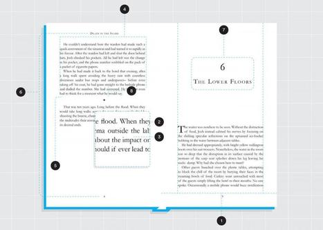
Page design is a fine art, but don’t despair. Even if you aren’t a professional designer, there are simple things you can do to make your pages look more polished.
Pull any bestseller or classic off your shelf and you’ll see all of the following principles brought into play. Use them yourself, and your book will belong with the best....
It’s no secret that designers have their special “go-to” places for inspiration and I was recently asked me what mine are.
When looking for inspiration with typography and design, these are the websites that I highly recommend bookmarking. It’s good stuff, really it is....
The media website you keep seeing again -- and again, and again...
Responsive design is still a new concept that is changing as designers and developers figure new ways to marry form and multi-function. Dan Mall, founder of web design firm SuperFriendly, noted that while responsive design is only about four years old, many of the programs being used to build new site are much olderz.“
I think there are really great tools that are coming out, but I think that we as an industry are still wrapping our heads around what it means to design for different context,” Mall said. “I think as the tools become more intuitive and the process becomes more intuitive, it will free us up to start thinking about these things in different ways.”
The designers that Mashable spoke with pointed to a variety of sites as examples of forward-thinking responsive websites, including blog publishing platform Medium, gaming site Polygon and digital magazine The Great Discontent....
The key to a gadget’s ubiquity is balancing both function and design, so the device can enhance someone’s lifestyle without requiring them to change their behavior…too much.
I was lucky enough to spend 17 years of my career at HP, mostly with the PC and printer business, at a time when we were creating new businesses and taking new ideas to market at a breakneck pace Some of the basic rules
I learned back then became extremely relevant when I joined Livescribe. Right away, we shifted our product design to embrace smartphones and tablets given the ubiquity and power of modern mobile devices....
Why is the Apple Watch a bit, well, boring?
Because the next set of problems Apple has to solve is so much less fun than the last....
Are you hankering to give your PowerPoint presentations a visual boost? Do you want to get away from the "I did this in PowerPoint look" that you (and everyone else) get from using PowerPoint's built in templates? Do you need a timeline slide or help finding graphics to illustrate your slide content?
If you answer yes to any of these questions, then take a look at these five great—and free—design tools. They can help you enhance your PowerPoint presentations and speed up the design process.
Via Baiba Svenca
Are you a web designer looking for the right place to get your creative juices flowing? Look no further — the following list is the perfect remedy for someone stuck-in-a-rut, bored of seeing the same designs over and over. Here are the most inspired, curated, and constantly updated websites around to help your creativity....
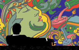
AMC unveiled the official poster for the final season of Mad Men, designed by renowned artist Milton Glaser. As Glaser explains in an exclusive interview with amc.com, the imagery plays on recurring themes from the series,”notably the head of a woman and the wine being poured.” Another familiar element that Glaser incorporates is “the figure that has become symbolic of the program” — the iconic silhouette of Don Draper from the show’s opener. Juxtaposing Don’s original Season 1 image with psychedelic art indicative of the new season was a challenge that Glaser happily accepted, and the result is, as he puts it, “harmonious and convincing as a single experience.”
Here at WDL, we never get tired of great logo design. This is why today we have a new selection of inspiring logos to show you. These logos are minimalist and beautiful. They use simple lines and great typography, proving that you don’t need to over design to represent your brand in a bold way..
From time to time we like to show you different sources of inspiration. From logos to icons, from print tobranding, we always like to show you that you can find inspiration in a lot of different designs, including package design. Packages are amazing for a group of reasons, but I believe that most important task of a package is to represent a product while catching the client’s attention. In package design we can find great examples of typography, textures, proportions, colors and much more. Remember to click on the images to read more about each design....
|


Innovation in journalism and social media at The Washington Post.