 Your new post is loading...
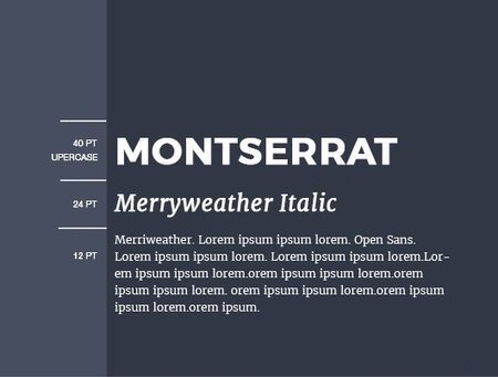
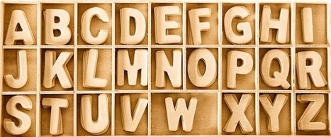
Thankfully, the design world has advanced to the point where fonts are not nearly as limited as they once were. Starting with 2010 the Google Fonts were released, making the process of choosing and pairing fonts easier and quicker.
However, you should be aware that not every font combination in Google’s library is a recipe for typographical success. With the right font pairings and usage considerations, your brand will convey the right message to your audience, professionalism, and reader friendliness without the need for expensive customized fonts.
In this article, I’ll show you 15 great Google Font combinations that will help you to accomplish all this.
You will find below 15 spectacular Google Font combinations that together with images and graphics, will help you define your brand’s personality.
Here's an inspiring collection of typeface and typography pairing resources for designers and bloggers.
Everyone, even non-designers, can agree that the smallest typographical change can make a world of difference (*cough* Warren Beatty *cough*). Elevating designs through typography is a skill every designer should have in their back pocket. Do you want to become a typography wiz—and, ultimately, an even better designer? We want that for you too! That’s why we’ve gathered a list of the best free typography resources—handpicked, just for you. Free typography education Check out these e-courses, e-books, and workshops to get started on your typographical journey....
One of the most important skills you can learn as a designer is how to choose type. This is because text is one of the primary ways designers can communicate with users. Typography can make or break a design. There’s a beauty and complexity to typography. Some people devote their entire careers to type. Thankfully, their work is well documented, so we have tons of online resources for typography. This article is designed to serve as a starting point for helping you learn how to choose type for your designs. It will encourage you to explore fonts and font combinations beyond those you’re familiar with....
Good typography may be hard work, but designers shouldn’t forget to have some fun with it! While crafting fonts and typographic characters can sometimes feel stiff and overly mathematical, we want you to help you find the joy in creating more expressive and playful typography.
Of course, this approach is great for children-oriented design projects—but let’s not limit ourselves. After all… not every coffee shop, ice cream store and logo needs to look posh. Let’s find the more creative side of typography and get goofy!
In this article, we’ll spotlight some examples of playful typography and show you how to join in the fun with your own work....
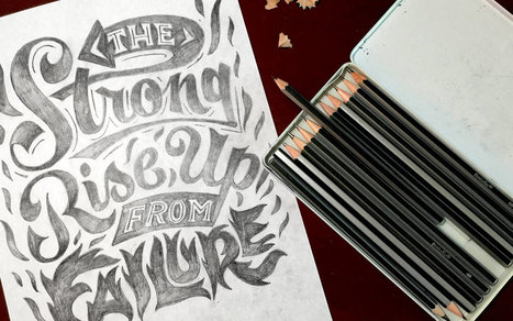
Have you seen the hand-drawn look? Hand lettering's rising popularity has imposed a new grungy, ornated style in fonts that we can't get enough of. These type families offer uniqueness and naivety, while adding an unpretentious touch to print and web designs alike. If you haven't tried your hand at lettering yet, get started with these brilliant fonts that evoke that coveted hand-drawn look....
These are the prettiest free minimalist fonts you will ever want to use in order to create super-clean, gorgeous designs!
Whether you want to use them for prints or logos, or want to add them to a website, these minimalist fonts are very versatile and can be used in pretty much any kind of design.
The trend of minimal design is here to stay, which is why minimalist fonts are so popular among designers. With the overwhelming use of mobile devices, and the increasing emphasis of search engines on website speed and usable, users are now looking for designs that are easy to use, without any over the top effects or graphics.
The 25 free minimalist fonts showcased here in this list include both free serif fonts and free sans serif fonts. They have clean shapes, unique details and will make your designs pop out if you decide to use them!...
There are over 650 Google Fonts available for free. But, pairing typefaces isn’t easy and many of those fonts don’t work for typical websites. Part of the 25x52 initiative, this collaborative, ongoing project offers inspiration for using Google’s font library.
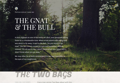
All passages are from the Project Gutenberg transcript of Æsop’s Fables. All photographic images are from Unsplash.com....
|
During my stint working for a newspaper, I recall their simple design philosophy: Big, bold text headlines on a white background. As we well know, the web is a totally different animal than print. But many principles of good design are applicable to both mediums. The use of large headline text is one of them. Typography on the web has changed a lot over the past decade or so. Whereas we used to have just a few basic fonts to choose from, we now have more than enough options to satisfy our appetites for beautiful, attention-grabbing headlines. Unlike that newspaper (which generally used one font for its headlines), web designers are exercising their creative freedom to use different types of fonts. Some are using the more traditional bold, serif and sans-serif fonts while others take advantage of more modern styles and weights. Let’s take a look at how designers are utilizing large headlines to convey a message. Most don’t apply to news, per se – they’re more about branding. But, as you’ll see, there is more than one way to successfully approach them....
I launched Typewolf as a side project in June of 2013. Working as a designer, I was always frustrated by the lack of good resources for choosing fonts for design projects. Seeing type samples set in “the quick brown fox jumps over the lazy dog” isn’t very useful when it comes to web design—seeing how real type performs on actual websites is much more helpful. I’ve also noticed that other typography sites tend to be written from a type designer’s perspective rather than from the perspective of someone who actually uses type in their day-to-day work. I’ve been a designer for 15 years, so everything on Typewolf is approached from a designer’s perspective....
Just like previous years, we've undertaken great efforts to look for, categorize, and create font previews of 100 typefaces that you can use to do almost anything. Regarding their licenses, you should pay attention to each one individually as, while the majority are completely free, some are for personal use only and others are not full families – this means that you’ll only be able to download regular or medium weights or condensed styles for free. Font Selection As you know, the selection has been made keeping the typical type classifications in mind to help you browse more efficiently: Serif, Sans Serif, Slab Serif, Rounded, Geometric, Decorative, Display, etc. Many of these fonts can also be downloaded as a web font kit so that you can use them in your online projects....
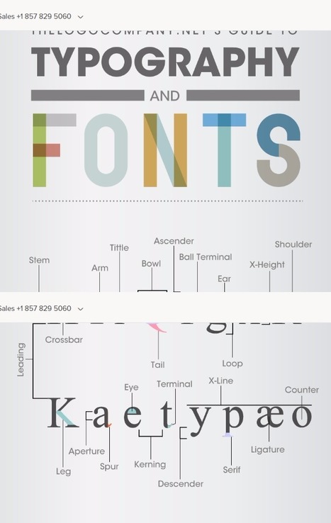
Typography is associated with great design for web and print. However, it was not so long ago that typesetting for printing presses was the norm. During this era of typesetting, many technical terms evolved for the construction and makeup of fonts and layout. It was like a secret code for typesetters, where few outside of the industry had any knowledge of the terms being used. The Logo Company has put together this clever graphic that decodes these technical terms associated with type and explains the meaning of each term in simple, plain English, that anyone can understand....
Why typography? Turns out that while the importance of typography is often overlooked, it plays a critical role in strengthening your brand, creating interest in your product, and highlighting your central message. Knowing that, I decided to sign up for a typography course at the Massachusetts College of Art and Design. Couldn't hurt to learn how to identify a good font from a bad one, right? I learned a lot more than that. I realized that paying attention to even the littlest details of type can make all the difference in the world when you're laying out an email, ebook, or image for social media. This is why I wanted to write this post: to share the most important learnings and resources with my fellow marketers. ...
Just like an awesome photo or graphic can really make your design stand out, so can the right font. But the wrong font can also make your design stand out ... in a bad way. If you've ever seen a design with really out-of-date typography, you know what I mean.
But what makes a font or typography design out-of-date? What's "in" right now? Whether you're designing a one-off project or you're a seasoned designer, it's important to stay on top of typography trends so your work looks and feels current.
Check out the infographic below from ThinkDesign to learn about the typography trends in 2016, from retro and handwritten fonts to mixing and matching typefaces, to the roles transitional effects and animation could play in your marketing. (And download our free do-it-yourself design guide here for tips about how to use fonts in your content and web designs.)...
Choosing harmonious font combinations is a key part of typography. Good font pairings will lead to beautiful designs that are also easy to read.For font-pairing ideas and inspiration, check out the following resources....
The best free fonts, from vintage-inspired typefaces to slap-you-in-the-face slab serifs, for Windows and Mac, for a range of design projects.We’ve scoured the web to present you with a fine and varied selection of free fonts. Including scripts, serifs, and a range of ligatures, these fonts will give you greater flexibility in your designs, and add to your arsenal of design tools....
|


Here's some useful guidance on typography and fonts.