


 Your new post is loading...


Before deciding to read this topic, ask yourself first – What are the things you wished was there in your last visit to a shopping site?
Should there have been more scope for interaction? Should there have been a price comparison facility? Did the web design communicate what it promised to sell? Would you purchase more if they offer seasonal discounts / free delivery next time?
Being 'user friendly', is the focal point of all e commerce sites. A design that is user focused, generates more conversions. So, if you were given the opportunity to make some improvements to the last visited shopping website, what would you have added or changed?
This post will bring to you a set of five best shopping site names, which try to maintain the key marketing principles, together with a beautiful web design....


Here is a comparison of how different retailers are managing to stand out in commerce and whath they do to engage customers.
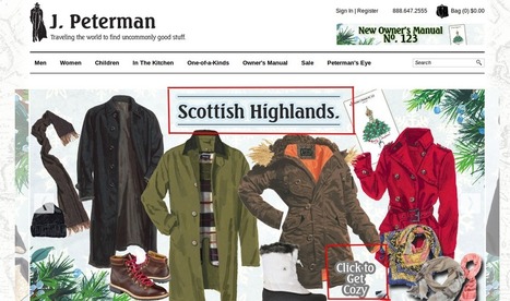
This article was very insightful. The article featured a variety of marketing tricks that you can learn from. The apple website utilizes a unique color and typography. Color and typography are important components of a website. Particularly to a website that sells luxury goods. J Peterman has an intriguing copywriting style. The style is straight to the point and well positioned. Amazon's website has a very simple and clear navigation feature. A good navigation feature is essential to. a website's success. Next day coffee has a persuading landing page that easily attracts users. to the site. A landing page can make or break a site. Mood by me website has a clear and direct call to action. The website is straight to the point. These features are recognized by the various companies as critical components to attract customers and increase sales.