 Your new post is loading...
Editor’s Note: In the world of web design, we tend to become preoccupied with the here and now. In “Resilient Web Design“, Jeremy Keith emphasizes the importance of learning from the past in order to better prepare ourselves for the future. So, perhaps we should stop and think more beyond our present moment? The following is an excerpt from Jeremy’s web book. Design adds clarity. Using colour, typography, hierarchy, contrast, and all the other tools at their disposal, designers can take an unordered jumble of information and turn it into something that’s easy to use and pleasurable to behold. Like life itself, design can win a small victory against the entropy of the universe, creating pockets of order from the raw materials of chaos....
Curated directory of the best Product Pages
Fresh, innovative, creative, minimalist award winning web design agencies websites for inspiration. Today we've selected 26 best web design agencies' websites. Beautiful examples of Web Design Agencies websites for inspiration. These agencies are are using the latest technologies “HTML5, CSS3 and JavaScript” for their websites to create perfect and eye catching design. Let’s take a quick look at some amazing new web trends to keep in mind when designing your next website project.
These technologies have combined to create a huge shift in the web design paradigm, creating, most notably, a responsive (or increasingly mobile-first) design philosophy. On the aesthetic side, 3 years ago flat design reigned supreme. And then Google introduced Material design, which brought us slightly out of abstraction. 2017 marks the year design takes one more step back into reality. Whether it’s through form, color choice or functionality, 2017 is a year of hybrids, where reality and technology collide to create a seamless browsing experience. Here are the 9 web design trends we think are going to bridge that gap...
It’s design vocabulary time! We know you’ve heard these two terms floating around: skeuomorphism and flat design. What do they mean? They’re two contemporary designs trends that each have their own unique style and set of traits. Skeuomorphism creates a sense of familiarity by emulating materials, while flat design stays true to its medium, often feeling minimal and utilitarian. These opposing styles create a major fork in the road for designers (especially those in UI design), and many projects begin with the question of which world to jump into. Luckily, we’re here to help answer that question with an in-depth look at each design style. We’ll also explore Google’s all-new design language, Material Design, which combines the aesthetic of both skeuomorphism and flat design....
This week's Six Pack features a vivid array of bold stylings from Pheist (Hamburg, Germany), Hector Mansilla (Ciudad Victoria, Mexico), Richard Vergez (Brooklyn, United States), Sarah Matuszewski (Ludwigsburg, Germany), Raluca Bararu (Bucharest, Romania) and Dylan Morang (Maine, United States)....
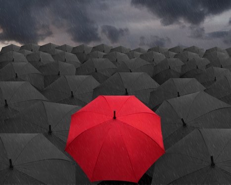
It’s the color of power and strength. As well as love and Disney romance. But the meaning of red goes way beyond fast cars and heart-shaped chocolate boxes. Through evolution, and thousands of years of human civilization, red has been used to tell stories, stir emotion and to get us to spend more money. Learn what the color means to different cultures around the world, and find out how to best use it for your business in our exploration of the color red.
In the beginning, there was red
Evolutionarily, red is a signal of heightened emotions, both good and bad. Think of our how our cheeks flush with anger when we’re upset, or how they blush when our crush pays us a compliment. In nature, the vibrant patterns of poison dart frogs help warn predators to stay away. And in reverse fashion it also attracts animals by serving as a signal of ripened fruit. Either way, the color red developed in nature in order to stand out.
Color wields enormous sway over our attitudes and emotions. When our eyes take in a color, they communicate with a region of the brain known as the hypothalamus, which in turn sends a cascade of signals to the pituitary gland, on to the endocrine system, and then to the thyroid glands. The thyroid glands signal the release of hormones, which cause fluctuation in mood, emotion, and resulting behavior. Research from QuickSprout indicates that 90% of all product assessments have to do with color. “Color,” writes Neil Patel, is “85% of the reason you purchased a specific product.” It’s a no-brainer fact of any website that color affects conversions. Big time. So, the bottom line is: use the right colors, and you win....
Web design thrives on two things: innovation and imitation.
Unfortunately, there's often a lot more of the latter. We all like to seize upon the latest trends, use them until they’re ubiquitous, and then look desperately for the next big thing. Think about sliders. They were all the rage a couple years ago. Today, they feel dated. What to do? Stop chasing microtrends, and start looking at the big picture. Here, we've isolated six web design ideas that are here to stay....
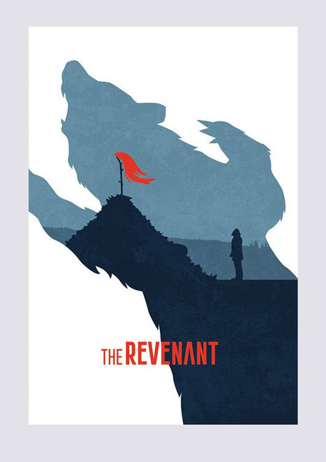
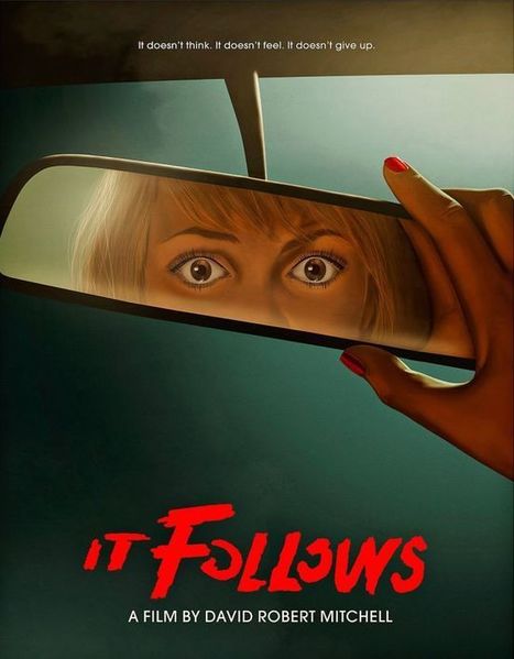
What better time to kick off a fun community contest than right before the Academy Awards?! This time around, we turned to our designer community to reimagine the 2016 Oscars movie posters for the 8 “Best Picture” nominees, drawing inspiration from the minimal movie poster trend.
The results were great – and Mad Max and The Martian were definite favorites. Check out the winners and some of the highlights below!...
It has been said that designing a blog is easy, a-no brainer. Pick a template from the myriads out there all readily available on any platform and you’ll be good to go, right?
But popping images and text into an existing template will likely translate into another generic looking blog. And in today’s growing blogging industry, being just another sheep in the herd won’t do much for your traffic. Differentiating your blog from others in the same niche by creating a blog designed with a bit more character will turn you into the sheep they’ll remember.
Creating a stunning blog does not necessarily mean building your own layout from scratch. You can take advantage of a template, let it do most of the heavy lifting, and pair it with a thoughtfully designed header to start engaging your target audience. Use them to set the mood and visually communicate what your blog is all about. They don’t have to be terribly complex, just tailored to fit your blog beautifully. Below, we showcase 50 awesome blogs with headers that make great first impressions and feature great content....
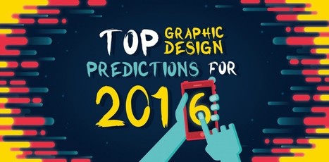
As a web & graphic design agency with an accent in visual storytelling, my team and I need to pay close attention to the everchanging trends of design, on and offline. Based on this monitoring, I’d like to share with you what I believe will be the 16 most prominent trends of graphic design in 2016.
Why is this important to you, if you’re not a designer? Well, if you’re a business owner, or if you own a blog, I’m sure you don’t want it to look and feel outdated. People will make a lot of assumptions based on the first impression they get from the design of your last post, your social profile or your flyer.
If you spend lots of hours writing your blog, wouldn’t you like to stand apart visually? Jump on board these trends before everybody does:...
Choosing harmonious font combinations is a key part of typography. Good font pairings will lead to beautiful designs that are also easy to read.For font-pairing ideas and inspiration, check out the following resources....
|
The colors you choose while designing a website, poster or any other type of image will have a huge impact on whether or not the overall design is successful. After all, there is a lot of psychology behind the colors that people are attracted to, and designers need to incorporate this into everything they do.
Color contrast plays a very valuable role, but it is often overlooked, undervalued and misunderstood. To avoid this problem, you must learn more about color contrast, including how and why you should use it. Once you go beyond the basics of knowing that red and orange aren’t good colors to create contrast but black and white are, you can begin to develop an enhanced aesthetic that will please clients and viewers.
Why is Color Contrast So Useful?
Color contrast, in a nutshell, provides visual intrigue and keeps viewers interested. Consider for a moment how boring it would be if an entire poster was made from one color or only included shades from the same color family. Although there are some instances when this does work from an artistic perspective, it’s not an approach that is likely to grab someone’s attention when they’re perusing store shelves, looking at movie posters or surfing the web. Therefore, it’s wise to use contrasting colors whenever appropriate....
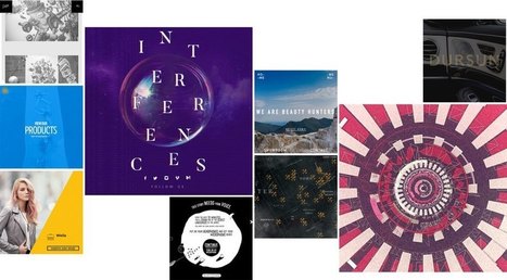
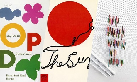
Posters offer a diverse canvas for graphic designers, and some of the very best are not only beautifully designed but also inspiring and thought-provoking. There are hundreds of stunning poster designs that are instantly eye-catching, but we’ve narrowed this list down to a few of the most intriguing examples from the current decade. Whether you prefer to be bold or understated, you’re certain to find something here that will get your creative juices flowing.
Lorem ipsum has become the industry standard for design mockups and prototypes. By adding a little bit of Latin to a mockup, you’re able to show clients a more complete version of your design without actually having to invest time and effort drafting copy. But despite all its benefits, seeing the same random Latin text in every design can get a little boring for you and your clients. So if you have a client who’s got a sense of humour or if you’re just tired of going the traditional route in your mockups, here are 15 creative and funny lorem ipsum text generators that are sure to lighten the mood at any client meeting....
What if I told you you could visit an art gallery ... from the comfort of your own home? Or from a bus seat on your commute to work? Or while you're taking a break for lunch? If you follow the right people, that's what Instagram can do for you. There are a lot of really talented artists and designers out there who use Instagram as a sort of mini art gallery -- a social portfolio, if you will. And it's a jackpot for people who love browsing gorgeous design work. To help you narrow your search, I've carefully curated some of the best Instagrams to follow for design inspiration. I did my best to place them in categories -- illustration, graphic design, pop art and installation, color palettes, street art, photography, typography, and calligraphy -- although you'll notice some of their work could fall into a number of different lists. ...
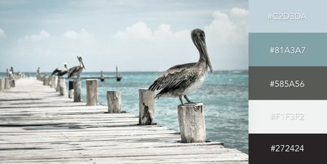
One of the keys to making your design come alive is choosing just the right color combination. Whether you’re attempting to evoke the feelings associated with a breathtaking landscape, a romantic sunset or a dynamic scene bursting with color, it takes a trained eye to bring together the perfect hues to drive your message home. To save you some time and effort in your search for the ideal color combination, we’ve created a list of beautiful color schemes you can use in any of your projects. These color presets are already available for you within Visme, so you can easily apply them to any of your own designs by simply clicking on the color combination of your choice, as seen below....
Good typography may be hard work, but designers shouldn’t forget to have some fun with it! While crafting fonts and typographic characters can sometimes feel stiff and overly mathematical, we want you to help you find the joy in creating more expressive and playful typography.
Of course, this approach is great for children-oriented design projects—but let’s not limit ourselves. After all… not every coffee shop, ice cream store and logo needs to look posh. Let’s find the more creative side of typography and get goofy!
In this article, we’ll spotlight some examples of playful typography and show you how to join in the fun with your own work....
There’s no denying it… Bright, bold colors have been a huge trend this year—not only a 2016 web design trend, but across all mediums. This color palette is popular with good reason; when bright color pops in design, it can conjure excitement, joy and intrigue. For that reason, it’s a great skill to master as a designer.
There are many different ways to incorporate bright color into your designs. This article takes a close look at 10 different examples which accomplish just that. Enjoy!...
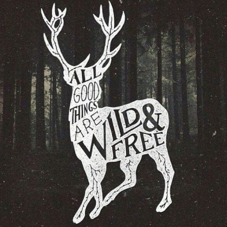
Picture quotes are one of the most pinned images on Pinterest.
The more visually striking your picture and quote combination is, the more shareable it will be. People can use them on social media, turn them into printable wall quotes, or download them as desktop wallpaper — that’s maximum visibility for you or your brand.
So whether you want to take your graphics to the next level or create your own for the first time, let’s go through some ways you can do the same for your quotes using some of the most eye-catching examples on the web....
See what the design world will look like this year with Shutterstock’s latest infographic.Global TrendsThe top four trends making an impact around the world.
From how Star Wars toys get designed to the power of type to Apple's fall from grace, here are the best features we wrote in 2015.
Deep dives, thrilling tales of derring-design, and damning essays by industry giants like Don Norman—we've put together a list of our favorite design longreads of the year. We hope you enjoy reading them as much as we liked writing them....
We all need a little inspiration sometimes. So, when you're feeling a bit lackluster, here is a list of 25 modern sites from a range of industries that will spark a little bit of inspiration in you. All of these sites are mobile friendly and responsive and feature a host of great features. This list is split into multiple sections based on industry so, you can find the most relevant and useful inspiration. Go forth, my friends!...
10 web designers who have amassed an excellent body of work and done something truly outstanding over the past year, as voted for by you!It's that time again!
Voting is now open in the 16th annual net awards and the leading lights of the web world are waiting to see whether they win one of the most sought-after prizes in the web design world.
There are 20 categories this year, including Designer of the Year. Below is the shortlist based on nominations from the public and in no particular order. We invite you to check them out and then vote for your favourites....
|


Resilient Web Design is a short book written by Jeremy Keith. You won’t find any code to help you build better websites, but you'll find ideas and approaches. A long read but a good one for design ideas.