Public Relations & Social Marketing Insight
444.5K views | +3 today
Follow
Public Relations & Social Marketing Insight
Social marketing, PR insight & thought leadership - from The PR Coach
Curated by Jeff Domansky
Your new post is loading...
Scooped by Jeff Domansky
Scoop.it!

5 Hottest Graphic Design Trends of 2016 So Far

5 Hottest Graphic Design Trends of 2016 So Far | Public Relations & Social Marketing Insight | Scoop.it

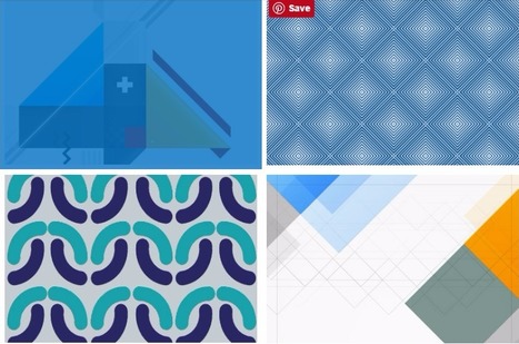
Some trends last for ages while others are cyclical, but whether classic or fleeting, design trends are both inspiring and incredibly useful when it comes to your graphics work. So what’s been hot in 2016? The five styles that have dominated the year so far are outlined here to help you develop eye-catching and relevant concepts, while still staying true your unique creative vision.

We rounded up visual examples of each design trend using royalty-free stock graphics, which you can easily incorporate into your own projects. Here’s the breakdown....

Jeff Domansky's insight:

Abstract Swiss is particularly interesting design.

No comment yet.
Scooped by Jeff Domansky
Scoop.it!

Awesome Showcase of Creative Side Menus Websites | DesigniMag

Awesome Showcase of Creative Side Menus Websites | DesigniMag | Public Relations & Social Marketing Insight | Scoop.it

Here is an awesome showcase of creative side menu websites that we have prepared with the aim to provide you the dose of inspiration for your upcoming design projects. Other than coming up with a website that has side menus you can suggest other guys in your field too for them to take inspiration and work on coming up with the one for themselves.


I personally liked them all as these are visually stunning and creative. With the belief that you all will like them too let us begin with the compilation of creative side menus websites. Check it out!...

Jeff Domansky's insight:

DesigniMag showcases all the latest and creative websites featuring elegant side menus. Inspiration to help you create a side menu website.

No comment yet.
Scooped by Jeff Domansky
Scoop.it!

52 Of The Very Best Web Designs from 2014 - Admire The Web

52 Of The Very Best Web Designs from 2014 - Admire The Web | Public Relations & Social Marketing Insight | Scoop.it

Yes, we are a tad late, but it’s always a great post to see how trends have moved forward, or how designs last year are now this years trends.


It’s interesting to look at where 2015 will take us. Is the trend of flat web design over? We certainly won’t be missing responsive web design this year, with more and more devices being created and used to surf the web. Or will go back to mobile only websites. Only time will tell.


We would love to pull our favourite out from this lot posted below, but we simply cannot, there are too many great designs in all shapes and sizes, what is your favourite ?...

Jeff Domansky's insight:

Creativity with your coffee. These 52 web designs are definitely worth viewing.  9/10

No comment yet.
Scooped by Jeff Domansky
Scoop.it!

30 Fantastic Examples of Parallax Scrolling Websites | Inspiration

30 Fantastic Examples of Parallax Scrolling Websites | Inspiration | Public Relations & Social Marketing Insight | Scoop.it

The very first website with parallax scrolling effect was designed by Ian Coyle in 2011. It was the site for Nike “Nike Better World”. These days parallax scrolling is overused by a wide range of websites. However, it’s a great tool that gives pleasant user experience and is a perfect solution for storytelling. In this roundup I put together 30 fantastic examples of parallax scrolling websites for your inspiration. Feel free to click on the images to see the parallax scrolling websites in action....

Jeff Domansky's insight:

Lots of inspiration for website designers .

kmmk's curator insight, October 23, 2014 7:24 AM
hmm love it - full of creativeness
Scooped by Jeff Domansky
Scoop.it!

6 Colorful Websites for Design Inspiration - 'Net Features - Website Magazine

6 Colorful Websites for Design Inspiration - 'Net Features - Website Magazine | Public Relations & Social Marketing Insight | Scoop.it

Light colors are easy on the eye, which means that they aren’t as likely to take attention away from the main goal or goals of a site. Negative space, on the other hand, makes websites look less cluttered and easier to navigate. Even though negative space can actually be filled with any color, white is typically the safest bet. For example, a brand like Best Buy is associated with the colors blue and yellow, but the company primarily uses these colors in the navigation menu of its site, which leaves plenty of whitespace to help guide visitors' eyes to calls-to-action (CTAs) like "Shop" and "Find out more."

Some brands, however, are okay with challenging the rules of Web design and are doing so with colorful designs that are pushing the best-practice boundaries. Although colorful designs are certainly not for everyone, they can be successful when they are executed correctly and used for the right brand. For some inspiration, check out the six colorful websites featured below...

Jeff Domansky's insight:

Nothing like a little design inspiration in these six websites provide that in spades.

No comment yet.
Scooped by Jeff Domansky
Scoop.it!

Web Designs of the Best Selling WordPress Themes

Web Designs of the Best Selling WordPress Themes | Public Relations & Social Marketing Insight | Scoop.it
WordPress themes are great sources of design inspiration, but it’s even more interesting to check out the best selling premium themes to see the kind of styles are popular with the general public. In today’s web design showcase I round up some of the most purchased themes from multiple marketplaces to compare their layouts. Can you see any common trends?...
Jeff Domansky's insight:
Who can resist these tasty WordPress website designs? Ultimate creativity. 10 / 10
Marco Favero's curator insight, March 10, 2015 3:22 AM

aggiungi la tua intuizione ...

Scooped by Jeff Domansky
Scoop.it!

10 Graphic Design Hacks that'll Make You a PRO Designer Overnight!

10 Graphic Design Hacks that'll Make You a PRO Designer Overnight! | Public Relations & Social Marketing Insight | Scoop.it

Canva just introduced a simple-as-pie new online Design School that empowers everyone to learn AMAZING graphic design skills.

Yes, it’s for people just like us — businesses & brands communicating through social media!

The school includes a series of quick & easy tutorials that cover everything beginners need to know about design.

So if you want to become a better visual communicator, here’s a taste of the powerful graphic design hacks you’ll learn at the Canva Design School....

Jeff Domansky's insight:

Want to design images that people can't help but LOVE and share? No worries. Anna Guerrero shares 10 easy graphic design hacks.

Scooped by Jeff Domansky
Scoop.it!

How To Use Psychology In Landing Page Design

How To Use Psychology In Landing Page Design | Public Relations & Social Marketing Insight | Scoop.it

Decisions, decisions, decisions!  Every day we are faced with a constant series of decisions.  Whether it is deciding to eat that piece of cake, or make a career change, the decisions we make shape our lives and who we are.


We like to think that all of our decisions are rational and that we are in control, however our unconscious mind, drives how we respond to advertising, brands, products, and in the end determines all of our buying decision. As a result, our landing page design plays an integral role in how our brains make a decision to buy a product or not.   The reasons unconscious triggers determine our decisions can be found in the structure of our brain. We can break our mind into three separate parts....

Jeff Domansky's insight:

Designing with psychology? When it comes to landing pages, they can work together.

No comment yet.