 Your new post is loading...
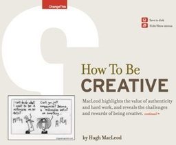
Online merchants could always use some free expert advice from the design community. There is a wide variety of free ebooks available to help. Here is a list of helpful ebooks on design. There are titles on typography, classic design, color theory, user-experience design, logos, brand building, creativity, and more. All of these ebooks are free.
Whether it’s a brand promotion, video, news update or even a meme, visual content rules the social media landscape. What has become so important is effectively conveying your brand on social media through images and video.
In this quick-scroll world of social media, the visual face of your brand is often times the first thing your audience sees and possibly the one thing they remember. It’s hard to cut and paste an image and reuse it across all of your social networks unless you have a tool like Landscape.
Sprout Social’s very own tool is free to use to resize, crop and scale social media image sizes. And along with our resizing tool, we’ve provided all the specific dimensions and a few quick tips to help you decide which image best fits each position....
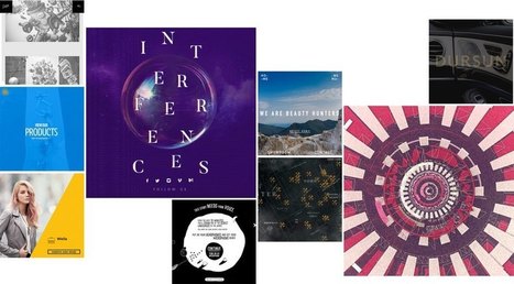
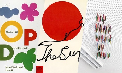
Posters offer a diverse canvas for graphic designers, and some of the very best are not only beautifully designed but also inspiring and thought-provoking. There are hundreds of stunning poster designs that are instantly eye-catching, but we’ve narrowed this list down to a few of the most intriguing examples from the current decade. Whether you prefer to be bold or understated, you’re certain to find something here that will get your creative juices flowing.
It’s that time of year where we look at the year that was and the year that will be. We’ve seen a lot of amazing website designs this year, and I’m eager to see what 2017 has in store for website and website design. 2017 is sure to bring some amazing website designs, but if we look hard enough, we can already start seeing some trends that are sure to dominate websites in 2017. Let’s take a look at the 10 website design trends we can expect to see in 2017....
These technologies have combined to create a huge shift in the web design paradigm, creating, most notably, a responsive (or increasingly mobile-first) design philosophy. On the aesthetic side, 3 years ago flat design reigned supreme. And then Google introduced Material design, which brought us slightly out of abstraction. 2017 marks the year design takes one more step back into reality. Whether it’s through form, color choice or functionality, 2017 is a year of hybrids, where reality and technology collide to create a seamless browsing experience. Here are the 9 web design trends we think are going to bridge that gap...
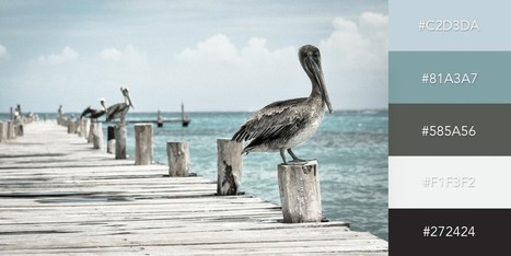
One of the keys to making your design come alive is choosing just the right color combination. Whether you’re attempting to evoke the feelings associated with a breathtaking landscape, a romantic sunset or a dynamic scene bursting with color, it takes a trained eye to bring together the perfect hues to drive your message home. To save you some time and effort in your search for the ideal color combination, we’ve created a list of beautiful color schemes you can use in any of your projects. These color presets are already available for you within Visme, so you can easily apply them to any of your own designs by simply clicking on the color combination of your choice, as seen below....
Snappa makes it easy to create any type of online graphic. Create & publish images for social media, content marketing, and more! Hundreds of ready made templates Don't want to design from scratch? No problem! Just choose from our growing collection of beautiful templates to get started in seconds. Everything you need to create stunning graphics Snappa combines the best visual assets with a fully-featured graphic editor....
I was curious what colors were being used by large, popular sites, so I decided to find out.Alexa.com maintains a list of the most visited sites on the internet. I wrote aPHP script to scrape the ten most popular sites and record all the colors used in the sites' home pages and style sheets. I plan to rescrape the data on a regular basis. Because of this, I'll keep analysis to a minimum, since it could become outdated when the data changes. Once I have data over a larger time period I'll be able to examine and graph trends in web development. I also plan to examine the difference in color usage between popular websites from different parts of the world....
Minimalism is one of the most dominating styles of today- right from architecture, to design, to literature. It is a style used in almost every other form of art. People often confuse minimalism with absence of detail. Minimalism is certainly not a grand style, but it is also not an absence of detail or design either. Minimalists just focus on how much of useless content can be stripped away from an item without losing its key purpose and identity. Minimalism is simple in form and function, devoid of pointless decorations, yet lavish. What exactly do we understand from Minimalist design? The simplicity of minimalist web design may seem too simple, but it is under the surface that the real content lies. Don’t think minimalism is easier just because it is simple. It gets even more difficult because with fewer elements you still need to provide the same usage with less interface. The less-is-more attitude was first applied in architecture and then slowly moved on to other industries like- interior design, industrial design, and now web design. The basic idea was to eradicate any element that didn’t really contribute to the main purpose or function. 6 Elements to Consider in Minimalist Web Design...
Good typography may be hard work, but designers shouldn’t forget to have some fun with it! While crafting fonts and typographic characters can sometimes feel stiff and overly mathematical, we want you to help you find the joy in creating more expressive and playful typography.
Of course, this approach is great for children-oriented design projects—but let’s not limit ourselves. After all… not every coffee shop, ice cream store and logo needs to look posh. Let’s find the more creative side of typography and get goofy!
In this article, we’ll spotlight some examples of playful typography and show you how to join in the fun with your own work....
There’s no denying it… Bright, bold colors have been a huge trend this year—not only a 2016 web design trend, but across all mediums. This color palette is popular with good reason; when bright color pops in design, it can conjure excitement, joy and intrigue. For that reason, it’s a great skill to master as a designer.
There are many different ways to incorporate bright color into your designs. This article takes a close look at 10 different examples which accomplish just that. Enjoy!...
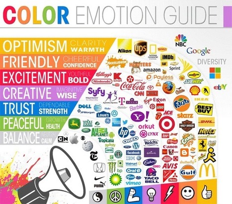
The psychology of color as it relates to persuasion is one of the most interesting — and most controversial — aspects of marketing. At Help Scout we believe the problem has always been depth of analysis. Color theory is a topic of complexity and nuance, but splashy infographics rarely go beyond See ‘n Say levels of coverage. Green Lantern can’t turn lemons into lemonade and I’m left equally unequipped to make smart decisions about the spectrum which shades our world. But why is such a potentially colorful conversation so unwaveringly shallow?...
Light colors are easy on the eye, which means that they aren’t as likely to take attention away from the main goal or goals of a site. Negative space, on the other hand, makes websites look less cluttered and easier to navigate. Even though negative space can actually be filled with any color, white is typically the safest bet. For example, a brand like Best Buy is associated with the colors blue and yellow, but the company primarily uses these colors in the navigation menu of its site, which leaves plenty of whitespace to help guide visitors' eyes to calls-to-action (CTAs) like "Shop" and "Find out more."
Some brands, however, are okay with challenging the rules of Web design and are doing so with colorful designs that are pushing the best-practice boundaries. Although colorful designs are certainly not for everyone, they can be successful when they are executed correctly and used for the right brand. For some inspiration, check out the six colorful websites featured below...
|
The colors you choose while designing a website, poster or any other type of image will have a huge impact on whether or not the overall design is successful. After all, there is a lot of psychology behind the colors that people are attracted to, and designers need to incorporate this into everything they do.
Color contrast plays a very valuable role, but it is often overlooked, undervalued and misunderstood. To avoid this problem, you must learn more about color contrast, including how and why you should use it. Once you go beyond the basics of knowing that red and orange aren’t good colors to create contrast but black and white are, you can begin to develop an enhanced aesthetic that will please clients and viewers.
Why is Color Contrast So Useful?
Color contrast, in a nutshell, provides visual intrigue and keeps viewers interested. Consider for a moment how boring it would be if an entire poster was made from one color or only included shades from the same color family. Although there are some instances when this does work from an artistic perspective, it’s not an approach that is likely to grab someone’s attention when they’re perusing store shelves, looking at movie posters or surfing the web. Therefore, it’s wise to use contrasting colors whenever appropriate....
Curated directory of the best Product Pages
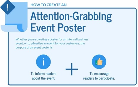
As it turns out, posters aren't as old-school as we might think. In fact, they're still quite effective devices for promoting events. Making yours stand out, however, is the tricky part.Like so many other things in marketing, it requires a combination of creativity and formula. But what are the success factors? And what makes a poster look its best? You're in luck. Our friends at Venngage, who know a thing or two about creating compelling visuals, put together this infographic to guide you along your poster-making journey. It'll help you figure out what information is essential to include on your poster, and how to make it aesthetically appealing -- without overwhelming the viewer....
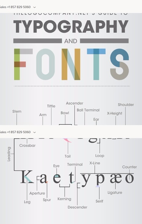
Typography is associated with great design for web and print. However, it was not so long ago that typesetting for printing presses was the norm. During this era of typesetting, many technical terms evolved for the construction and makeup of fonts and layout. It was like a secret code for typesetters, where few outside of the industry had any knowledge of the terms being used. The Logo Company has put together this clever graphic that decodes these technical terms associated with type and explains the meaning of each term in simple, plain English, that anyone can understand....
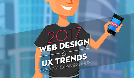
Are you considering creating a new website for your business? Want to know the trends that are expected to take charge in 2017?
The Deep End take a look at the 10 web design trends they expect to see more of in this infographic....
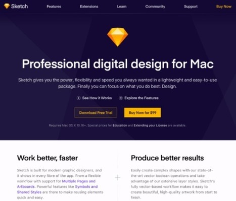
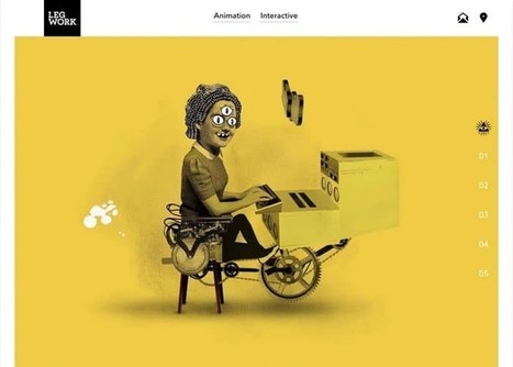
Why do you want to create a site? Is it to deliver good looking visuals to your visitors? No! The objective is to drive conversions, generate sales, improve brand visibility and ensure your business reaches a wider audience. Unfortunately, an unnecessary focus on visuals might see you creating a site that is low on ROI. Your target website visitors are interested in getting more information about your business and its products and services from your site. If great visuals help drive brand and business messaging forward, well and good and that should be their primary objective. If they haven’t been picked keeping the website’s goal in mind, they will just serve to distract visitors. Here are two sites that have made great use of visuals, and they serve to illustrate the purpose of the site. The visuals are arresting but do not distract visitors from what the website is all about and the products/services it is bringing to them....
This week's Six Pack features a vivid array of bold stylings from Pheist (Hamburg, Germany), Hector Mansilla (Ciudad Victoria, Mexico), Richard Vergez (Brooklyn, United States), Sarah Matuszewski (Ludwigsburg, Germany), Raluca Bararu (Bucharest, Romania) and Dylan Morang (Maine, United States)....
For the last five years, Google and the font giant Monotype have been working together to fill in all those tofu squares—hundreds of thousands of them. With the help of hundreds of designers, researchers, linguists, and cultural consultants, the two companies created Google Noto (the name derives from "NoTofu"). It’s a typeface family of the world’s languages—many in the minority, or even extinct—which can be rendered in serif or sans serif across eight weights, totaling more than 300,000 unique glyphs in all. As a point of comparison, Helvetica supports 97 different languages. Google Noto supports more than 800. According to Google, Noto is nearly 10 times larger than the nearest universal typeface, Arial Unicode. "For everyone in the typographical field, this is a scale of language and script support that’s never been attempted before," says Kamal Mansour, linguistic typographer at Monotype. "And it would be hard to imagine anyone sponsoring this other than Google. It’s a very big investment."...
I come to you today with my best tips for how to create awesome, attention-grabbing event posters.
This article focuses specifically on how to create posters to advertise events. I’m going to write another article on how to create informational posters soon.
In this article, I’ll explain how to: - Create a hierarchy of information.
- Grab readers’ attention with a beautiful design.
- Design specifically for print.
- Design specifically for email....
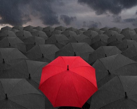
It’s the color of power and strength. As well as love and Disney romance. But the meaning of red goes way beyond fast cars and heart-shaped chocolate boxes. Through evolution, and thousands of years of human civilization, red has been used to tell stories, stir emotion and to get us to spend more money. Learn what the color means to different cultures around the world, and find out how to best use it for your business in our exploration of the color red.
In the beginning, there was red
Evolutionarily, red is a signal of heightened emotions, both good and bad. Think of our how our cheeks flush with anger when we’re upset, or how they blush when our crush pays us a compliment. In nature, the vibrant patterns of poison dart frogs help warn predators to stay away. And in reverse fashion it also attracts animals by serving as a signal of ripened fruit. Either way, the color red developed in nature in order to stand out.
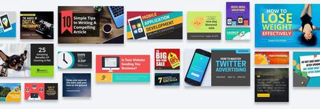
Are you including images in your social media content? Looking for easy-to-use tools to help you create images for your content strategy? If the idea of using Photoshop makes your head spin or hiring a graphic designer isn’t an option, there are many easy-to-use, low-cost alternatives available to you to create social media graphics. In this article, I’ll show you 6 easy tools that will help you create compelling graphics for social media.
A decade ago, the internet was a very different place. The celebration of Envato’s 10th birthday has us feeling nostalgic, and so we’re taking a look at the 2006-2016 era of web design.
From MySpace and the iPhone, to minimalism and material design, a lot has happened in ten years. We won’t attempt to fit every design trend and technology innovation into one article, but we wanted to highlight some key moments in design. Put on your favorite early 2000’s playlist and read about some of our favorite web trends from the past decade:...
|


Great design resources. Did I mention free?