 Your new post is loading...
Ten years ago, a lot of breweries found they could get away with soliciting a friend to design their beer packaging. Not anymore.
With so many beers competing for attention on the shelves, standout beer labels have become a critical part of any brewery's marketing strategy.
So which breweries have come up with those really standout designs?
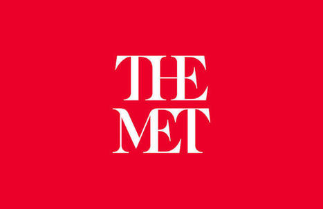
Three weeks ago the Metropolitan Museum of Art—known colloquially and now formally as "the Met"—unveiled a new logo and identity system designed by the international firm Wolff Olins. The response from critics was swift and fierce. Influential typographer Erik Spiekermann harped on the logo's proportions and "forced curvy shapes"; New York Times critic Michael Kimmelman accused the museum of pandering to younger audiences; and Justin Davidson, of New York magazine, compared it to a typographic bus crash. Ouch.
It’s a familiar scenario with logo and identity reveals—the images get passed around the Internet, critics weigh in, and the peanut gallery follows. Such was the case with Google, Airbnb, Hillary Clinton's campaign logo, the Olympics, and the rebrand that (arguably) sparked incendiary "logogate" culture: Gap.
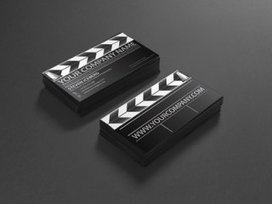
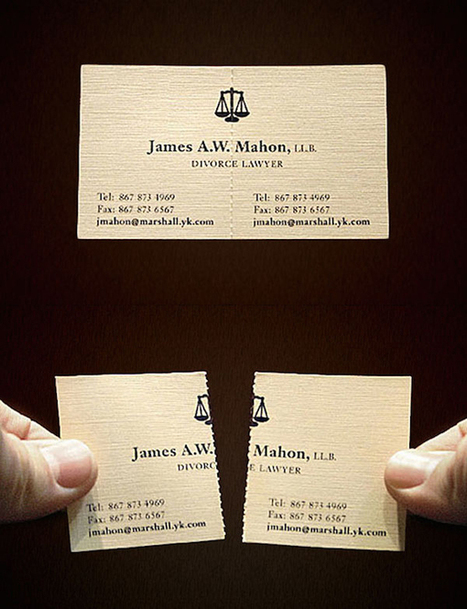
Business cards can be a reflection of who you are. Not only can you make an excellent first impression all on your own, but a uniquely designed business card can help seal the deal and give someone something to remember you by.
No matter how QWERTY savvy those little fingers are, putting someone’s name, email, and phone number into a phone takes valuable time neither party has. Hand them over a business card (which takes what, two seconds?) and you’ve given someone a carbon copy of your information they can do whatever they please with. Now let’s get to some awesome business cards....
However, if you're familiar with Photoshop, Manga Studio will offer few surprises. As a digital drawing program it's a pretty stunning addition to anyone's toolset. The perspective tools alone make the small price of admission worth it. The paint engine is also pretty powerful, and it certainly gives Photoshop and Painter a run for their money.
I'm only scratching the surface of this software, and I'm sure with time I will discover much more. It's comforting to know that no software will have a monopoly on digital creation. Some will be easier to use than others, but the ability to create digitally won't be dictated by one powerful player....
Looking for an innovative business card for yourself? Check out these 32 ingenious examples that are sure to leave a lasting impression. It’s interesting to see not just creative businesses like agencies, design firms and photographers using unconventional cards but also lawyers, doctors, finance professionals, etc. If cost is a concern, you can also create two sets – one conventional/economical and the other radical (in lesser quantity). Use the appropriate one depending on the type of client, budget, etc.
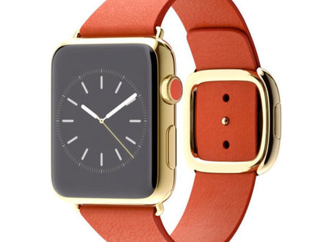
Like other smartwatches, Apple's Watch is embracing skeuomorphism.
But that's okay: It needs to.
Whatever the Apple Watch is, it's not a watch. Not really. Nor is any smartwatch: the Moto 360, the Pebble, or the Samsung Gear Live. It's an entirely new class of device. But it doesn't look like a new device. It mostly resembles a watch. That's because Apple (and other gadget makers) are turning to an old frenemy to help wrap their heads around these things: skeuomorphic design.
What is skeuomorphism? In the software world, it's all those buttons, shadows, gradients, chrome, and textures that designers use to make digital software resemble the real-world objects they're meant to replace. It's the calendar app bound in virtual cowhide, or the podcast app that looks like an ancient reel-to-reel tape recorder. It's a design language of digital fakery that Apple stuck to until Jony Ive blew out of the airlock with iOS 7. In the case of the Apple Watch, it's the wrist-based computer that resembles an analog timepiece in form alone.
But despite Apple's big move away from these principles last year, it had hood reason to follow along with other smartwatch makers and revisit the concept with its watch: Skeuomorphism is good at teaching people how to use new technology. In the words of our own John Pavlus, the iPhone's use of skeuomorphism was "a canny and monstrously effective solution to a daunting problem: how to make an input method once only seen in science fiction movies seem as normal and friendly as... well, as dialing a phone."...
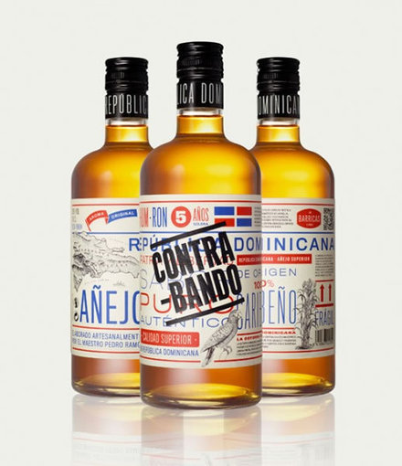
From time to time we like to show you different sources of inspiration. From logos to icons, from print tobranding, we always like to show you that you can find inspiration in a lot of different designs, including package design. Packages are amazing for a group of reasons, but I believe that most important task of a package is to represent a product while catching the client’s attention. In package design we can find great examples of typography, textures, proportions, colors and much more. Remember to click on the images to read more about each design....
|
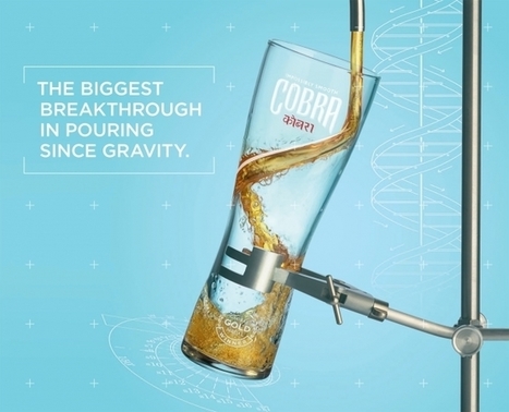
Coors Light may have its double-vented wide-mouth cans and its two-stage activation bottles, but it doesn't have a monopoly on beer technology. Another Molson Coors brand, Cobra, is out with a notable invention—not with its own packaging, but with a special glass it claims is revolutionary.
London agency Karmarama helped design the glass, with help from hydrodynamics and fluid mechanics specialists and professors at universities including Birmingham University and Imperial College. The futuristic chalice is now in production for release this summer.
The agency says the glass "has a unique channel in the interior facia allowing the liquid to flow smoothly around the glass to the base, creating a whirlpool effect, releasing flavor and aroma and creating the perfect head, all in order to bring to life the beer's 'Impossibly smooth' positioning."...
We’ve all received brochures from various businesses and most of the time they all have one thing in common — they’re boring.
Whether they’re packed with so much information you feel like you’re about to read a full length novel, or so plain you feel like you’re sitting in the dentist’s office, brochures tend to get a bad rap. They may be chock full of important stuff, but unless you can get someone to pick it up and read it, it doesn’t matter how great the content inside is.
Here are 25 ways to step up your brochure design game and ensure your information will be shared....
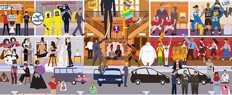
Your memory of 2014 won’t be defined by those things. Instead, you’ll remember the Ebola outbreak, Lavern Cox, Ferguson, LeBron’s return home, the World Cup, True Detective, missing flight MH370, and maybe even Alex from Target.
These and many other cultural and political moments shaped the year and will continue to be part of our conversations in 2015. To commemorate these events, Beutler Ink created Here’s to 2014!, a graphic featuring 91 memorable moments. The poster is a follow-up to the 2013 edition, which featured Miley Cyrus, Prince George, and Pope Francis...
Design is hot. Design executives are being tasked with being design driven, but don't have the tools or processes to sustain this effort.
... In some ways, designers and design managers have shot themselves in the foot — design thinking neither negates nor replaces the need for smart designers doing the work. And because design thinking has many paths through parallel phases, it seems fuzzy compared to the process of creating code. Compared to analytical thinking or science, our industry still doesn't have a consensus on what design thinking means. Most designers couldn't tell you what it means
.It's been 20 years since I was ingrained with the concept that the designer mind could think much differently than a marketer, engineer or the guy in a suit-and-tie. Yet, for all its power and inspiration, I still don't completely understand the meaning of design thinking.
Should we abandon the concept? Absolutely not. I use the methods and ideas that it espouses daily. I believe we just lack some of the tools necessary for the practical application of these methods to stick within organizations....
The 10 best designs of the year include a soccer cleat, a campaign to end gun violence, and much more.Fast Company hosted its annual Innovation By Design Awards and Conference in downtown New York today.
It culminated this evening at our awards celebration, where we revealed the 10 best designs of the year.It was long road getting here. We received 1,587 submissions from around the world. From that, we pared entries down to 53 finalists. And from there, our esteemed panel of judges fiercely debated, voted, stalemated, and debated again to reach a consensus on the top 10 designs of the year....
Stashed inside closets in his Brooklyn apartment, Scott Wiener has exactly 652 pizza boxes. It’s the Guinness World Record for pizza box collections, and proof of Wiener’s bigger pizza obsession--he also runs a company that takes people on pizzeria tours of New York, writes a blog on pizza, and recently published a book about pizza boxes. “Everything I do is pizza-related,” Wiener says.
What makes the perfect pizza box? Though most are still a simple cardboard square, Weiner says a few innovators have tried to solve some of the design’s basic flaws. “Boxes are notoriously bad at impacting the flavor of a pizza,” he explains. “Normally you get a pizza in a box, you lift open the box, and the box has trapped so much steam that the pizza is gross and soggy.”...
Considering how Twitter's main site has seemed to regress in recent times and greater attention has been placed on the mobile app, we've decided to give the site a makeover and show how the site can be improved... We understand that Twitter is designed more for mobile, but considering how neglected its desktop site feels – and especially since it is its main source of revenue – we decided to take matters into our own hands and present our vision of how Twitter should look and feel. The Aim Before starting the redesign, it was important to look at what Twitter does right first and incorporate those features into the new look. For one, its simplicity is its greatest strength, and so the overall aim was to evolve the platform instead of creating an entirely new interface from scratch. While it’s very tempting to fill the entire page with different columns and boxes to give users more features to interact with, doing so would make the page busier, which would compromise the overall experience. Therefore, we limited the design to two columns and placed tweets on the left-hand column to maintain consistency....
|


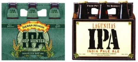


Nothing like the tasty design of beer labels.