 Your new post is loading...
Online merchants could always use some free expert advice from the design community. There is a wide variety of free ebooks available to help. Here is a list of helpful ebooks on design. There are titles on typography, classic design, color theory, user-experience design, logos, brand building, creativity, and more. All of these ebooks are free.
Building a new website? Here are 4 steps to choosing the right color schemes for your brand. You’re creating a website, what colors should you be using on your site? Here’s the thing, different colors mean different things. Green means nature and kind and nice and organic, colors like red mean urgency and stop, colors like black resemble luxury but you know what? Pick whatever colors you feel resembles your brand....
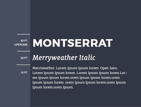
Thankfully, the design world has advanced to the point where fonts are not nearly as limited as they once were. Starting with 2010 the Google Fonts were released, making the process of choosing and pairing fonts easier and quicker.
However, you should be aware that not every font combination in Google’s library is a recipe for typographical success. With the right font pairings and usage considerations, your brand will convey the right message to your audience, professionalism, and reader friendliness without the need for expensive customized fonts.
In this article, I’ll show you 15 great Google Font combinations that will help you to accomplish all this.
You will find below 15 spectacular Google Font combinations that together with images and graphics, will help you define your brand’s personality.
As a general rule of thumb,“ A good website is one which makes users take a desired action” This action could be anything from making users add a product to a cart or share a particular article, good website design urges them do it without a lot of clutter or text to go along. Consequently good websites are one which are - High Converting - Easy to Navigate - Cleanly Branded - Interruption Free. Whether you own an e-commerce website or are building a forum for dog lovers, there are a few basic guidelines you can follow to ensure high conversions and revenue regardless of what scale you are running at....
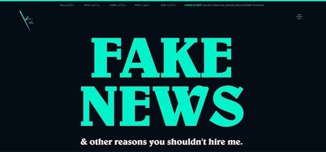
During my stint working for a newspaper, I recall their simple design philosophy: Big, bold text headlines on a white background. As we well know, the web is a totally different animal than print. But many principles of good design are applicable to both mediums. The use of large headline text is one of them. Typography on the web has changed a lot over the past decade or so. Whereas we used to have just a few basic fonts to choose from, we now have more than enough options to satisfy our appetites for beautiful, attention-grabbing headlines. Unlike that newspaper (which generally used one font for its headlines), web designers are exercising their creative freedom to use different types of fonts. Some are using the more traditional bold, serif and sans-serif fonts while others take advantage of more modern styles and weights. Let’s take a look at how designers are utilizing large headlines to convey a message. Most don’t apply to news, per se – they’re more about branding. But, as you’ll see, there is more than one way to successfully approach them....
This article is the third in a series devoted to the understanding of minimalism in web design. During the time, this trend has become very popular among the graphic designers and it will still be on top for the years that will come, regardless the influences it will have. You might assume minimalism is easy – after all, fewer elements mean less work, right? In fact, the opposite is more accurate. Because you are restricted to a usage of few elements, they must be chosen and used with care and thoroughness, having a specific purpose as a starting point. If it’s done properly, minimalist design can be a stunning masterpiece, in terms of UI, visual design, UX and conveying your message to the users. Minimalism works because it does what all design should do – it puts the emphasis on content....
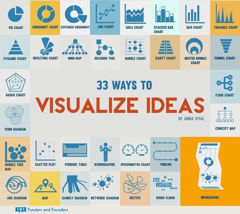
So how do you visualize your ideas? Your old standby bar graphs and pie charts are just the tip of the iceberg — it’s not uncommon now to see executives and professionals of all stripes working on visuals instead of hunkering down at the keyboard for a long session of pecking away in Word. The people over at Funders & Founders shared this interesting infographic recently, with 33 different ways to visualize your ideas. Unleash your inner creative and challenge yourself to try one of these visual formats the next time you need to pitch your idea to a colleague or client....
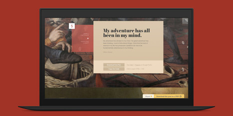
There are several nifty ways to go about pairing fonts for your design projects, including this machine learning-based tool and this Tinder-style app. But if you just want to see some great combinations, you’ll want to check out this excellent guide by designer Lou Levit. It features 50 top-notch pairings that draw from Google’s extensive web font collection – so you can grab all the typefaces you like for free, and use them on web design projects – and they’re matched with beautiful classic art. The pairings are organized and navigable by font style and mood (choose from Modern, Striking, Eccentric, Classic, Minimal, Neutral, and Warm). That’s handy for quickly finding a combination that suits your needs, whether it’s to professionally present information or announce an event. Plus, you can download the entire guide as a PDF. Find the guide, as well as tips on pairing fonts and the handy PDF, over at ReliablePSD.
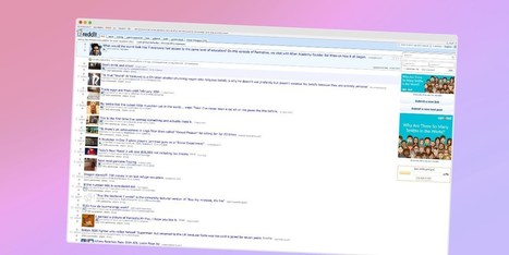
If you’ve been on the Web in the past decade, you’ll likely have visited Reddit, Craigslist, Wikipedia, 4Chan, Hacker News, or The Drudge Report at some point. While these sites are all vastly different, they have two things in common: they’re all extremely popular among their audiences and they all look, well, terrible. Web technologies have come so far in the past few years and designers now have a vast array of tools and techniques at their disposal. Yet these sites feature unflattering layouts that have no connection to the modern design philosophies seen around the Web today. Craigslist’s current design is lacking, to say the least. Why do some of these sites look like they were built in the 90s? Where are the clean layouts, carefully selected fonts and complementary colors? For the record, The Drudge Report and Craigslist are indeed more than 20 years old — both were launched in 1995. Wikipedia just turned 15 last month. Reddit has now been around for 10 years, while image board 4chan is going on 13....
The public struggles to parse fact from fiction on the latest political and societal news story, but marketers face an even sharper struggle when it comes to parsing the truth about website design trends. The rise of various devices, web apps, and chatbot interfaces, has stirred designers and marketers into discussions about what HTML, CSS, and JavaScript elements ultimately bring value to consumers. So let's look at what is an ADF (Alternative Design Fact) and a RF (Real Fact) in design elements that support a digital marketing strategy. The ADFs are not necessarily false or negative in and of themselves. But time and new influences shape how consumers appreciate a website or web app, which means deploying new combinations of site elements to match the new expectations....
The principles of minimalism in web design are that a website (and other mediums as well) should be stripped down to their bare bones, while carefully making use of whitespace and improving readability with clearer typography. When implemented correctly, the result will allow users to focus on what’s truly important without being distracted by non-essential elements. While this may sound easy, it can be difficult deciding what the truly important elements are and what’s little more than decoration. It can also be risky. Accidentally removing a seemingly innocuous element could be deemed critical by the user and could result in the wrong message (or worse, no message at all) being delivered to your target audience....
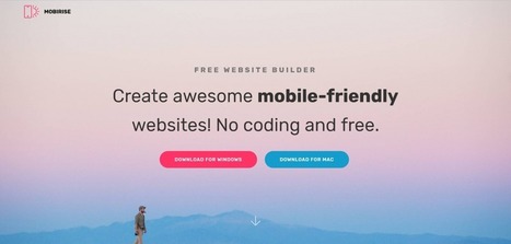
Talking about website builders, we have a plethora of options. But those that simply build a site as fast as 123 are few. Mobirise is the quickest builder I ever ran across. Most small businesses don’t aim at delivering the most innovative website ever. All they want is a digital representation of their business on the web. Sure it’s supposed to look quite decent and not as if it was born yesterday. But it doesn’t have to be cutting edge technology either. So what do these businesses or brands (which includes the many lone-wolf freelancers out there) really need? They need content, and they need a website that works across devices so that their content has the chance to get noticed. That’s about it.
Designing for the web, you must keep up-to-date with the latest trends and tools. For trends, it’s fairly easy to know what’s going on, but it can be hard to keep up with the latest tools. Let’s look at ten web design tools you can add to your toolbox.
|
As reported by Fast Company and Inc. Magazine, a new EyeQuant study has shown that there's a surprisingly strong relationship between the "visual clarity" of a website (as rated by an algorithm) and its bounce rate. In fact, the results suggest that up to one-third of a user's decision to stay or bounce comes down to a snap judgment of whether or not the page is too cluttered. In this post, we'll take a closer look at the data and the methodology behind the study.
Why study the impact of visual clarity?
Within the design community, there's been a definite trend towards simpler, more stripped-back design. At EyeQuant, we've seen many of our customers "de-clutter" their way to higher conversion rates, and even observed that amongst a collection of online retailers, the ones with "cleaner" design were growing the fastest.
What we wanted to understand is this: does "clean" design have a positive impact on user engagement across the board, or is it limited to specific cases like overly cluttered-sites or retail?
In terms of design, the minimalist aesthetic is the visual representation of this concept. Even if in the early days of this style it was very difficult for the designers to achieve its simplicity and clean lines, they have learned to “declutter” the visual to the point of it being the second nature. However, some of the designers take it a step further and cut out almost everything from the design.
Indeed, even if the latest web designs with loud color, trendy headers, and stunning imagery are really attractive, sometimes, it’s nice to see and admire the everlasting minimalist style. The ultra-minimalist websites in this list focus on composition and typography to create clean and simple visuals, and the naked designs are as beautiful as those full of glamour.
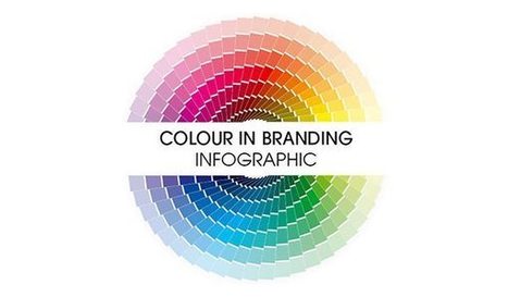
Are you in the process of choosing a colour scheme for your new website? Perhaps you’re wondering if your existing colour scheme is right for you? Iconic Fox share their guide to colour and branding in this infographic....
We may not judge a book by the cover, but we always judge a business by its website. This is the reality and we have to deal with it. Back in time, in the early days of the Internet, creating a website was something that only IT guys were capable of making. With today’s advancement of technology and increasing interest for better and easier solutions when designing websites, almost anyone can design websites without much effort or any coding know-how. Before listing the worst websites I have found on the Internet, let me be clear about some things: Firstly, I don’t mean to cause any trouble or pain to anyone, and I am certainly not making fun of web designers. Therefore, I beg the developers of the listed sites not to take offense at my remarks. I am quite sure some of these sites are designed by beginner designers. We all have to start somewhere. Besides, mistakes easily occur if you don’t have any experience.
Websites that are considered as modern and fresh today, will not be treated in the same manner tomorrow because Web design trends are changing constantly with time. Professionals associated with the industry are aware of the fact that every year brings new challenges and opportunities in the field of web design and development. Therefore, it is important to know how to make them flexible and adaptive towards the rapidly changing trends of website design. Here, we have put together a list of web design trends that will have a bigger impact in 2018....
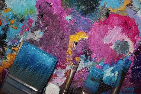
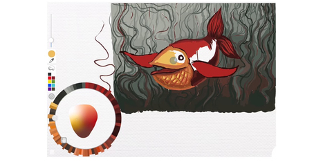
While many imaging apps’ tools closely resemble those used by artists in the real world – such as brushes and pens – the color picker feels like a completely digital device. A new project from the folks at Adobe Research and University of Toronto reimagines it as a skeuomorphic palette that’s designed to be more natural and intuitive, while allowing for the creation of harmonious color schemes and works of art. Instead of forcing users to choose from colors from across the entire spectrum, Playful Palette presents you with an interface that’s more like how you’d mix paint in real life. Pick a bunch of colors represented as paint blobs, make a puddle with them, blend them with lighter and darker hues by pushing in different directions and get a gradient of colors to work with. Hit ‘play’ on the clip for a better idea of what I’m talking about:...
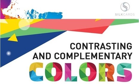
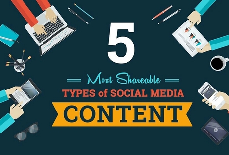
Color theory is the art and science of colors, our understanding of how colors mix, how people perceive colors, and the message the colors communicate. Are you aware that colors impact how one thinks and behaves? In fact, color ads attract 42 percent more attention than those in black and white. This holds true even outside the realm of social media and into print marketing. Prospects hold on to colored business cards 10 times longer than standard white cards.
Why Is Color Theory Important to Content and Social Media Campaigns?
When a prospect’s eyes meet a particular color, they immediately send a message to the brain. After a nanosecond of processing the information, the individual makes a judgment about what they see. They may be interested, bored, or repulsed.
Great marketers wind up testing multiple visuals to find the best option. However, this can’t begin without an understanding of the benefits of color theory in marketing.
Dr. Gitte Lindgaard at Carleton University wanted to find the answer to that question, so she ran a study. She flashed web pages in front of users for 1/20th of a second. Then she had the participants rate the web pages they saw.First impressions are formed in milliseconds. Her research pointed to something amazing: customers form first impressions about marketing in as little as 50 milliseconds. 50 milliseconds. Customers make judgments about marketing before they’ve even had a chance to process what it’s trying to convey. There’s no cognitive effort involved in this first impression; it’s completely visual and based almost entirely on emotion and feeling....
Selling services online is an entirely different ballgame than selling products. There are separate processes, marketing techniques, and web design principles you must follow. You can’t pitch services in the same way as products and you must understand the advantages and disadvantages that come with the service industry. With the right web design ideas, your company can easily meet and exceed the business success of your product-selling peers. Optimize your website with these six tips..
Are you going to burst the Internet with something really creative? You are at the right place. Here we compiled 50 most creative WordPress themes. They are suitable for different business niches like art, fashion, photography, entertainment, personal blogs and many others. We have thoroughly handpicked them for you, so you doesn`t need t
Regardless of the industry you operate in, when it comes to the B2B world, a professional website is the crux of a successful marketing strategy. A B2B website is the landing spot for digital ads, email campaigns, social media advertising, direct mailers, and everyday communications. If you don’t already have a clear B2B web design strategy laid out for your firm, it’s time to set one in place. Before you determine whether it’s time for a website redesign or start bidding out website enhancements, check out at these six statistics that will help you determine what matters (and what doesn’t) in your web design strategy....
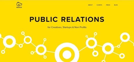
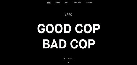
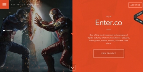
If you want to get the job or freelance gig you’re looking for, your portfolio needs to impress. And web designers have a tougher time than other creatives, as it isn’t just the case studies people will judge you on, but the design of the site itself. In this post, we bring you 10 of the coolest web design portfolios we’ve seen emerge in 2017 so far. While some go to town on special effects, others just rely on the timeless values of good design. All, however, should provide ample inspiration for your own portfolio....
|


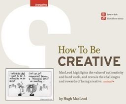


Great design resources. Did I mention free?