Public Relations & Social Marketing Insight
443.4K views | +2 today
Follow
Public Relations & Social Marketing Insight
Social marketing, PR insight & thought leadership - from The PR Coach
Curated by Jeff Domansky
Your new post is loading...
Rescooped by Jeff Domansky from Eclectic Technology
Scoop.it!

13 Of The Best Tools To Create Infographics

13 Of The Best Tools To Create Infographics | Public Relations & Social Marketing Insight | Scoop.it

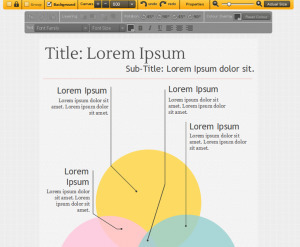
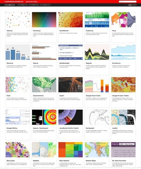
Visual information is popular these days, and there are now many tools to help students create infographics. This post lists three infographic creation tools but also goes one step further. It provides ten data sources that you may use. 


Data is a key part of an infographics. Having this list of ten data sources opens up possibilities for students to create a more polished infographic which combines data and visuals.


[Good snapshot of infographic tools and data resources ~ Jeff]


Via Beth Dichter
Henry Lee's curator insight, March 16, 2015 9:29 PM

This lists various tools that are available to make infographics, which is a data visualization format that makes learning quantitative statistics about a topic easier for the general public to understand.


Scooped by Jeff Domansky
Scoop.it!

Want to correct misinformation? Try doing it with a graphic

Want to correct misinformation? Try doing it with a graphic | Public Relations & Social Marketing Insight | Scoop.it
A new study finds that a correction that does its work in visual form is more likely to be accepted.


At this point, we pretty much take for granted the power of graphics to help journalists explain — stories, concepts, context. What we pay less attention to is graphics’ power to persuade. But that could (and, maybe, should) be changing. A new paper (pdf) on motivated reasoning and political misperception — the latest from political science professors Brendan Nyhan, of Dartmouth, and Jason Reifler, of Georgia State — suggests that graphics can also provide a powerful, and perhaps essential, way of counteracting misinformation. In the political world, in particular — but presumably in the broader sphere, as well....


Facinating implications for PR, marketing pros too...

No comment yet.
Rescooped by Jeff Domansky from Presentation Tools
Scoop.it!

A Curated Collection of Interactive and Dynamic Data Visualization Libraries

A Curated Collection of Interactive and Dynamic Data Visualization Libraries | Public Relations & Social Marketing Insight | Scoop.it

Robin Good: Here is a curated collection of "libraries for plotting data on maps, frameworks for creating charts, graphs and diagrams and tools to simplify the handling of data" to create interactive and dynamic data visualizations.


Useful. 8/10


Collection: http://datavisualization.ch/tools/selected-tools/


[Serious bloggers and content producers will find these resources to be invaluable - JD]


Via Robin Good
Dean Meyers's comment, September 6, 2012 8:19 AM
I turn to this collection routinely for inspiration and to learn what's up and coming in the dataviz world. d3.js was probably my latest find through this site.
wildswans's curator insight, May 5, 2013 12:08 AM

What an interesting selection of tools for data presentation, if only more of them were free.