 Your new post is loading...
We are hardwired to be visual. Science has proven vision is the most powerful of all our sensory systems for cognition. 90% of all input in our brains is visual. People remember 60% of what they see, but only 40% of what they read. What’s different nowadays is the shift from functional charts and graphs to more beautiful, interactive infographics. Boring designs increasingly fail to engage our audience; people crave for more art-like visuals. For the vast majority of non-designers out there, the challenge is to strive for a balance between beauty and functionality. In our quest to learn how to make sense of all the information out there, we asked 25 experts for their best advice on how to tell visually compelling data-driven stories. We hope these experts’ tips will help you communicate data-driven information in an engaging way....
How much more memorable are visuals compared to text?
One oft-referenced answer is that people remember visuals 6 times better than text—an answer referenced in Buffer’s article on the anatomy of a perfect blog post and an answer that led to a lot of great discussion. After reviewing the original research, it’s clear that pictures are more memorable than words. So the next question became:
People remember visuals better than text. But which visuals exactly?
I’ve spent some time collecting the best research and science on pictures, images, infographics, and more, and I’m excited to share with you what I’ve found—along with some specific ways to use these insights in your marketing!
Your infographics are effective marketing tools to build brand awareness. This is due to the fact that visuals used in the illustration of content can convey your business message to the audience easily and so your brand stays in the memory of the audience for a longer time.
You can also use infographics offline for marketing activities. For example, you can take out printed versions of infographics to distribute them on the sidelines of an event or use them on brochures and leaflets to promote your products and services....
The main reason why infographics are so successful is that they transpose written data into a visual representation of the ideas that information contains. Visual data is absorbed much more quickly and easily, which leads to faster understanding. The majority of the population learns best through visual stimuli as shown in research undertaken into Individual learning styles, which is why for advertising companies, such as those involved in ecig marketing, relevant information is delivered in a visually interesting, coherent and direct way.
Every year people proclaim the death of something or other in marketing -- and the death of the infographic doesn't escape conversation. It's probably because while more people have caught on to the power of infographics for communications or marketing initiatives, not all of them are doing it well -- so it's hard to separate the wheat from the chaff.
These 15, however, managed to stand out. My criteria here were not scientific. I looked for infographics that I simply could not stop reading til the very end -- or in the case of the interactive ones in the latter half of this post, the ones I couldn't stop exploring. Enjoy perusing the best of what 2014's infographics had to offer, ranked in no particular order (except for #1 -- I love #1)....
I think we’ve looked at the very essentials of data visualization, and the post from DB Friends is going to help you to avoid making common mistakes when it comes to visualizing your data. The tools in this post can definitely attract many opinions, so if you feel like you’ve got something to say – leave a comment and we’ll take it from there.
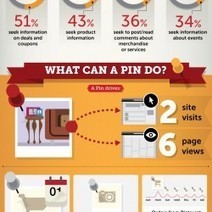
Pinterest was once an internet secret; with its beta version only available by invite, millions were clamoring for an exclusive invite. Now, however, the site has become a social media heavyweight....
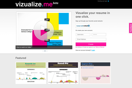
Are you looking for some free to use web tools that can help you create beautiful Infographics and visualize data? Well, if your answer is yes, then you are lucky enough to land on the right page. In this round up, we are presenting 10 useful tools to create beautiful infographics and let you visualize data. These tools will make creating infographics simpler for you and also save time as well....
They used to say content is king. But what really makes up content? Gone are the days when “content” meant purely text. Today, if you want to engage and enchant your customers, your content must have some visual cues. The human brain processes visual information much quicker than text. And with web 2.0 visuals like infographics, you can convey complex, boring data in a meaningful manner. Although infographics make things simpler, it can be time-consuming to create them. Here is a list of my top 10 tools to create your own beautiful infographics and more visual content (no Photoshop required!).
...The only problem is, infographics that look like they were simple to make are often anything but. Creating something beautiful and instantly understandable in Photoshop is often beyond the limits that time allows. Which is why it's occasionally useful to use a quick and dirty infographics tool to speed up the process.
We've selected our favourites here. They're all free, or offer free versions. Let us know which ones you get on best with...
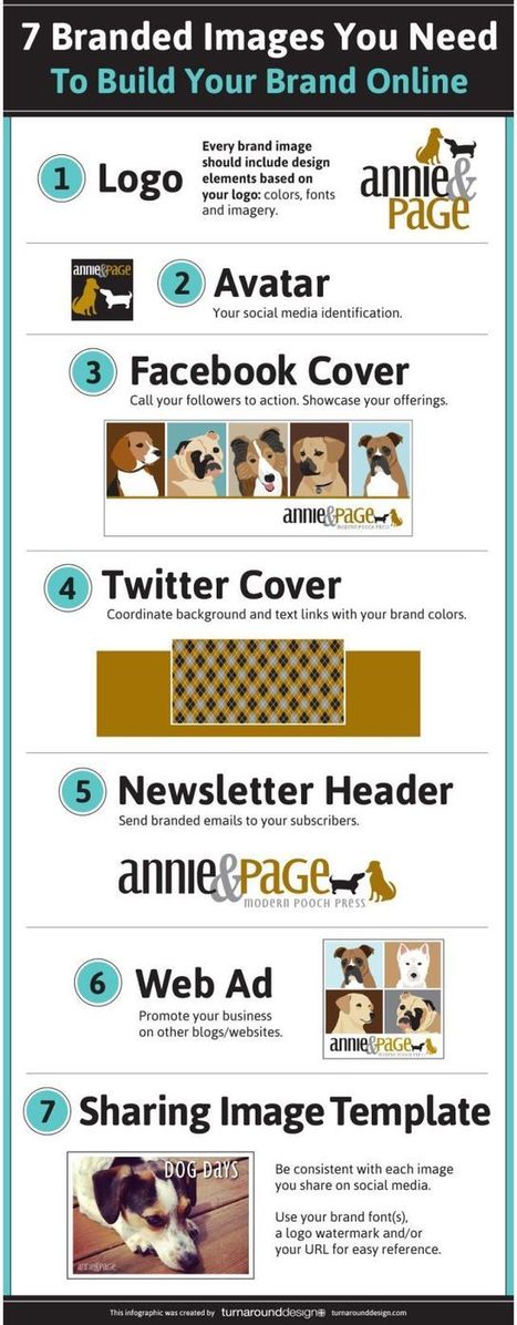
Building your brand online takes work. Every image that you associate your business with needs to represent your brand in some way. You certainly don’t want to cut corners in this area. This infographic by Turn Around Design covers 7 images you need to build your brand online:
There have never been more technologies available to collect, examine, and render data. Here are 30 different notable pieces of data visualization software good for any designer's repertoire. They're not just powerful; they're easy to use. In fact, most of these tools feature simple, point-and-click interfaces, and don’t require that you possess any particular coding knowledge or invest in any significant training. Let the software do the hard work for you. Your client will never know.....
|
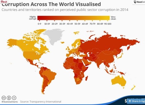
Poorly equipped schools, counterfit medicine and elections decided by bribes are just some of the consequences of public sector corruption. According to Transparency International, nowhere on earth is deemed totally free of corruption. Somalia and North Korea in particular stand out on this map - both scored only 8 out of a potential perfect score of 100. Denmark, New Zealand, Finland and Sweden were rated the least corrupt nations worldwide, according to Transparency International....
It’s only August, but voting is already underway for the March 2016 South By Southwest (SxSW) Interactive conference. Long thought of as the breeding ground for new ideas and creative technologies, we can gleam industry insights from the SXSW Interactive Festival. This year, I decided not to wait until the conference to delve into the veritable buffet of groundbreaking panels vying for festival space. This year’s PanelPicker interface received more than 4,000 proposals, which is an all-time record!
While a quick search of infographics yields only 11 results, a mere TWO actually have the word “Infographics” in the title. The industry discourse has shifted away from “how-to” models to “how to do it right.” Infographics have become a key format of the larger conversation: Visual Storytelling.
A quick search for “Visual Storytelling” yields over 200 talks in PanelPicker, along with hundreds more for “data visualization” and “visual content”. Infographics are now used as one of many effective tools in the Marketer’s toolbox, and an accepted part of the larger conversation happening in the content marketing industry.
Visual storytelling is vital to content marketing success. The following types of visual content are at the forefront of the proposals for next year’s SXSW Interactive Festival.
There are different types of Infographics, such as flowchart, timeline, versus Infographics, data visuals and more.With the advent of advanced designing tools, the process of creating Infographics has become more exciting. Here I am presenting a list of useful online tools that will help you to ease your designing process to a great extent. Though they cannot replace Adobe Photoshop, they can surely help you to craft basic Infographics easily....
Given the popularity and effectiveness of visual content for marketing, it's no surprise that today's marketers are creating more and more infographics. They're a more enjoyable way of digesting statistics, data sets, and timelines, and they can drive more traffic and engagement than plain text.
Even though there are a lot of good infographics out there, there are still a ton of bad infographics out there, too. You usually know one when you see one: Either it's jam-packed with information, or it hardly shows any useful information at all. Sometimes it's loud with clashing colors; other times, it's plain and boring.
But "knowing it when you see it" doesn't help you prevent from making a bad infographic. Here to dissect what a bad infographic looks like is an infographic from Vertical Measures. Check it out below.
Infographics are a great way to present a wealth of information on social media, without overwhelming your audiences. This visual trend of data visualization is just getting warmed up, as more and more companies are sharing vital pieces of information in layers and sub layers of an Infographic.
As 2014 is coming to an end, and before we ring in the New Year. I’ve decided to share with you a list of 10 best infographics of 2014, which share such valuable insights on various facets of social media marketing which are vital to know before you say goodbye to this year!...
At Marketo we have a pretty interesting and diverse set of infographics – covering topics from marketing automation and social networks, to kittens and bacon. But those are just examples of how versatile infographics can be as a content medium. So why aren’t all marketers leveraging the blockbuster power of infographics?
Infographics for everyone!
Unless your target market hates visual content (we’re not judging!) then infographics are probably something you can add to your content repertoire. They are an awesome way to clearly present complex information. For example, if you have an interesting but dense report that you’d like more people to engage with, try translating that information into an infographic. People absorb visual content faster and with greater ease than reading the same information....
A few weeks ago here on Copyblogger, Demian Farnworth presented the infographic as the Salvador Dalí of content marketing — the most interesting person at the cocktail party.
More than just a superficial presence, an infographic is a significant asset pillar with diverse possibilities that help you grow your media empire.Today, let’s equate the Internet to the world of pop music. In this case, infographics are The Beatles....
Visual social media posts get more engagement than text, but this rule goes for all content marketing pieces.
Visual content is taking the web by storm. Infographics. Motion graphics. Micro-content. It’s hard to keep track of it all.
I’m here to talk about interactive graphics – the cool new kids on the block when it comes to visual content – and why they’re the next big thing incontent marketing....
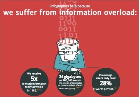
The age of big data is here. Over the course of a week, billions of pieces of content are created and spread all over the web. Indeed, on average, 500 million tweets are sent everyday.
Yet, we have increasingly less time to absorb this data. Enter the infographic. Simple, attractive, fun; infographics make often incredibly detailed research and statistics easy to digest. Packed with charts, graphs, maps, icons, they are visual shorthand, if you will.
The popularity of the infographic has certainly rocketed in recent times. Here’s why and, moreover, why you should be using them....
Gradually, then suddenly.” That’s how Hemingway described the ill fortune of a bankrupt in The Sun also Rises. It should probably be required reading for any incumbent in a digitally disruptable market. But who has time to read a book these days — or even a Kindle? Instead, here are three charts that tell a compelling story with an inescapable conclusion.
Chart One plots the decline of analog photographs (and the film manufacturing industry they sustained). In the year 2000 — at the very height of dotcom 1.0 hysteria — over 80 billion analogue photographs were taken around the world....
|


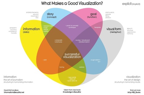


25 industry experts share the best ways to visualize boring information into beautiful designs such as data visualizations, infographics, and more.