Public Relations & Social Marketing Insight
443.6K views | +0 today
Follow
Public Relations & Social Marketing Insight
Social marketing, PR insight & thought leadership - from The PR Coach
Curated by Jeff Domansky
Your new post is loading...
Scooped by Jeff Domansky
Scoop.it!

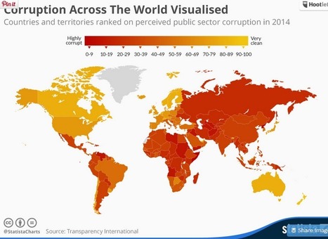
Infographic: Corruption Across The World Visualised

Infographic: Corruption Across The World Visualised | Public Relations & Social Marketing Insight | Scoop.it

Poorly equipped schools, counterfit medicine and elections decided by bribes are just some of the consequences of public sector corruption. According to Transparency International, nowhere on earth is deemed totally free of corruption. Somalia and North Korea in particular stand out on this map - both scored only 8 out of a potential perfect score of 100. Denmark, New Zealand, Finland and Sweden were rated the least corrupt nations worldwide, according to Transparency International....

Jeff Domansky's insight:

Fascinating infographic on corruption around the world.

No comment yet.
Scooped by Jeff Domansky
Scoop.it!

New data viz tools and resources of 2014

New data viz tools and resources of 2014 | Public Relations & Social Marketing Insight | Scoop.it
We continue our special posts with the best data viz related content of the year, with a useful list of new tools and resources that were made available throughout 2014. A pretty straightforward compilation that was much harder to produce than initially expected, we must say, since the number of mentions to include was way beyond our initial (poorly made) estimates. So many new options out there!

So, we had a hard time gathering 20 of those new platforms, tools and resources – if you’re a frequent reader of our weekly Data Viz News posts, you’ll might recall several of the mentions in this list, -, and we deliberately left out the new releases, versions and updates of existing tools, such as CartoDB, Mapbox, Tableau, D3.js, RAW, Infogr.am and others.

Of course, there’s always Visualising Data’s list of 250+ tools and resources for a much broader view of what’s available out there.
Jeff Domansky's insight:

Great resource for 20 top visualization tools.

No comment yet.
Scooped by Jeff Domansky
Scoop.it!

Meet Dadaviz: Curated, YouTube-Style Distribution Platform for Data Visualizations

Meet Dadaviz: Curated, YouTube-Style Distribution Platform for Data Visualizations | Public Relations & Social Marketing Insight | Scoop.it

“If I read news without dataviz I get a bit nauseous, I don’t have patience for words alone anymore. Nor infographics”. This helps explain why marketing expert and consultant León Markovitz co-founded Dadaviz, nicknamed by some as “the YouTube of data visualizations“. Online since June 11th, it’s a collection of the best dataviz selected from different sources by an invite-only community.


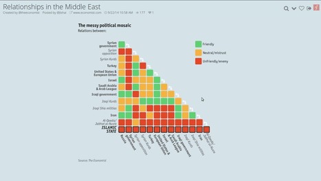
Want to learn the Who’s Who of political relationships in the Middle East, what’s the average commute time in the U.S. or where do the visitors of the Oktoberfest come from? This is the place to go.


Most of the published material is “curated” from external sources (the Middle East dataviz was taken from the Economist), but there’s also a certain amount of original work. Every visualization shared on Dadaviz links to the author, original link and data source, when available, so people can find out more and get more context if they wish. If someone wants to use a dataviz, they can reach directly the creators, or type “/embed” at the end of any Dadaviz link -which gives them an embed of the image with all the attribution already in place. Or they can simply share it on social media....

Jeff Domansky's insight:

Dadaviz is an awesome resource for anyone looking to add visuals to their content, marketing or communications. Highly recommended.   9.5/10

No comment yet.
Scooped by Jeff Domansky
Scoop.it!

How to Give a Bad Infographic a Makeover | HubSpot

How to Give a Bad Infographic a Makeover | HubSpot | Public Relations & Social Marketing Insight | Scoop.it
Given the popularity and effectiveness of visual content for marketing, it's no surprise that today's marketers are creating more and more infographics. They're a more enjoyable way of digesting statistics, data sets, and timelines, and they can drive more traffic and engagement than plain text.

Even though there are a lot of good infographics out there, there are still a ton of bad infographics out there, too. You usually know one when you see one: Either it's jam-packed with information, or it hardly shows any useful information at all. Sometimes it's loud with clashing colors; other times, it's plain and boring.

But "knowing it when you see it" doesn't help you prevent from making a bad infographic. Here to dissect what a bad infographic looks like is an infographic from Vertical Measures. Check it out below.
Jeff Domansky's insight:

Here's an infographic with a couple of basic tips on, what else, how to make a bad infographics good.

No comment yet.
Scooped by Jeff Domansky
Scoop.it!

10 Free Tools for Data Visualization - CodeCondo

10 Free Tools for Data Visualization - CodeCondo | Public Relations & Social Marketing Insight | Scoop.it

I think we’ve looked at the very essentials of data visualization, and the post from DB Friends is going to help you to avoid making common mistakes when it comes to visualizing your data. The tools in this post can definitely attract many opinions, so if you feel like you’ve got something to say – leave a comment and we’ll take it from there.

Jeff Domansky's insight:

Here's a list of 10 free data visualization tools that are easy to use.

No comment yet.
Scooped by Jeff Domansky
Scoop.it!

30 Simple Tools For Data Visualization | Fast Company

30 Simple Tools For Data Visualization | Fast Company | Public Relations & Social Marketing Insight | Scoop.it

There have never been more technologies available to collect, examine, and render data. Here are 30 different notable pieces of data visualization software good for any designer's repertoire. They're not just powerful; they're easy to use. In fact, most of these tools feature simple, point-and-click interfaces, and don’t require that you possess any particular coding knowledge or invest in any significant training. Let the software do the hard work for you. Your client will never know.....

Jeff Domansky's insight:

A superb list of visualization tools, well described from Fast Company. Recommended. 8/10

Jeff Domansky's curator insight, April 17, 2014 1:49 PM

Great resource for blogging, PR and content marketing.