Public Relations & Social Marketing Insight
443.4K views | +2 today
Follow
Public Relations & Social Marketing Insight
Social marketing, PR insight & thought leadership - from The PR Coach
Curated by Jeff Domansky
Your new post is loading...
Scooped by Jeff Domansky
Scoop.it!

Learn to pair Google web fonts with this classic art-inspired guide

Learn to pair Google web fonts with this classic art-inspired guide | Public Relations & Social Marketing Insight | Scoop.it

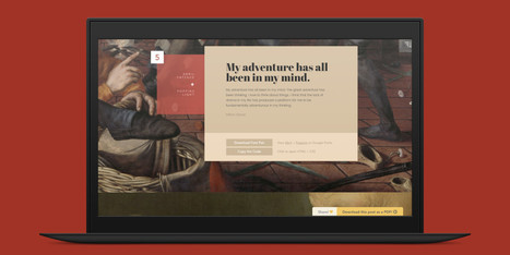
There are several nifty ways to go about pairing fonts for your design projects, including this machine learning-based tool and this Tinder-style app. But if you just want to see some great combinations, you’ll want to check out this excellent guide by designer Lou Levit.


It features 50 top-notch pairings that draw from Google’s extensive web font collection – so you can grab all the typefaces you like for free, and use them on web design projects – and they’re matched with beautiful classic art.


The pairings are organized and navigable by font style and mood (choose from Modern, Striking, Eccentric, Classic, Minimal, Neutral, and Warm). That’s handy for quickly finding a combination that suits your needs, whether it’s to professionally present information or announce an event. Plus, you can download the entire guide as a PDF.


Find the guide, as well as tips on pairing fonts and the handy PDF, over at ReliablePSD.

Jeff Domansky's insight:

This excellent guide by designer Lou Levit depicts 50 gorgeous font pairings along with beautiful classic works of art. Find the right one for your project.

No comment yet.
Scooped by Jeff Domansky
Scoop.it!

Typography Inspiration for the Modern Web · Typewolf

Typography Inspiration for the Modern Web · Typewolf | Public Relations & Social Marketing Insight | Scoop.it

I launched Typewolf as a side project in June of 2013. Working as a designer, I was always frustrated by the lack of good resources for choosing fonts for design projects. Seeing type samples set in “the quick brown fox jumps over the lazy dog” isn’t very useful when it comes to web design—seeing how real type performs on actual websites is much more helpful.


I’ve also noticed that other typography sites tend to be written from a type designer’s perspective rather than from the perspective of someone who actually uses type in their day-to-day work. I’ve been a designer for 15 years, so everything on Typewolf is approached from a designer’s perspective....

Jeff Domansky's insight:

Jeremiah Shoaf's Typewolf helps designers choose the perfect font combination for their next design project—features web fonts in the wild, font recommendations and learning resources. Excellent resource.

No comment yet.
Scooped by Jeff Domansky
Scoop.it!

100 Greatest Free Fonts Collection for 2015

100 Greatest Free Fonts Collection for 2015 | Public Relations & Social Marketing Insight | Scoop.it

Just like previous years, we've undertaken great efforts to look for, categorize, and create font previews of 100 typefaces that you can use to do almost anything.


Regarding their licenses, you should pay attention to each one individually as, while the majority are completely free, some are for personal use only and others are not full families – this means that you’ll only be able to download regular or medium weights or condensed styles for free.


Font Selection


As you know, the selection has been made keeping the typical type classifications in mind to help you browse more efficiently: Serif, Sans Serif, Slab Serif, Rounded, Geometric, Decorative, Display, etc.


Many of these fonts can also be downloaded as a web font kit so that you can use them in your online projects....

Jeff Domansky's insight:

The type is right and other design inspiration from this collection of 100 typefaces.

No comment yet.
Scooped by Jeff Domansky
Scoop.it!

If You’re still using these Fonts… You need to stop. – The Mission

If You’re still using these Fonts… You need to stop. – The Mission | Public Relations & Social Marketing Insight | Scoop.it

Like most rational people, I’ve never been a fan of Comic Sans. In fact, I die a little inside when I see that this font is still used on some websites and blogs! Comic Sans makes people bounce. It’s that awful.


But like I said, some fonts are even more offensive and awful. Here are 10 examples Carly Stec over at HubSpot came up — I made a visual out of her list because you have to see these bad boys to truly appreciate just how much they need to die....

Jeff Domansky's insight:

Bad fonts apocalypse now! Kudos to Larry Kim.

Stephen Buckley's curator insight, January 22, 2017 10:00 PM

This piece by Larry Kim is both important and comical. The article is about how some text fonts can be visually displeasing and turn off people who are visiting a web page. Notably, Kim compares the text font on a web page to the style of clothing a person wears. He argues that people will immediately think someone is "cool" if we like their style which he then argues that it is exact same paradigm with text fonts. Kim along with the help of Carly Stec from HubSpot have noted 10 fonts that "need to die" in the article. Although this article is an opinion piece and is not credible, the topic is extremely relevant to anyone who has a say in what text font is being used in any form of communication. I personally do not think that the need to cut certain text fonts out of our lives is a new idea. This is a topic that should be discussed at design tables before a font is used. 

Scooped by Jeff Domansky
Scoop.it!

Typography Trends Every Marketer Should Have on Their Radar | HubSpot

Typography Trends Every Marketer Should Have on Their Radar | HubSpot | Public Relations & Social Marketing Insight | Scoop.it

Just like an awesome photo or graphic can really make your design stand out, so can the right font. But the wrong font can also make your design stand out ... in a bad way. If you've ever seen a design with really out-of-date typography, you know what I mean.


But what makes a font or typography design out-of-date? What's "in" right now? Whether you're designing a one-off project or you're a seasoned designer, it's important to stay on top of typography trends so your work looks and feels current.


Check out the infographic below from ThinkDesign to learn about the typography trends in 2016, from retro and handwritten fonts to mixing and matching typefaces, to the roles transitional effects and animation could play in your marketing. (And download our free do-it-yourself design guide here for tips about how to use fonts in your content and web designs.)...

Jeff Domansky's insight:

Check out the current typography trends to watch for this year.

Jorge Canales's curator insight, February 9, 2016 8:48 AM

In the art of marketing and promotions, the smallest of details is key to gain a reaction from those who see it. This article helps open ourselves to more fonts, instead of using the same ones over and over. Time to be a little more creative.

Scooped by Jeff Domansky
Scoop.it!

Behance: Creative typography pairs

Here's an inspiring collection of typeface and typography pairing resources for designers and bloggers.
Jeff Domansky's insight:

What a pair! Of typefaces that play well together, that is.

No comment yet.
Scooped by Jeff Domansky
Scoop.it!

Free typography resources: The big list - InVision Blog

Free typography resources: The big list - InVision Blog | Public Relations & Social Marketing Insight | Scoop.it

Everyone, even non-designers, can agree that the smallest typographical change can make a world of difference (*cough* Warren Beatty *cough*). Elevating designs through typography is a skill every designer should have in their back pocket.


Do you want to become a typography wiz—and, ultimately, an even better designer? We want that for you too! That’s why we’ve gathered a list of the best free typography resources—handpicked, just for you.


Free typography education


Check out these e-courses, e-books, and workshops to get started on your typographical journey....

Jeff Domansky's insight:

Over 40 free typography resources—font identifiers, downloadable fonts, courses, and more. Awesome resource.

No comment yet.
Scooped by Jeff Domansky
Scoop.it!

Typography can make or break your design: a process for choosing type

Typography can make or break your design: a process for choosing type | Public Relations & Social Marketing Insight | Scoop.it

One of the most important skills you can learn as a designer is how to choose type. This is because text is one of the primary ways designers can communicate with users. Typography can make or break a design.


There’s a beauty and complexity to typography. Some people devote their entire careers to type. Thankfully, their work is well documented, so we have tons of online resources for typography.


This article is designed to serve as a starting point for helping you learn how to choose type for your designs. It will encourage you to explore fonts and font combinations beyond those you’re familiar with....

Jeff Domansky's insight:

What type are you? Tips on typeface and design impact.

No comment yet.
Scooped by Jeff Domansky
Scoop.it!

30 Stunning Lettering Fonts That Nail The Hand-Drawn Look

30 Stunning Lettering Fonts That Nail The Hand-Drawn Look | Public Relations & Social Marketing Insight | Scoop.it

Have you seen the hand-drawn look? Hand lettering's rising popularity has imposed a new grungy, ornated style in fonts that we can't get enough of. These type families offer uniqueness and naivety, while adding an unpretentious touch to print and web designs alike. If you haven't tried your hand at lettering yet, get started with these brilliant fonts that evoke that coveted hand-drawn look....

Jeff Domansky's insight:

Cool typefaces for creative designs.

No comment yet.
Scooped by Jeff Domansky
Scoop.it!

20 famous logos made with Helvetica - The Creative Edge

20 famous logos made with Helvetica - The Creative Edge | Public Relations & Social Marketing Insight | Scoop.it

Just what separates a brand name in a standard, mass-distributed typeface from a bona fide logo? One of them is generic and basically worthless, while the other is (hopefully) an impactful, memorable, skillfully made, often very expensive work of design.In plainer terms, one of them is nothing, the other is something. Getting from point A to point B is one of the most common, difficult tasks that a graphic designer faces. How do you do it?


Helvetica offers the best possible lesson. Developed in 1957 by Swiss type designers Max Miedinger and Eduard Hoffmann, Helvetica is such a versatile typeface that it is virtually everywhere—logo designs included....

Jeff Domansky's insight:

A staggering number of famous logos are based on the ubiquitous font, Helvetica. They are a study in how to make a great design, simply

No comment yet.