


 Your new post is loading...

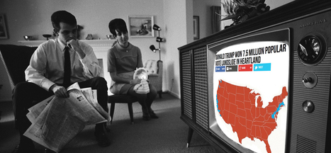

For the most part, fake news stories are still relatively crude and unsophisticated, with nothing more than text, a photo grabbed off the internet, and hyper-partisan, attention-grabbing headlines to lure clicks and shares.
But fake news creators might begin to include one thing that journalists and researchers already know works to increase engagement: data visualizations.
Readers Believe Data Visualizations
The mere inclusion of a simple data visualization, like a chart or map, has shown to significantly increase a story’s believability, whether true or not. Researchers from Cornell University tested readers with two articles on a scientific claim, both identical except in one regard. One included a graph and the other did not. While only 68 percent of readers believed the claim in the article without a graph, nearly all –97 percent– of readers believed the same claim with the graph included.
Similar effects were seen when a chemical formula was included, suggesting that the persuasive effects are based on the association of a graph with what the researchers call the “prestige of science.” The researchers conclude that “graphs signal a scientific basis for claims, which grants them greater credibility.” While their conclusions pertain to science stories in particular, it’s just one step to the applicability to news in general to infuse them with an aura of scientific backing....


This is a powerful post. It shows the power of visuals in content and points to the future risk of fake data visualizations in news, politics and communication. Recommended reading! 10/10