


Mobile apps and responsive websites are looking - and working - better than ever, as designers come to terms with the parameters involved. Smaller screens, it seems, do not necessarily make for poorer experiences.
Get Started for FREE
Sign up with Facebook Sign up with X
I don't have a Facebook or a X account


 Your new post is loading...
 Your new post is loading...
Your new post is loading...
 Scoop.it!
Mobile apps and responsive websites are looking - and working - better than ever, as designers come to terms with the parameters involved. Smaller screens, it seems, do not necessarily make for poorer experiences.
Jeff Domansky's insight:
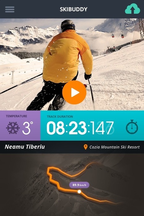
What a great app for skiers too LOL. 
|


True "drop-dead gorgeous" designs of responsive web. RW design picks the right resolution of device it's being served on. Flexible images and fluid grids then size correctly to fit the screen.
Visuel, visuel, toujours visuel: l'important dans la "user interface"