


 Your new post is loading...


Selecting a color palette is one of the most impactful choices you can make while developing your brand aesthetic. Choosing the right logo colors can highlight your business’ strengths and help you attract the right customers. And, as you might guess, the wrong combination can have the reverse effect.
Everyone has heard of color psychology, which tells us that colors impact our emotions and behaviors. yellow is cheerful (because the sun is bright and yellow!) and green is calming (like laying in the grass and looking up at a bunch of leaves is peaceful). But do these “rules” really translate into logo color meanings?
Researchers Lauren Labrecque and George Milne looked into that and found that some do and some don’t. So yes, yellow will make your brand look youthful and approachable, but a green logo doesn’t inherently make customers think your brand is peaceful. Does that mean if you want to intelligently choose a logo color scheme you have to read and and interpret a long academic study?
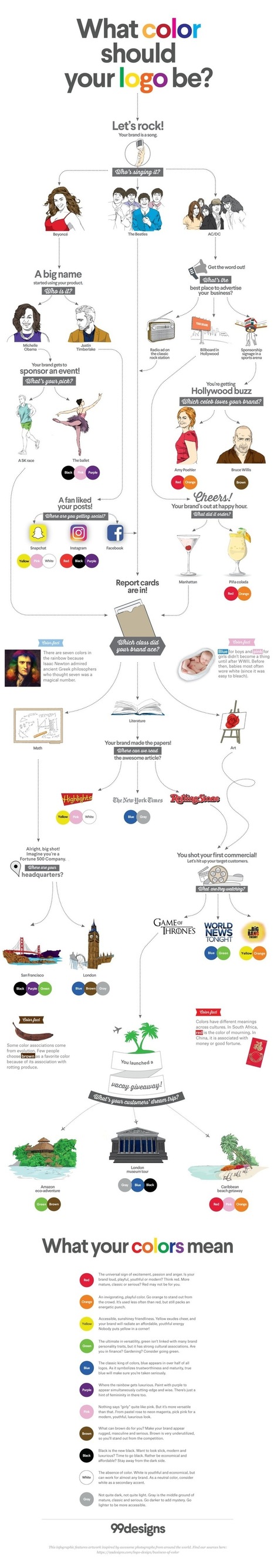
Nope! We did that for you. And turned it into a handy infographic quiz. Just answer a few fun questions about your brand and we’ll tell you which logo colors you should think about using.....


Interesting look and logos and color psychology.