

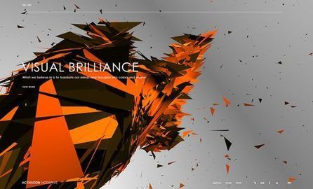
Presenting the recipients of Best In Class, a special award to commend the most impressive sites in each of the WOTY 2015 award categories.
Get Started for FREE
Sign up with Facebook Sign up with X
I don't have a Facebook or a X account


 Your new post is loading...
 Your new post is loading...
Your new post is loading...
Presenting the recipients of Best In Class, a special award to commend the most impressive sites in each of the WOTY 2015 award categories. 
No comment yet.
Sign up to comment
From
line25

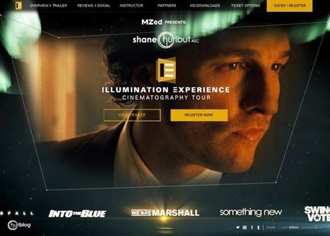
Website layout designs naturally tend to make use of horizontal and vertical lines due to the blocky nature of the coding behind them, but designers are breaking free from these constraints by using dynamic angles in their designs. Sometimes these angled lines are simply background images created in Photoshop, but others are animated elements made directly in code. Check out today’s web design showcase to see some great examples of website interfaces with angled lines....
Jeff Domansky's insight:
What a wonderful collection of creative web designs with angles! Recommended viewing. 10/10

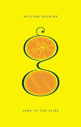
In this series of posters, graphic designer Nick Barclay illustrates 14 famous films as circles of color. Dracula's poster features two red fang marks; Harry Potter's depicts the outlines of his famous broken spectacles; The Lord of the Rings is a giant gold ring to rule them all; Trainspotting is a series of pink track marks on pale flesh; and The Matrix is one red and one blue pill. The posters are eye-catching pieces of abstract decoration, letting you pay homage to your favorite movies without making you cover your wall with giant photos of Keanu Reeves in a trench coat or Daniel Radcliffe holding a wand. Each poster is complete with some film buff stats: the date the picture was released, its budget, and how much it earned at the box office....
Jeff Domansky's insight:
Here's a great quiz for movie buffs and a real source of inspiration for graphic designers.
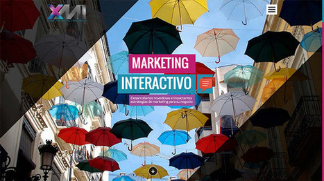
Let’s take a quick look at some new trend of web design to keep in mind when designing your next site. Enjoy the list of thirty two inspiring responsive web design examples.
Jeff Domansky's insight:
Really impressive list of responsive website designs. Perfect inspiration and creativity with your coffee. Recommended viewing. 10/10
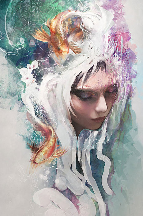
Amazing Digital art and illustration artwork created by professional artists from around the world that will surely mesmerize you and stir your imagination. Have a look, and feel the power of Illustrator! Via Brian Yanish - MarketingHits.com
Jeff Domansky's insight:
Browse these fantastic illustrations for a little creativity with your coffee.
|
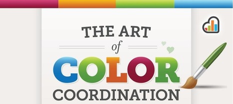
This is not another “use red instead of blue” article. We have heard that one time too many. Applying colors is a delicate process that needs to take in context the audience and the entire environment of the website you want to modify. The choice is highly individual, as it needs to fit the website’s (and the brand’s) personality.
Jeff Domansky's insight:
Here's some smart thinking about why contrast is so powerful in web design.
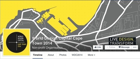
Your Facebook page cover photo is a small but powerful tool when it comes to promoting yourself, your services or your business. It’s the first thing seen by anybody who visits your Facebook page and you have the power to decide whether they just scroll past it or stop and have a proper look. Have a look at these creative examples to see how you can make the most out of your Facebook cover!...
Jeff Domansky's insight:
These Facebook covers are superb creativity and highly recommended viewing. 10/10

Amsterdam-based graphic designer José Bernabé has created a fascinating new type called Chemical Cloud.
Jeff Domansky's insight:
This is a very eye-catching font from a very creative designer. Some things are simply cool!
In September 2009, type designer Jessica Hische started what would become a wildly popular personal project: Daily Drop Caps, in which she intricately illustrated a decorative letter every day and uploaded it to her blog. Her lettering style modernizes an age-old typographic tradition: a drop cap is the single large letter that starts a book chapter, often seen in sacred texts or early editions of classic literature. The artform dates back to 2,000-year-old illuminated manuscripts.
Jeff Domansky's insight:
Creativity with your coffee: gorgeous design from Jessica Hische. Recommended viewing. 10/10
|


you must grab a coffee and take 10 minutes to marvel at the creativity in this year's "best in class" design winners from CSSDA. Recommended viewing. 10/10