 Your new post is loading...
Bringing ideas to life in an organization can be a bumpy ride. We’re all familiar with the myth of Isaac Newton sitting under the apple tree, waiting for inspiration to fall on his head. Newton’s apple is one of the more common symbols of innovation, right up there with Archimedes shouting Eureka from his bathtub. Metaphorically, that’s what we do when go to a brainstorming meeting to come up with new ideas. If the conditions are right, and the coffee strong enough, the next great idea just might fall on our heads. What is often overlooked is what happens next, after the apple falls, when we have to actually bring that idea to life. If we’re not careful, Newton’s apple can turn into Newton’s applesauce, a watered down imitation of the idea. One of my first cartoons (back in 2002) was about this phenomenon.j...
Perhaps you’re sitting here, reading this on your phone, absently checking your email whenever your attention drifts, tapping text messages to the friend you’re meeting tonight for dinner.
You stand at the end of a long line of inventions, which might have never existed, but for the disabled. The keyboard on your phone, the telecommunications lines it connects with, the inner workings of email: In 1808, Pellegrino Turri built the first typewriter, so that his blind lover, Countess Carolina Fantoni da Fivizzano, could write letters more legibly. In 1872, Alexander Graham Bell invented the telephone to support his work helping the deaf.
And, in 1972, Vint Cerf programmed the first email protocols for the nascent Internet. He believed fervently in the power of electronic letters. His proof was his own experience: Electronic messaging was the only seamless way to communicate with his wife, who was deaf, while he was at work....
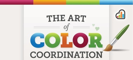
This is not another “use red instead of blue” article. We have heard that one time too many. Applying colors is a delicate process that needs to take in context the audience and the entire environment of the website you want to modify. The choice is highly individual, as it needs to fit the website’s (and the brand’s) personality.
However, there is one utterly universal principle. Do you know what rules our perception? It is contrast. This article will not tell you “use colors in your designs,” but will tell you “use contrasts in your designs,” followed by a proof in a form of a case study...
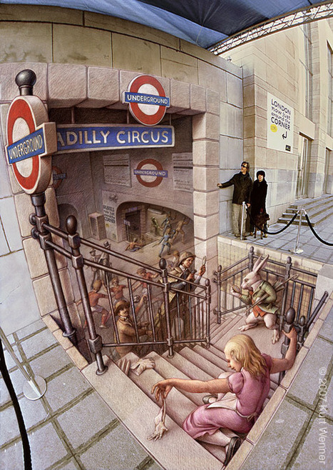
3D Street Painting and 3D Pavement Art Illusion
Is it real?! The chalk drawing of London's most popular underground train station looks to have that couple a bit off-balance as the man holds onto the wall.. it must be as good in person as it is digitally! Wait ..is that sign on the far left not real?!
“Home,” Maya Angelou wrote in her magnificent meditation on belonging and (not) growing up, “is that youthful region where a child is the only real living inhabitant.”
Indeed, it seems that only for children, with their purity of feeling and their ability to“mediate the ideal and the real,” does the Venn diagram of home and house integrate into one fully overlapping circle. In adulthood, the circles drift further and further apart as we begin to project our conflicted dream-home ideals onto our real houses.In the impossibly wonderful Home (public library), illustrator and children’s book author Carson Ellis presents an imaginative taxonomy of houses and a celebration of the wildly different kinds of people who call them home...
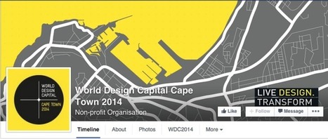
Your Facebook page cover photo is a small but powerful tool when it comes to promoting yourself, your services or your business. It’s the first thing seen by anybody who visits your Facebook page and you have the power to decide whether they just scroll past it or stop and have a proper look. Have a look at these creative examples to see how you can make the most out of your Facebook cover!...
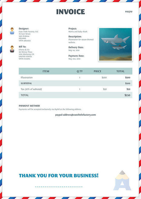
It’s the end of the day. You’ve just finished an exciting project, and it’s time to bill the client. You pull up your invoice template and instantly your good mood is gone. It’s so boring! Why can’t your invoice reflect your branding and express your thanks to the customer for their business?
Just because the invoice is a business document, doesn’t mean it has to be boring. An invoice is usually your last contact with a client, so why not leave them with a lasting impression? Done properly, your invoice can be an effective part of your marketing strategy....
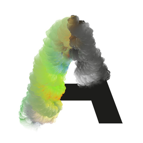
Amsterdam-based graphic designer José Bernabé has created a fascinating new type called Chemical Cloud.
By playing around with brushes in Photoshop, Bernabé successfully fuses a cloud-like pattern with a gradient of color, together with a sans-serif font as the backbone. The result is unexpectedly stunning.
Religious architecture has been shaped by traditions that span thousands of years. But the times are changing. It's not all soaring cathedrals and stained glass any more.Faith and Form, a journal exploring intersections between religion, art, and architecture, honored dozens of projects in the 2014 International Awards for Religious Art & Architecture, many of which reimagine the long-established norms of what a mosque, or interfaith chapel, or convent can look like....
Many agencies have launched their own incubators and accelerators in the past few years. Learn about 16 cool products agencies have launched.Agencies have, within their walls, some of the most brilliant creative and strategic minds. But these creatives are subject to the volatile business of agencies: Project work that comes and goes, relationships with risk-adverse clients, and billing rates that are stagnant.Agencies believe they are in the services business, so that is what they do. But in reality, they have the knowledge, expertise, and experience necessary to create products, services, and software.That's why so many agencies have launched their own incubators and accelerators in the past few years....
Let’s take a quick look at some new trend of web design to keep in mind when designing your next site. Enjoy the list of thirty two inspiring responsive web design examples.
In September 2009, type designer Jessica Hische started what would become a wildly popular personal project: Daily Drop Caps, in which she intricately illustrated a decorative letter every day and uploaded it to her blog. Her lettering style modernizes an age-old typographic tradition: a drop cap is the single large letter that starts a book chapter, often seen in sacred texts or early editions of classic literature. The artform dates back to 2,000-year-old illuminated manuscripts.
Jessica Hische will debate the merits of algorithmic design at the 2014 Innovation by Design Conference, Wednesday, October 15, at the Metropolitan Pavilion in New York. Sign up today!
In collaboration with Penguin art director Paul Buckley, Hische has applied her colorful, ornate drop cap lettering to 26 book covers for classic works of literature and poetry--one for each letter of the alphabet. The Penguin Drop Caps series features bright jewels of book covers, each with an illustration of the first letter of the author’s last name, starting with Austen, Bronte, and Cather. The last batch of letters--X, Y, and Z for Xinran, Yeats, and Zafron--has just been released....
Designing a home for a slopeside site alongside the main ski lift at Aspen Highlands presented architect Rob Sinclair with a variety of challenges.Chief among them was a logistical challenge: fit a 10,000-square-foot, four-story home on a steep quarter-acre lot, while considering city and county setback zoning restrictions and the additional constraints imposed by the presence of a ski lift just a stone’s throw away....
|
In the infancy of the drone era, we’re still only certain about a handful of specific use cases. Choreographed drone dancing probably wasn’t one of them, unless you’re with MicroAd, the company that created this artful waltz of LED-laden drones in front of Mt. Fuji.
The production featured over 16,500 LED lights on over 20 drones that then launched into a choreographed performance at the foot of Mt. Fuji. The spectacle offered the perfect juxtaposition of old and new and an innovative way for MicroAd to show of its new Sky Magic Drone.
As the drones move through the night sky in conjunction with a band playing the Samisen (traditional Japanese guitar), it imparts a feeling of futuristic wonder that, for just a second, reminds you of the awe-inspiring power conceived at the intersection of tech and creativity....
Presenting the recipients of Best In Class, a special award to commend the most impressive sites in each of the WOTY 2015 award categories.
There are a million other things people would rather think about than banking. It is boring. It's tedious. It's complex. That's why financial institutions need to build an innovation strategy completely around making banking easy and saving people time.
In the opening remarks delivered at the Forum 2015, Jeffry Pilcher, the CEO/President and Founder of The Financial Brand, showed nearly 1,000 attendees why they need to simplify banking, and what they can do to pull it off. Here's the script from that speech....
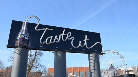
Here's a fun way for brands to dole out product samples. As part of its sponsorship of this weekend's NCAA Men's Final Four competition, Coke Zero and Ogilvy & Mather installed a "drinkable billboard" that shoots soda through a massive straw into a public drinking fountain.
The 23,000-pound novelty is in White River State Park in Indianapolis, where the games are taking place. Coke Zero flows through 4,500 feet of straw to spell out "Taste It." Then the liquid travels from the bottom of the billboard to a sampling area with six fountain spouts where people can taste the soda....
Website layout designs naturally tend to make use of horizontal and vertical lines due to the blocky nature of the coding behind them, but designers are breaking free from these constraints by using dynamic angles in their designs. Sometimes these angled lines are simply background images created in Photoshop, but others are animated elements made directly in code. Check out today’s web design showcase to see some great examples of website interfaces with angled lines....
Think about all the different reasons you can provide value for your consumer base. If you can use those reasons to build a unique and inviting story, you’ll have built a strong brand and satisfied group of customers. Here are some examples of TED talks that exemplified this ability, and have something to teach all of us as marketers:
In this series of posters, graphic designer Nick Barclay illustrates 14 famous films as circles of color. Dracula's poster features two red fang marks; Harry Potter's depicts the outlines of his famous broken spectacles; The Lord of the Rings is a giant gold ring to rule them all; Trainspotting is a series of pink track marks on pale flesh; and The Matrix is one red and one blue pill.
The posters are eye-catching pieces of abstract decoration, letting you pay homage to your favorite movies without making you cover your wall with giant photos of Keanu Reeves in a trench coat or Daniel Radcliffe holding a wand. Each poster is complete with some film buff stats: the date the picture was released, its budget, and how much it earned at the box office....
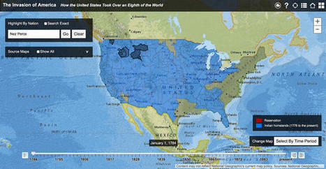
This land was not our land.
As late as 1750—some 150 years after Britain established Jamestown and fully 250 years after Europeans first set foot in the continent—[Native Americans] constituted a majority of the population in North America, a fact not adequately reflected in textbooks," Claudio Saunt writes in an accompanying article. "Even a century later, in 1850, they still retained formal possession of much of the western half of the continent."
With Saunt's map, you can watch the shift occur. Each part is clickable, with information on the treaties that were used to negotiate cessions available via links in pop-up boxes. You can also search for a location or any Native American nation, such as Cherokee or Sioux, to see the land they once possessed. Color coding distinguishes between native lands (blue) and reservations (orange). The latter have dwindled significantly since their creation....
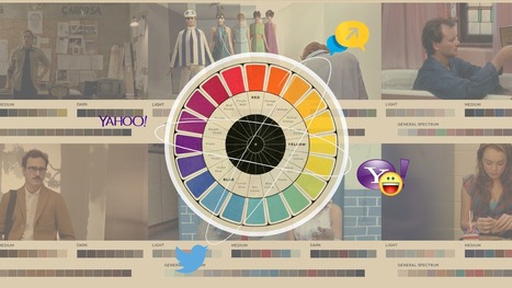
...Lens choices, camera angles, color palettes, editing rhythm, and more are all elements in a specific vocabulary created to best express the story.
Here’s the insight for color: instead of trying to map colors back to cultural associations (which are not fixed across all cultures, but change with every micro-culture), it’s better to assign meaning to each color and stick with it.
This trick works perfectly as long as you never break your own rules, unless, of course, the shock itself creates a greater truth....
While we appreciate it in the abstract, few of us pause to grasp the miracles of modern life, from artificial light to air conditioning, as Steven Johnson puts it in the excellent How We Got to Now: Six Innovations That Made the Modern World (public library), “how amazing it is that we drink water from a tap and never once worry about dying forty-eight hours later from cholera.” Understanding how these everyday marvels first came to be, then came to be taken for granted, not only allows us to see our familiar world with new eyes — something we are wired not to do — but also lets us appreciate the remarkable creative lineage behind even the most mundane of technologies underpinning modern life....
San Francisco artists Ransom & Mitchell blend photography, digital painting and 3D CG to produce portraits of sideshow acts seen in traveling Carnivals from long ago.
These pieces were created by Jason Mitchell & Stacey Ransom for The Rough and Ready Sideshow, a group show at the Bash Contemporary. The show also includes artwork by Stephanie Vega, whose work I shared with you last Halloween, Alexandra Manukyan and Aunia Kahn.
Director/photographer Jason Mitchell and set designer/photo illustrator Stacey Ransom create highly detailed and visually lush portraits and scenarios by combining their talents with elaborate costumes, hair and make-up, props, hand-painted backdrops and set design. Then they add their own unique style of digital illustration and 3D computer generation.
...Woah.
What do you get when you give someone a Sharpie pen and a Nissan Skyline GTR? Probably a bunch of ugly scribbles on a perfectly nice car...unless you're this woman, who has such an amazing artistic talent that when her boyfriend equipped her with a Sharpie, she created a masterpiece out of his car.
It first started as a small project to cover up the dents and scratches on the bumper, but when she revealed her design, they both decided that she should cover the entire car in her doodles. It took her roughly 100 hours of work to finish this masterpiece! Check out her amazing work; it's obvious those 100 hours were very well worth it....
|


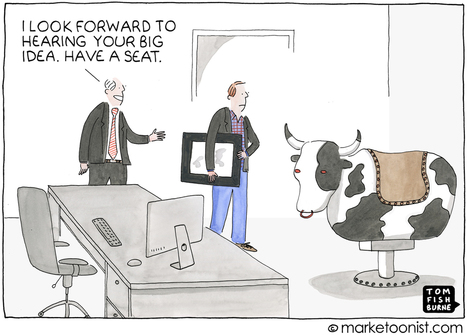


Tom Fishburne shares a brilliant post about design innovation. Recommended reading! 10/10