


The full infographic we designed to highlight the many reasons why you should rely on visuals to create impactful design, no matter the project.
Get Started for FREE
Sign up with Facebook Sign up with X
I don't have a Facebook or a X account


 Your new post is loading...
 Your new post is loading...
Your new post is loading...
The full infographic we designed to highlight the many reasons why you should rely on visuals to create impactful design, no matter the project. 
No comment yet.
Sign up to comment

Given the popularity and effectiveness of visual content for marketing, it's no surprise that today's marketers are creating more and more infographics. They're a more enjoyable way of digesting statistics, data sets, and timelines, and they can drive more traffic and engagement than plain text.
Jeff Domansky's insight:
Here's an infographic with a couple of basic tips on, what else, how to make a bad infographics good.

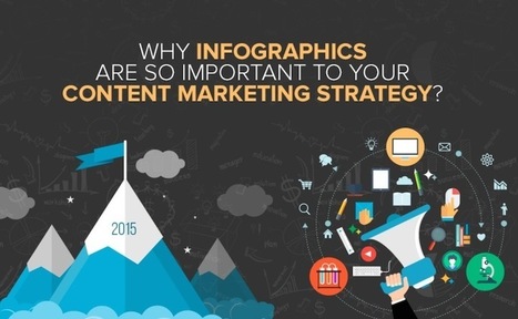
At Marketo we have a pretty interesting and diverse set of infographics – covering topics from marketing automation and social networks, to kittens and bacon. But those are just examples of how versatile infographics can be as a content medium. So why aren’t all marketers leveraging the blockbuster power of infographics? Infographics for everyone! Unless your target market hates visual content (we’re not judging!) then infographics are probably something you can add to your content repertoire. They are an awesome way to clearly present complex information. For example, if you have an interesting but dense report that you’d like more people to engage with, try translating that information into an infographic. People absorb visual content faster and with greater ease than reading the same information....
Jeff Domansky's insight:
Get the picture? Visuals work and infographics are still a valuable social marketing tool.
|
Your infographics are effective marketing tools to build brand awareness. This is due to the fact that visuals used in the illustration of content can convey your business message to the audience easily and so your brand stays in the memory of the audience for a longer time.
Jeff Domansky's insight:
Here are the infographics tips you need get started quickly.
Every year people proclaim the death of something or other in marketing -- and the death of the infographic doesn't escape conversation. It's probably because while more people have caught on to the power of infographics for communications or marketing initiatives, not all of them are doing it well -- so it's hard to separate the wheat from the chaff. These 15, however, managed to stand out. My criteria here were not scientific. I looked for infographics that I simply could not stop reading til the very end -- or in the case of the interactive ones in the latter half of this post, the ones I couldn't stop exploring. Enjoy perusing the best of what 2014's infographics had to offer, ranked in no particular order (except for #1 -- I love #1)....
Jeff Domansky's insight:
Take a look at the top static and interactive infographics of 2014. They are simply amazing from design to content and impact! They must read for marketing, design and PR pros. 11/10 LOL

Jeff Domansky's curator insight,
December 18, 2014 10:23 AM
Truly amazing content, creativity and inspiration. You'll learn and enjoy these infographics hugely. Recommended viewing. 10 / 10 |


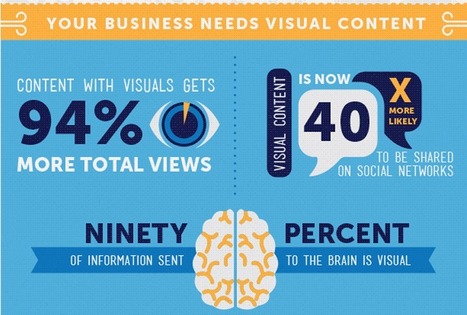
Here's why you need to add visuals to your content marketing.