

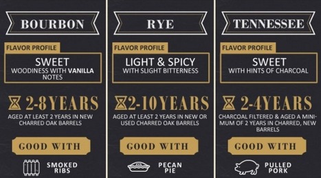

Drink up boys and girls. Today’s graphic will not only inform, but you’ll get to test your whiskey knowledge. How much do you know?
Get Started for FREE
Sign up with Facebook Sign up with X
I don't have a Facebook or a X account


 Your new post is loading...
 Your new post is loading...
Your new post is loading...
Drink up boys and girls. Today’s graphic will not only inform, but you’ll get to test your whiskey knowledge. How much do you know?
Jeff Domansky's insight:
This is one tasty infographic. 
While great infographics come in a variety of forms, the common thread is that they're visually pleasing and designed in a way that makes complex topics easy to understand whether you're a novice in the subject or an expert.
Jeff Domansky's insight:
Lots of infographics inspiration.

Claude Maran - Webmarketer's curator insight,
August 14, 2015 4:01 PM
ajouter votre perspicacité ... 
Elias "Estatistics" Tsolis's comment,
August 15, 2015 10:56 AM
the only one that i liked was this about plastic bugs

If you’re anything like me, you learned how to use programs like Photoshop and Gimp out of necessity to do minor changes to photos. You might have even dabbled in some easier graphic design projects for your own website, but it takes you hours to get the image or the design looking just right and you’re left exhausted. You might even spend time looking up tutorials on how to achieve a certain effect and still have trouble re-creating it. In short, while you do know your way around the programs like Photoshop to a certain extent, it takes you forever and there’s absolutely no way you’d call yourself a graphic designer. But then, you’re surfing around the web and you noticed some really cool infographics on things like fashion, music and food and you can’t help but wish that you could create something like that; even if it’d take you a week....
Jeff Domansky's insight:
Cool infographics tools.

Gust MEES's curator insight,
December 31, 2014 9:51 AM
If you’re anything like me, you learned how to use programs like Photoshop and Gimp out of necessity to do minor changes to photos. You might have even dabbled in some easier graphic design projects for your own website, but it takes you hours to get the image or the design looking just right and you’re left exhausted. You might even spend time looking up tutorials on how to achieve a certain effect and still have trouble re-creating it. In short, while you do know your way around the programs like Photoshop to a certain extent, it takes you forever and there’s absolutely no way you’d call yourself a graphic designer. But then, you’re surfing around the web and you noticed some really cool infographics on things like fashion, music and food and you can’t help but wish that you could create something like that; even if it’d take you a week.... Learn more: - http://www.scoop.it/t/21st-century-tools-for-teaching-people-and-learners/?tag=infographics 
Michelle Gilstrap's curator insight,
December 31, 2014 4:02 PM
Always good to have a way to create good designs.

Easel.ly is an online tool for creating infographics. I've reviewed a couple of times in the past on this blog. The latest update to Easelly introduced a tool for creating charts to incorporate into your infographics. The chart creation tool is a drag-and-drop option that can be found in the Easelly toolbar. Easel.ly provides a canvas on which you can build your own infographic by dragging and dropping pre-made design elements. You can use a blank canvas or build upon one of Easel.ly's themes. In addition to using the built-in creation tools you can upload your own graphics to include in your infographic. Your completed infographic can be exported and saved as PNG, JPG, PDG, and SVG files....
Jeff Domansky's insight:
Very useful addition to a useful infographics tool.
Make sure your infographics don't fall flat. Learn what essential elements you need to increasing sharing. Luckily, there are few things we can do to infographics to hedge our bets a bit. So, we put together the following infographic on making highly shareable infographics -- helping you rake in more views and conversion opportunities. Follow these tips, and your infographic will be much more likely to get shared.
Jeff Domansky's insight:
Here are six key components to a highly shareable infographics from Ginny Soskey at HubSpot. Plus five free templates to help you create infographics quickly using PowerPoint.

Jeff Domansky's curator insight,
June 9, 2014 7:59 PM
Here are six key elements to an effective infographic. HubSpot also offers five free templates for quickly creating infographics using PowerPoint. It's surprisingly easy. 
Sunil Saxena's curator insight,
June 10, 2014 11:14 AM
The web has given a new lease of life to infographics. They are easy to follow, and better than reading a 700-word article. You don't have to be a design editor to make them. Some of the tools being used today are simple, and easy to master. This article gives you an understanding of the elements of an infographic.
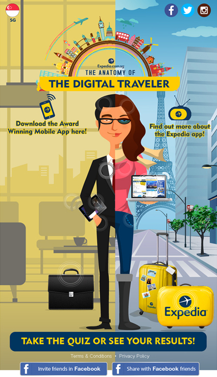
The team decided on an interactive infographic (or what we coined as an “Interac-phic”) to gain mindshare through social media platforms. Seeing how SG travellers are increasingly travel-savvy, we sensed an opportunity to allow users to explore the app and discover these travel trends for themselves. Expedia loved our idea and energy. Furthermore, after witnessing our creative sensibilities, they gave us the freedom to play pilot in the Expedia cockpit and deliver beyond what was initially expected. After expanding the concept, Expedia saw what could be achieved and were behind us all the way. We got cracking on the project with a programming resource, and the “The Anatomy of the Digital Traveller” campaign was launched in December 2013....
Jeff Domansky's insight:
Good social marketing case study by the Hoffman Agency using the interact-phic or interactive infographic. Recommended reading for PR, marketing and content marketing pros. 9/10
Jeff Domansky's curator insight,
March 16, 2014 11:26 PM
Look out for interact-phics - interactive infographics - to blossom.
It’s safe to say that Big Data is revolutionizing 21st century business. The big question for marketers, however, is how do you take the wealth of information at your disposal and effectively simplify and present it in an engaging and informative way? One answer is infographics. Defining what entails a good infographic is complex. For one, not all data lends itself to creative and unique visual communication. Someone who’s expert in design may not understand your audience or how to map relevant data in a compelling way. Don’t forget: great content isn’t great until it’s discovered, consumed and shared...
Jeff Domansky's insight:
Very useful outline of infographics best practices.
Not a day goes by where I do not see a new infographic being tweeted, shared on Facebook, or posted on LinkedIn. The topics range from data visualization to education to humor — and everything in between.It’s obvious that infographics have become a popular vehicle for content marketing, as visual content can often get shared more than links or text. But, due to the rapid growth of infographic-style content, will the allure of infographics last? I’ve asked six experts to share their perspectives on what may be in store for infographics in the future.Here is what they had to say...
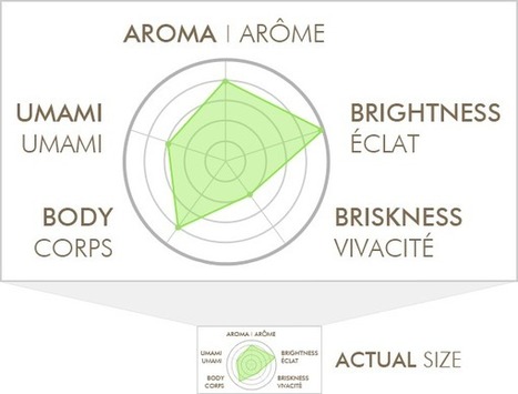
This is an ode to a data visualization I found on my box of tea. It's a perfect reminder of how we sometimes get carried away as marketers, especially as our tools make visualization easier.
...I’m not attacking the company that made this, and I’m not going to “out” them here – their product is actually pretty great. I just want to use this visualization to illustrate some of the wrong ways to do things, in hopes that we can all raise our game a bit.
But It’s So Pretty! I admit – the earth tones are nice, and it’s not entirely unappealing. I guess, for a moment, it made me feel better about shelling out $11 for an ounce-and-a-half of leaves. Maybe that’s even good marketing, although I really doubt this 1” tall graphic on the back of the box has ever swayed anyone’s decision. I’m not trying to say that it’s an ugly picture. The problem is that it’s a pleasant distraction disguised as meaningful data.
The job of a data-visualization is to communicate an idea better than the raw data itself could. Of course, that also implies that there’s actual data behind the visualization. So, how do we get it wrong?...
Jeff Domansky's insight:
Get much better impact with your charts, infographics and charticles with these tips.
Most companies have been brought up on a diet of pushing ads in front of people to sell their stuff. On a social web it is about engaging through content first.
...Content’s role in this is about creating such great value whether that is entertainment or education that it engages your customers and prospects....
Here are 5 Infographics that share some valuable insights into how the content marketing game plays out on the world wide web....
Jeff Domansky's insight:
There's no question content marketing is all the buzz. The challenge of course is to produce the top quality content that gets you higher up in the search engines and lots of attention in your chosen social media channels. You'll enjoy these five excellent infographics and their content marketing tips.
By my best estimate I think we've probably been sent around 700,000 infographics this year, many of which were of excellent quality.
Obviously there have been a few duds along the way, but the best way for us to share all the decent graphics we are sent is in our regular Friday roundup of the best six we've received that week.
And the logical conclusion to our weekly roundup is a final collection of the best infographics we've seen in 2012.
Just to be clear, there were no strict criteria in the judging process, it's just a subjective roundup of 14 of my favourites from the past 12 months. So here they are...
Jeff Domansky's insight:
Enjoy this collection of superb infographics from Econsultancy.
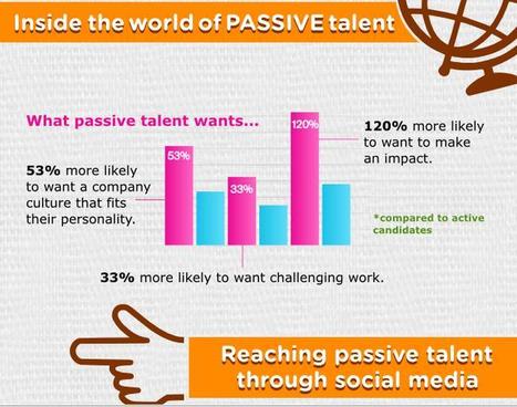
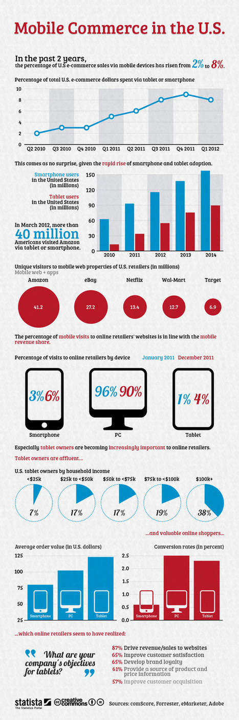
Did you know that 84 percent of recruiters use social media to recruit candidates that might not have otherwise applied, and, in 2012, companies are expected to use social media to recruit for more than 80 percent of job openings?
Moreover, 7 out of 10 employers have successfully hired a candidate through social media, and, since implementing social recruitment, almost half (49 percent) have received more applicants to choose from.
Social networks such as Twitter, Facebook and LinkedIn have made a huge impact on the business strategy of companies across almost every industry, and recruitment is no exception. By proactively targeting ‘passive’ job talent through social channels – relying on vacancy postings and other applicant tracking systems attracts just five percent of the workforce – firms can widen their reach and dramatically improve the quality of their workforce.
This infographic takes a closer look at the new age of recruitment.
[Evidence you need to get your social media profiles cleaned up, creative and convincing ~ Jeff ]
Want to create your own infographics? PiktoChart is a full-featured tool that lets you write, design and produce your own professional visuals for PR, content marketing, sales and marketing.
It has free and reasonably priced pro versions. Well worth a closer look.
Jeff Domansky's curator insight,
June 29, 2013 8:47 PM
PiktoChart is my preferred tool for creating infographics. It rocks! |
Infographics have become the design darling of visual marketing. It’s no wonder organizations and individuals are taking advantage of them as a communication tool. We’ve scoured the web to compile a collection of 45 inspiring infographics that show what’s possible in this design category. Browse through them to get some ideas for your next project....
Jeff Domansky's insight:
Take a look at how these infographics transformed tedious data into enlightening visuals — and learn some interesting trivia while you're at it!
Jeff Domansky's curator insight,
September 19, 2015 6:05 AM
Take a look at how these infographics transformed tedious data into enlightening visuals — and learn some interesting trivia while you're at it! 
Jasmin Davies-Hodge's curator insight,
September 21, 2015 4:13 AM
#infographics an excellent visual communication tool
We all know a picture speaks thousand words and for that reason infographics are being more popular due to its amazing information displayed in the form of images. It has the capability to capture everyone’s eye and tell them a story with engaging content and images. It’s an all in one package with text, images and creative design that come all along. It holds a great marketing potential that has the ability to attract customers. Many people click on infographics as it is more appealing and hence your web traffic is increased which is beneficial aspect for SEO.
Jeff Domansky's insight:
Great collection and useful reading for marketers, and social media pros.
Jeff Domansky's curator insight,
December 8, 2014 12:44 AM
Great collection of social media infographics. Well worth reading. 9/ 10 
rodrick rajive lal's curator insight,
December 9, 2014 1:53 AM
These are some interesting infographics that provide a pictorial representation of data in a form that can be easily understood. In an age where the quantum of data is increasing exponentially, it has become extremely important to use infographics. Raw data and statistics can become a turn off, especially for those who don't have an eye for figures! Infographics are being used very successfully in schools and colleges to present information in an easily assimilable form.
Infographics are everywherebut what made them so successful?This infographic exposes the science behind the boom....
Jeff Domansky's insight:
This HTML 5 interactive infographic explains why infographics are so effective.
Jeff Domansky's curator insight,
October 21, 2014 3:15 AM
This HTML 5 interactive infographic explains why infographics are so effective.
...The only problem is, infographics that look like they were simple to make are often anything but. Creating something beautiful and instantly understandable in Photoshop is often beyond the limits that time allows. Which is why it's occasionally useful to use a quick and dirty infographics tool to speed up the process. We've selected our favourites here. They're all free, or offer free versions. Let us know which ones you get on best with...
Jeff Domansky's insight:
Cool infographic tools that are easy to use and mostly free.

Miklos Szilagyi's curator insight,
August 22, 2014 4:26 AM
I know nothing about this but it looks like a good starting point...:-)))
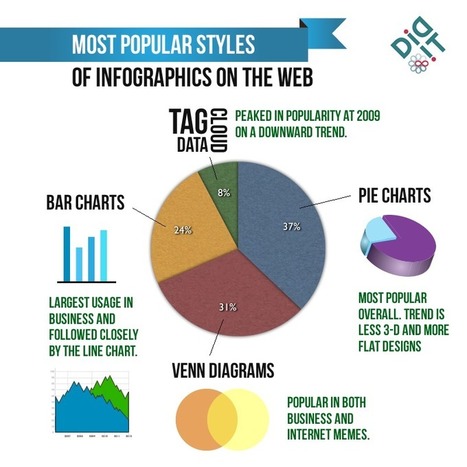
What are the current trends with infographics in 2014? Infographics have always been around, but the emergence of “Big Data” has caused the display of trends and statistical correlations using “little men” and 3-D pie charts to become more popular than ever. Why? As a society we’ve become inundated with piles of alphanumeric data each day. Infographics takes this content and boils it down to essential, understandable visual elements. Additionally, as a content building/content marketing tactic, infographics can provide a break from “dry text,” causing users to spend more time on the page. But as the novelty of infographics has faded, more and more bad infographics saturate the web landscape. In order for infographics to be effective, they need to use multiple data points to tell a cohesive story or prove a theory. After some research, I found some interesting trends affecting the infographics space....
Jeff Domansky's insight:
Aaron Kupferberg offers a look at infographics trends.
Jeff Domansky's curator insight,
May 14, 2014 2:54 AM
Good look at infographics trends by Aaron Kupferberg.
The Internet is constantly changing and evolving alongside human demand and technological growth. From first public availability in 1994 to now, we've seen a major transformation from text-based to graphic-based design... and it looks like the visual web trend is here to stay and will rule the next web world. Let's take a look below infographic by ON team to see how visually oriented content has exploded in the past few years, why it works - and the future of the visual web..…
Jeff Domansky's insight:
Take a look at this infographic to see how visually oriented content has exploded in the past few years, why it works - and the future of the visual web.

In my previous article I discussed the importance of ensuring that your data is clean and processed before attempting any form of data visualisation. Here I will share some really awesome tools that (once your data is clean and ready to use) you can have at your disposal to create mind-blowing representations of the facts and figures. Here is a list of tools, some more open and adjustable than others, that add value to your raw data and can be used as a source of inspiration and design when approaching the visualisation process....
Jeff Domansky's insight:
Several really useful tools to help you tell a story, communicate or share complex information using data visualization.

Jenifer Rettler's curator insight,
July 25, 2013 7:26 PM
We are in the year of "Big Data". Well if data is big, so is data visualization. Learn about some great tools to help you visualize your data.
Our goal as savvy email marketers is to look beyond the lure of the one-time conversion and strive to build an ongoing relationship between consumers and our brands. Why is this goal so important? Because it’s been proven through many a marketing study that engaged customers become loyal customers and loyal customers are the most valuable segment in any list or database.
This type of highly engaged, loyal customer typically has higher overall lifetime value than the casual consumer. They’re also more likely to be an evangelist, introducing new customers to your brand in a very personal way and building the next layer of loyal customers.
But, how can you help to build a stronger bond with your customer base? In my last article, I outlined ways to stimulate an unengaged audience by increasing the relevancy of your email creative by including more dynamic content. Sharing relevant content demonstrates to customers that we know them as individuals and are dedicated to providing them with useful information, products or services. Using historical and behavior data is a great way to present content that’s tailored to their individual needs and preferences, but you also need to engage with your audience on an emotional level in order to achieve the goal of creating a true brand-loyal customer....
Let’s explore four creative ways in which email marketers have used data as a platform to build creative that forms a bond between their customers and their brand....
Jeff Domansky's insight:
This post highlights the importance of customer engagement and how data can be used to tell interesting and meaningful stories. The four examples demonstrate how.
Researching may sound easy: with a quick Google search, almost anything can be found. But the internet also holds some gems for when you want to get that social or trend based angle.
Here are the top five websites that make my job easier. They can also be interesting to play about with too!...
Jeff Domansky's insight:
Five useful tools for content marketers and infographics makers.
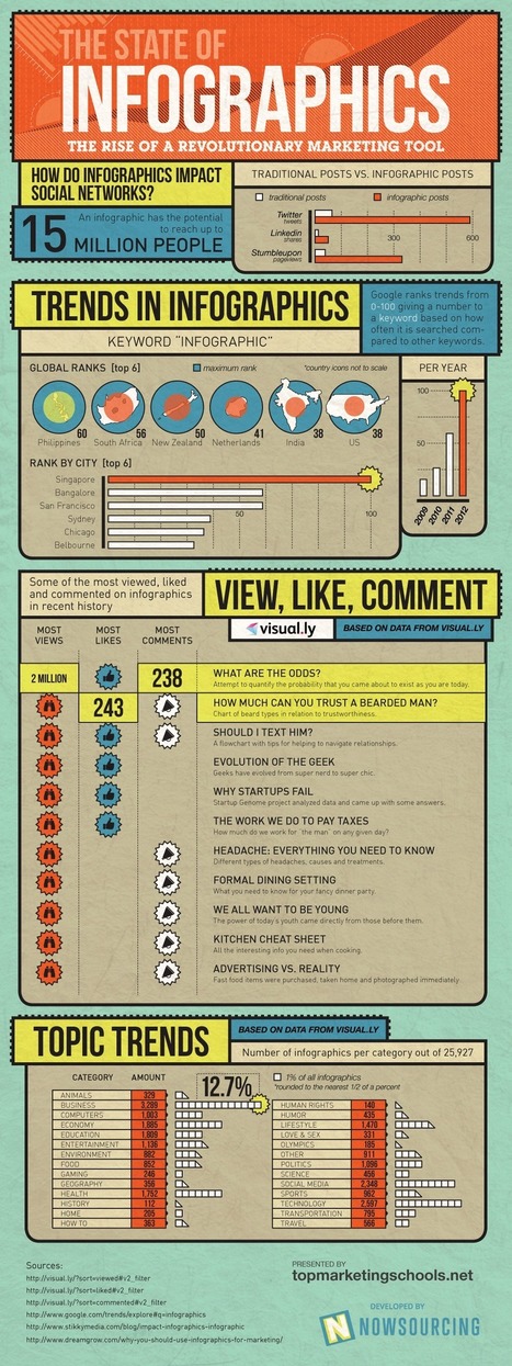
Did you know that infographics shared on Twitter receive almostten times as many retweets as traditional posts?
And it’s not just our favourite micro-blogging social network that eats these data visuals for breakfast – infographics shared on LinkedIn receive, on average, seven times as many shares as other submissions, and those added to Stumbleupon’s “ocean of awesome” generate 746 percent more pageviews than other kinds of content....
Jeff Domansky's insight:
Proof of the powerful impact of infographics, despite my sense they are nearing saturation point for some of us early adopters.

Vicente G. Moreno's curator insight,
January 8, 2013 10:59 PM
Proof of the powerful impact of infographics, despite my sense they are nearing saturation point for some of us early adopters. 
ben bernard's comment,
January 9, 2013 11:52 PM
thanks ! http://www.scoop.it/t/direct-marketing-services my newly made scoop.it :)
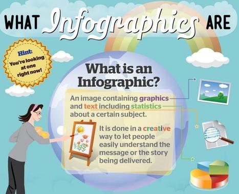
What could be a better way to describe what infographics are than... an infographic?
Really nicely done by the folks at Infographic Labs ~ Jeff
(Hat tip to Andy Bull for pointing this one out)
B2B marketing is becoming more competitive. Creating infographics is a great way to attract prospects to your website and build your inbound marketing program.
One of the great things about B2B marketing is there is endless potential for generating interesting content for your audience. Marketers have to constantly be aware of what the next big thing is and if that big thing is worth our time and money.
I think we can all agree that tools to help create cool and creative content is worth looking at, especially if that content format has proven successful time and time again.
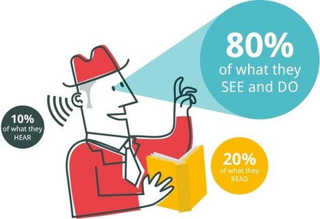
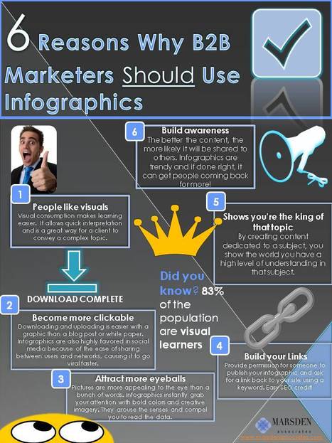
Ok, Rookie, what’s your point? Infographics is that new, interesting style to create and display your content. Information graphic or infographics are graphic, visual representations of information, data or knowledge. These particular graphics are popular because they present complex information quickly and clearly. And given that 65% of the population are visual learners (including myself), infographics can easily be successful. Here’s 6 reasons B2B marketers should use infographics: 1. People connect with visuals. Visual consumption makes learning easier. In fact, the brain processes visual information 60,000x faster than text. Visuals allow quick interpretation. This would be great way for a client to convey a complex topic.
2. Easily shared. Downloading and uploading is easier with a graphic than a blog post or white paper. Infographics are also highly favored in social media because of the ease of sharing between users and networks, causing it to go viral faster.
3. Attracts more attention. Let’s face it, pictures are more appealing than something written. It’s content eye candy! The nature of an infographic is to instantly grab your attention with bold colors and creative imagery. These elements arouse the senses and encourage further reading of the text.
4. Great for link building. Infographics are great ways to build links. Someone could publish your content and you could ask for a link back to your site with a particular keyword. Google will index your website higher and it will gain importance to search engines.
5. Shows an expert knowledge of a subject. By creating content dedicated to a particular topic, you show the world you high level of understanding of that topic. You could be viewed as an expert in that topic.
6. Builds awareness and traffic. Every marketer knows that content creation is important to build hype around your company. The better the content, the more likely it will be shared to others. Infographics are trendy and if done right, it can get people coming back for more!

Natalie Hodgkiss's curator insight,
May 13, 2014 3:07 PM
The strength of this infographic is its simple, easy to look at design with clean lines. The weakness of this visualized article, however, is that it presents the information in a circular format which I personally don't like and there's not much eye catching color. 
Anthony's curator insight,
December 16, 2014 3:35 PM
This is absolutely necessary to take into consideration. We cannot get away from the fact that in this day and age 'visual stimulation' influences the masses almost immediately. Brands are embedded into our consciousness with careful design strategies (colours, angles, lighting, font size etc) just look at the Virgin logo for an example of visual brilliance. Simply yet unforgettable. See if you can implement some of the strategies given here in this article. Enjoy! |


This is one tasty infographic.