Public Relations & Social Marketing Insight
443.6K views | +2 today
Follow
Public Relations & Social Marketing Insight
Social marketing, PR insight & thought leadership - from The PR Coach
Curated by Jeff Domansky
Your new post is loading...
Scooped by Jeff Domansky
Scoop.it!

24 Walls and Fences from Fiction | Visual.ly

24 Walls and Fences from Fiction | Visual.ly | Public Relations & Social Marketing Insight | Scoop.it
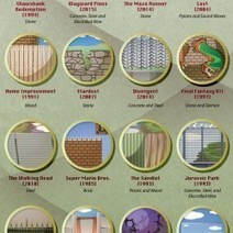
From the Secret Garden to Pacific Rim, this infographic details 24 fictional fences and walls from our favorite movies, television shows, video games.
Jeff Domansky's insight:
Very creative design.
No comment yet.
Scooped by Jeff Domansky
Scoop.it!

Infographic Design: 6 Ways To Use Icons - Venngage

Infographic Design: 6 Ways To Use Icons - Venngage | Public Relations & Social Marketing Insight | Scoop.it

Do you want to make your infographics iconic? Okay, so we don’t mean “iconic” in the usual sense. We mean using icons in your infographic design. Icons are those little illustrative graphic images/clip art that represent an object, action or idea. They are often stylized and simplified designs. N


Using icons can make your infographic design more cohesive and more professional. With Venngage you can choose from over 10,000 icons in our icon library and stylize them to your preference by editing their colors, sizes and positions.  Here are some tips for how to use icons in your infographics....

Jeff Domansky's insight:

6 ways to use icons in your infographic design. Quick infographic tips from Venngage.

Jeff Domansky's curator insight, October 21, 2015 10:57 AM

6 ways to use icons in your infographic design. Quick infographic tips from Venngage.

Scooped by Jeff Domansky
Scoop.it!

25 Best Free Infographic Elements | CSS Author

25 Best Free Infographic Elements | CSS Author | Public Relations & Social Marketing Insight | Scoop.it

Websites are taking the advantage of infographics storytelling ability. Today’s websites are more focusing on the core content and are looking to present the content in a visually pleasing way to enhance user experience.


Today we have put together very useful free infographic elements to help you build all your information into one creative package. All these elements are free, feel free to use them in your projects....

Jeff Domansky's insight:

Building an infographic? Here's a collection of free design tools to help you.

Marco Favero's curator insight, February 19, 2015 10:42 AM

aggiungi la tua intuizione ...

Nedko Aldev's curator insight, February 20, 2015 8:22 AM


423
Scooped by Jeff Domansky
Scoop.it!

How Complex Systems And Chaos Theory Work, According To Emoji

How Complex Systems And Chaos Theory Work, According To Emoji | Public Relations & Social Marketing Insight | Scoop.it

Emoji are a great way to express yourself. Through Simulating the World, the latest interactive web toy by artist Nicky Case, they're more than just cute stickers. They become a tool for thinking about systems, illuminating how everything from forest fires to flu pandemics start, or spread out of control.


Simulating the World is a time-lapsed grid that is semi-randomly populated with whatever emoji you choose, according to certain user-defined rules: what happens when an emoji spawns to another emoji that is different, for example. It doesn't sound like much, but used intelligently, this emoji grid is enough to simulate, if not predict, how all sorts of systems work: how a bolt of lightning can decimate a forest during a drought year, for example, or how neighborhoods can desegregate over time....

Jeff Domansky's insight:

How do neighborhoods become segregated, forest fires spread, and herd immunity work? Emoji can help explain it all. Cool design you'd never suspect.

Jasper Molina's curator insight, March 10, 2016 1:22 AM

How do neighborhoods become segregated, forest fires spread, and herd immunity work? Emoji can help explain it all. Cool design you'd never suspect.

Scooped by Jeff Domansky
Scoop.it!

How to Create Awesome Infographics Without Being a Designer

How to Create Awesome Infographics Without Being a Designer | Public Relations & Social Marketing Insight | Scoop.it
Well, I’m here to tell you that it’s definitely possible to create some awesome infographics in any category that you choose, EVEN if you’re not a designer. In this blog post, I’m going to introduce you to three awesome tools to create the best infographics, tell you how to use them AND how you can share your infographics in different channels all over the web. So, let’s get started!..
Jeff Domansky's insight:
Basic infographics tips from Lillian Sue.
Well Connected Mom's curator insight, April 10, 2015 4:11 PM

Infographics makes statistics visually interesting and more palatable.

judyhaar's curator insight, April 20, 2015 1:19 PM

Info graphics are the norm. Get onboard!

Daniel de Lisle's curator insight, April 23, 2015 5:05 PM

New to infographics and want to get a handle on how to make complex data speak to your clients then read on.

Scooped by Jeff Domansky
Scoop.it!

Layout Cheat Sheet for Infographics : Visual arrangement tips

Layout Cheat Sheet for Infographics : Visual arrangement tips | Public Relations & Social Marketing Insight | Scoop.it

Infographic layouts refer to the arrangement of your visual elements and your content. When you begin working on a piece of infographic, you should have a story to tell hence, you will need to select a layout that best suits your story. Using the right layout will ensure good readability and convey your message well.


We have put together a cheat sheet for your quick reference to the right arrangement to use, here are six common ones you can quickly work with....

Jeff Domansky's insight:

Very helpful blueprint for creating interesting and effective infographics.

Tony Guzman's curator insight, March 2, 2015 3:29 PM

This article helps you determine the best layout for the type of infographic you may be creating.

David Baker's curator insight, March 13, 2015 1:21 AM

This is a great tool to share with my seminar teachers whose final project for the year is an infographic.

Monica S Mcfeeters's curator insight, March 20, 2015 11:51 PM

HERE ARE SOME HELPFUL LAYOUTS TO SPEED UP YOUR DESIGNS.