 Your new post is loading...
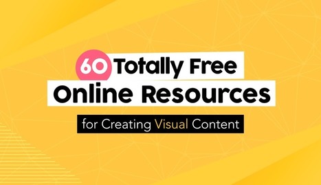
Creating engaging visual content doesn’t have to require a financial investment. Sure, at one time graphic designers needed expensive software and even more costly images to craft a winning visual campaign. But thanks to a host of free online resources, anyone can design high-quality visual stories with ease. Of course, navigating the sea of online images and editing tools is easier said than done. Some require membership, others charge royalty fees, some require advance permission and others charge for high-definition. Fortunately, we’ve scoured the Web for the most complete, the easiest to use and the most innovative resources to aid even the most amateur designer in crafting stunning visual content. Check out these 60 totally free design resources for non-designers...
Whether it’s a brand promotion, video, news update or even a meme, visual content rules the social media landscape. What has become so important is effectively conveying your brand on social media through images and video.
In this quick-scroll world of social media, the visual face of your brand is often times the first thing your audience sees and possibly the one thing they remember. It’s hard to cut and paste an image and reuse it across all of your social networks unless you have a tool like Landscape.
Sprout Social’s very own tool is free to use to resize, crop and scale social media image sizes. And along with our resizing tool, we’ve provided all the specific dimensions and a few quick tips to help you decide which image best fits each position....
More engagement with every image you create. Perfect for creating social media posts, ad graphics, content marketing visuals, email images & more! 89% More Favorites (Source: Buffer) 150% More Retweets (Source: Buffer) 84% More Clicks (Source: Kiss Metrics) Create images faster & easier than ever before. Pick a background. Add some text. No biggie....
Why typography? Turns out that while the importance of typography is often overlooked, it plays a critical role in strengthening your brand, creating interest in your product, and highlighting your central message. Knowing that, I decided to sign up for a typography course at the Massachusetts College of Art and Design. Couldn't hurt to learn how to identify a good font from a bad one, right? I learned a lot more than that. I realized that paying attention to even the littlest details of type can make all the difference in the world when you're laying out an email, ebook, or image for social media. This is why I wanted to write this post: to share the most important learnings and resources with my fellow marketers. ...
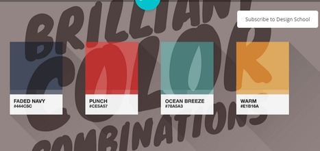
Color makes a design come alive.It can attract attention, set a mood, and even influence our emotions and perceptions. But sometimes it can be hard to know where to start when choosing a color palette for your design project. So we’ve done the hard work for you— giving you 100 color combinations inspired by nature, food & drink, travel, and everyday items. Want to use these color combinations in Canva? Click here to sign up for free if you haven’t already (if you haven’t — are you kidding me?!). Canva lets you change the colors of your design by entering the hex code in the color menu. Check out the video below for a quick tutorial on how...
Color blocking is nothing new. It’s long been designers’ go-to trick for chopping up large pieces of content, crafting call-outs and adding visual interest to an otherwise plain page. But in today’s design world, color blocking has evolved into a stunning minimalist trend that’s a perfect fit for spring.
Gone are the convoluted colors and clunky squares that too often transform quality design into an eyesore. Now it’s all about airy white space, pastel hues and clean lines. The results are beautiful and soft, confident and more modern – ideal for boutiques, chic websites and stylish brochures.
Curious how to put this update into action? We’ve gathered 18 inspiring designs from 99designs and beyond that prove how compelling this contemporary style can be....
Picture quotes are one of the most pinned images on Pinterest.
The more visually striking your picture and quote combination is, the more shareable it will be. People can use them on social media, turn them into printable wall quotes, or download them as desktop wallpaper — that’s maximum visibility for you or your brand.
So whether you want to take your graphics to the next level or create your own for the first time, let’s go through some ways you can do the same for your quotes using some of the most eye-catching examples on the web....
Creating high-quality blog graphics is an integral part to producing a catchy, highly shareable post.
According to media theorist John Berger, in his book Ways of Seeing, "Seeing comes before words." This statement supports the assertion that high-quality blog graphics can attract (or repel) readers instantly and affect them viscerally, without them having to read anything first. After all, from an evolutionary perspective, humans are genetically wired to respond to visuals faster, as text is a relatively newer invention....
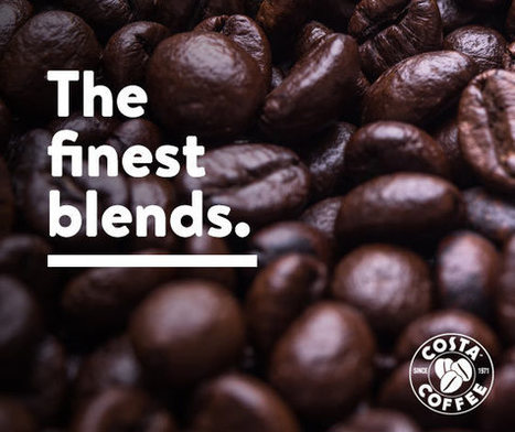
When you are browsing different social media platforms – Facebook, Twitter, LinkedIn, you are likely to see images with text on them – these can be inspirational, informative, or just plain fun. Having your message on a colourful image will catch your customer’s eye more effectively than just using text alone.
However, if you are a small business owner, you probably don’t have the budget to hire a a graphic designer. Luckily, there are plenty of options on the market today to help you create the graphic yourself for minimal time and effort....
A recent study by Principal Financial Group among Millennial internet users revealed that over 40% of them still prefer to be reached via email by companies in various spaces: retail stores, financial institutions, wellness centers and insurance companies.
MarketingSherpa discovered a much more pronounced trend: according to their study, a large majority of U.S. adults —72% — prefer communication with companies to happen through email. The same study showed that 86% of U.S. adults would like to receive promo emails at least monthly and 61 percent at least weekly. If that doesn’t ring a bell, I honestly don’t know what would.
While they don’t save the day or wear flashy capes, hero images are a very important and very effective tool in the world of web design. Basically, the term ‘hero image’ refers to a specific type of website banner, usually quite large and at the very top of a website.
For sites that use hero images, it is often the first thing users see when they click through to a site. So, it’s probably wise to think of hero images like an introduction – they give users a sense of what to expect from the rest of the site.
If you have a sophisticated hero image, they’ll expect class and culture, or if you had a colourful and fun hero image, and they may expect some comedy and playfulness.
Whatever your choice of tone, let’s have a look at 35 striking examples of hero images to get you inspired and on your way to crafting your own heroic image today....
It's of importance as people become more mobile and the need to make things more compact arises.
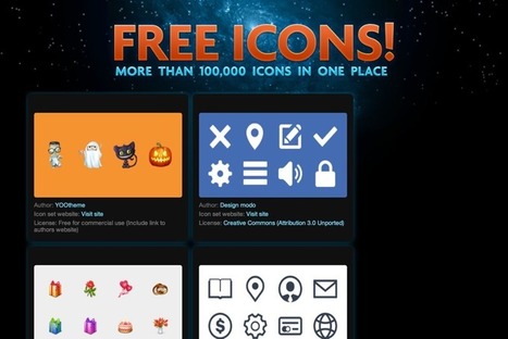
Understanding Icons What are these icons for? Well, icons actually have a pretty wide scope, depending on how you look at it.
See those little boxes on your smartphone that represent different applications? Those are icons. Did you notice those little boxes on your favorite website, that, when clicked, would trigger a new action such as open a new email window or identify a link being promoted, such as a Twitter or a Facebook profile? These are all icons....
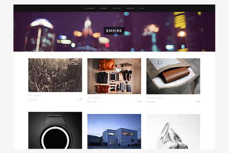
There are thousands of Tumblr themes all over the web. To be perfectly frank, most of them aren’t great, and won’t do your creative work justice. Today we’ve collected thirty of our favourite premium Tumblr themes from across the web.
All of these cost a few dollars, but all of them will take your Tumblr blog to another level. From stylish, minimal Tumblr themes, through to those featuring big colours and bold images — we have a full selection. All of them are available to buy straight from Tumblr directly, and can be set up on your blog in a few minutes!...
|
So why are marketers still insisting on continuing to design this way? As previously mentioned, the thinking behind the tactic is that the average user is too lazy to scroll down. But if you’re reading this right now on a phone or tablet or maybe even your laptop, chances are you’ve already done plenty of scrolling to get this far. Are you exhausted? We didn’t think so.Furthermore, studies have disproven this aged assumption, as 66% of attention on a normal media page is spent "below the fold."...
Lorem ipsum has become the industry standard for design mockups and prototypes. By adding a little bit of Latin to a mockup, you’re able to show clients a more complete version of your design without actually having to invest time and effort drafting copy. But despite all its benefits, seeing the same random Latin text in every design can get a little boring for you and your clients. So if you have a client who’s got a sense of humour or if you’re just tired of going the traditional route in your mockups, here are 15 creative and funny lorem ipsum text generators that are sure to lighten the mood at any client meeting....
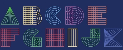
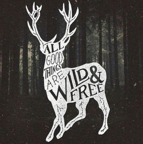
Good typography may be hard work, but designers shouldn’t forget to have some fun with it! While crafting fonts and typographic characters can sometimes feel stiff and overly mathematical, we want you to help you find the joy in creating more expressive and playful typography.
Of course, this approach is great for children-oriented design projects—but let’s not limit ourselves. After all… not every coffee shop, ice cream store and logo needs to look posh. Let’s find the more creative side of typography and get goofy!
In this article, we’ll spotlight some examples of playful typography and show you how to join in the fun with your own work....
And considering social media cover photos are likely something you'll want to update regularly to align with new campaigns, cover photo design can be an ongoing process -- not to mention how frequently social networks redesign their layouts, inevitably affecting cover photo sizes by cropping, warping, and mucking up your existing design.
This is definitely not ideal for brands looking to put their best foot forward in social media. So what's a poor marketer to do when the only scalable option is to take graphic design into their own hands?
To make things easier on social media managers and non-designers doing design, we created an essential cheat sheet containing the most up-to-date social media cover photo dimensions -- something you can bookmark and reference when you're ready to create or re-create a cover photo for Facebook, Twitter, LinkedIn, YouTube, or Google+.
We also created free, downloadable PowerPoint templates that are already pre-sized for each channel's specific cover photo dimensions so you can easily customize them for your own business. Just add your creative, save it as an image file, and upload it to your social media business page....
In order to arrange your design, you need a place to start. Backgrounds are the foundation of your graphics — it helps pave the path to forming a successful composition. Textures and colors help create depth and contrast, allowing your graphics to stand out and get noticed. Well composed images can help create space for you to overlay text, while visually communicating your message at the same time. Using a background can help give your designs more context and provide a visual element to help support your content. Bonus: We’ve designed most of the images in this article as templates for you to personalize! To use them for your own stuff, just click them and they’ll be ready to edit in your Canva account (No Canva? It’s free!).
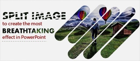
PowerPoint 2013 has some amazing features that are no less than those offered by Photoshop and other image editing softwares. One such effect that I love the most personally is the ‘Merge Shapes’ feature that lets you create breathtaking effects. One such effect (we gave it away in the the banner image of this post) is the splitting of an image into multiple pieces that serves a very unique function- it interrupts your gaze at the picture at every intersection but still gives you a complete picture at a glance. This grabs the viewer’s attention and forces them to read into each element of the image. The image and the slide as a whole get imprinted on the audience’s mind which is everything a presenter can ask for. This article will guide you step-by-step how to create this split image effect. When you work with us side by side on PowerPoint 2013, you’ll end up with exactly this design:
Via Baiba Svenca
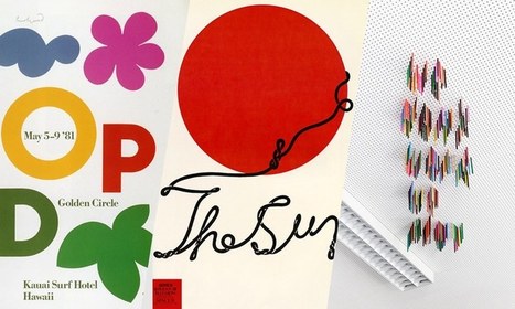
In this post, we have compiled together some of best modern sans serif fonts for your latest project or to inspire you for your next assignment. In case, you want to work with a bunch of them together, do check out Canva’s Ultimate Guide to Font Pairing.
The fonts are all listed as free to use for personal and commercial uses, so let your creativity run wild. To start using any of them right away, download and upload them straight to Canva. Here’s how....
As an owner of a blog, you need to have engaging, relevant and updated content that satisfy the needs of your readers. There are several ways through which a blog owner can make sure that there is enough and more content on his or her blog at any given time.
The most invincible pillar and pinnacle in any online business are therefore the creation and writing of content which is engaging to the readers that visit your blog. There are several ways in which you can create more content for your blog to make sure that you achieve your desired goals of online business.
If you pay attention to web and graphic design styles, you may have noticed that this has been something of a trend in recent years. You might see blurred images popping up in website hero headers (the large images that extend the whole width of a page) or as site backgrounds, or to set off typography in graphic design.
But the design trends that stick around, like this one, usually do because they’re functional as well as beautiful — they have a purpose beyond just following the crowd or experimenting with a new look just because you can. Good trends do something to improve your designs.
So how can you use blurred images to enhance your own designs? Let’s look at 10 techniques....
As we mentioned last week, picking the right colors is the single most important decision you can make when designing an infographic. Most designers realize this, and for years they’ve been trying to answer one question: is there a science to picking colors that work well together or is it just subjective? Why do some colors match, while others look strange?
The internet has been debating this for a while without much consensus, but I believe the real answer is both: it’s an art and a science. Every design decision is heavily influenced by a designer’s intuition and sense of aesthetics, but there is also a strong scientific component that conveys if a color works well with another.
Expert designers use it to validate their intuition, but we are going to learn how to use color theory to pair beautiful colors together....
9 Designer Tools Everyone Should Know About
A look at the psychology and research behind shareable social media images, and how to create your own.But, how much do you know about actually creating scientifically shareable images?
Turns out, there’s tons of actionable, research-backed advice on how to create social media images that get shared—the ideal colors, fonts, text, and more, all leveraging what we know about design, psychology and the Internet to get more shares and engagement.
By the end of this article you’re going to be fully aware of how to make images that your readers can’t help but share. All backed by science....
|


![The Essential Cheat Sheet of Cover Photo Dimensions for Facebook, Twitter & More [Templates] | Public Relations & Social Marketing Insight | Scoop.it](https://img.scoop.it/rIHLuZ_uuTs4sBix2ZzD5jl72eJkfbmt4t8yenImKBVvK0kTmF0xjctABnaLJIm9)
![Design School's Ultimate Guide to Designing With Backgrounds [With Ready-to-Use Templates] | Public Relations & Social Marketing Insight | Scoop.it](https://img.scoop.it/eUy0foC9bWwH53Mpp35bKjl72eJkfbmt4t8yenImKBVvK0kTmF0xjctABnaLJIm9)


![10 Expert Tips for Designing With a Blurred Background [Case Studies] – Design School | Public Relations & Social Marketing Insight | Scoop.it](https://img.scoop.it/7i7z3gGNZU1UaIwpOJr04zl72eJkfbmt4t8yenImKBVvK0kTmF0xjctABnaLJIm9)


Useful list of the best sites to bookmark for free design resources, including icons, images, fonts and DIY design tools.