 Your new post is loading...
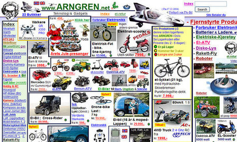
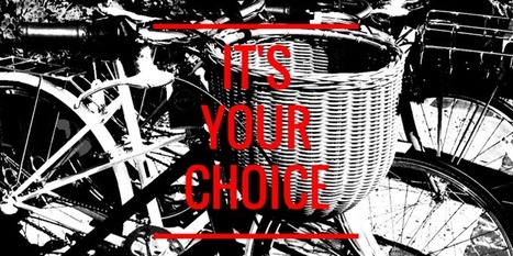
Craigslist is one of the ugliest websites on the Internet. The home page is an indistinct wall of links and text, the site is tough to navigate, the postings are cluttered, and the design has barely changed in the past 15 years. At a time when websites are competing to offer the best digital experiences, Craigslist is the pinnacle of user unfriendliness. And that's exactly what makes it brilliant, says Pascal Deville.
Deville is founder of Brutalist Websites, a site dedicated to the most frustrating design on the web. The site takes its name from the controversial architectural movement Brutalism. To some, Brutalist buildings are poetry in concrete; to others, they're chilly monoliths. Web design, Deville argues, has a similar dichotomy. Here's how he describes a Brutalist website:
In its ruggedness and lack of concern to look comfortable or easy, Brutalism can be seen as a reaction by a younger generation to the lightness, optimism, and frivolity of today's web design.
Appropriately, Deville's website has some of the hallmarks of the content it espouses—a rudimentary layout, one of the most basic typefaces (Courier), an infinite scroll, and no tabs or ways to sort the dozens of blog posts....
In order to arrange your design, you need a place to start. Backgrounds are the foundation of your graphics — it helps pave the path to forming a successful composition. Textures and colors help create depth and contrast, allowing your graphics to stand out and get noticed. Well composed images can help create space for you to overlay text, while visually communicating your message at the same time. Using a background can help give your designs more context and provide a visual element to help support your content. Bonus: We’ve designed most of the images in this article as templates for you to personalize! To use them for your own stuff, just click them and they’ll be ready to edit in your Canva account (No Canva? It’s free!).
There’s no reason for your designs to look drab – especially when it comes to color. A quick glance online and you’ll find a stockpile of color scheme apps ready to help you learn, play and perfect your next palette.From clever Hex code games to comprehensive color wheels, here are 15 of our favorite free color scheme apps to take your designs to the next level....
Sometimes websites are just so darn ugly. You have to wonder what they were thinking about when they slapped it together. However, if you want users to take an interest in your website you can learn from all the mistakes of previous website admins.
While it might be a bit ugly below, every website is a goldmine of information on how not to design a website. When you put together the lessons, you can determine the best way to design your own site....
It's of importance as people become more mobile and the need to make things more compact arises.
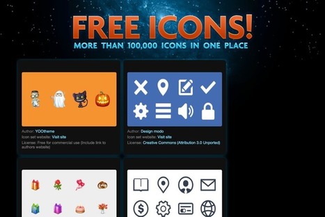
Understanding Icons What are these icons for? Well, icons actually have a pretty wide scope, depending on how you look at it.
See those little boxes on your smartphone that represent different applications? Those are icons. Did you notice those little boxes on your favorite website, that, when clicked, would trigger a new action such as open a new email window or identify a link being promoted, such as a Twitter or a Facebook profile? These are all icons....
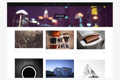
There are thousands of Tumblr themes all over the web. To be perfectly frank, most of them aren’t great, and won’t do your creative work justice. Today we’ve collected thirty of our favourite premium Tumblr themes from across the web.
All of these cost a few dollars, but all of them will take your Tumblr blog to another level. From stylish, minimal Tumblr themes, through to those featuring big colours and bold images — we have a full selection. All of them are available to buy straight from Tumblr directly, and can be set up on your blog in a few minutes!...
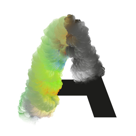
Amsterdam-based graphic designer José Bernabé has created a fascinating new type called Chemical Cloud.
By playing around with brushes in Photoshop, Bernabé successfully fuses a cloud-like pattern with a gradient of color, together with a sans-serif font as the backbone. The result is unexpectedly stunning.
Canva just introduced a simple-as-pie new online Design School that empowers everyone to learn AMAZING graphic design skills. Yes, it’s for people just like us — businesses & brands communicating through social media! The school includes a series of quick & easy tutorials that cover everything beginners need to know about design. So if you want to become a better visual communicator, here’s a taste of the powerful graphic design hacks you’ll learn at the Canva Design School....
A gentle application of transparency to your images is a clever way to create beautiful designs. Whether applied to a photograph used as a background or to shape and text to form a layered effect, this tool is a powerful and popular part of the web and print design process....
Typography is that kind of regular things. When everything is fine with it, you don't pay much attention to the text style. But when the designer used a bad typography, you immediately notice that its hard to read, its looks bad and so on. What happens if we strip all the text out of any layout design? Right, in 95% of cases you’ll not understand what this design was all about. And one more question, what can you say about minimal style of design where “Text is the interface“? I’m sure, today we can confidently say that typography is one of the cornerstones of web design. Typography is such an addictive thing! It is like a delicious dish – you taste it and want it over and over. Stunning typography examples easily can blow your mind and make you a typography maniac in seconds. Don’t believe me? So how will you explain a huge list of typography related websites? Different galleries, typography blogs, font sources – all these resources will bring you useful knowledge, inspiration and attractive, creative typography examples.... [These typography blogs will inspire you! ~ Jeff]
|
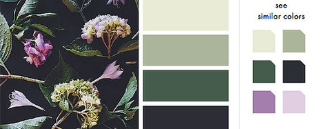
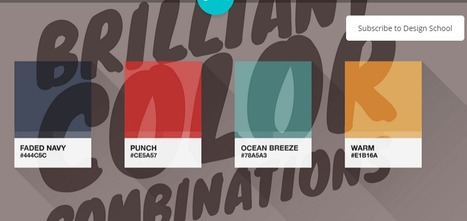
Color makes a design come alive.It can attract attention, set a mood, and even influence our emotions and perceptions. But sometimes it can be hard to know where to start when choosing a color palette for your design project. So we’ve done the hard work for you— giving you 100 color combinations inspired by nature, food & drink, travel, and everyday items. Want to use these color combinations in Canva? Click here to sign up for free if you haven’t already (if you haven’t — are you kidding me?!). Canva lets you change the colors of your design by entering the hex code in the color menu. Check out the video below for a quick tutorial on how...
Creating high-quality blog graphics is an integral part to producing a catchy, highly shareable post.
According to media theorist John Berger, in his book Ways of Seeing, "Seeing comes before words." This statement supports the assertion that high-quality blog graphics can attract (or repel) readers instantly and affect them viscerally, without them having to read anything first. After all, from an evolutionary perspective, humans are genetically wired to respond to visuals faster, as text is a relatively newer invention....
While building and maintaining a web presence has become easier than ever, it can be a laborious and expensive process. That’s where The Grid comes in. The San Francisco startup, currently in beta, provides a URL, hosting services and a dead-simple app -- not a complicated content management system -- on which to build a website.
All users do is move text, video and photos into The Grid’s program. Once the content is loaded, The Grid’s artificial intelligence arranges it into a sleek layout based on best practices for user-interface architecture and SEO. It knows, for instance, if it’s building an e-commerce page and will create boxes beneath the images for descriptive copy. Prices are automatically turned into click-through buttons that lead to the checkout page.
More impressive, The Grid’s AI makes thematic suggestions to improve the overall vibe of the site and its effectiveness, analyzing colors, photographs and text so it understands the subject matter....
If you pay attention to web and graphic design styles, you may have noticed that this has been something of a trend in recent years. You might see blurred images popping up in website hero headers (the large images that extend the whole width of a page) or as site backgrounds, or to set off typography in graphic design.
But the design trends that stick around, like this one, usually do because they’re functional as well as beautiful — they have a purpose beyond just following the crowd or experimenting with a new look just because you can. Good trends do something to improve your designs.
So how can you use blurred images to enhance your own designs? Let’s look at 10 techniques....
A look at the psychology and research behind shareable social media images, and how to create your own.But, how much do you know about actually creating scientifically shareable images?
Turns out, there’s tons of actionable, research-backed advice on how to create social media images that get shared—the ideal colors, fonts, text, and more, all leveraging what we know about design, psychology and the Internet to get more shares and engagement.
By the end of this article you’re going to be fully aware of how to make images that your readers can’t help but share. All backed by science....
As a web designer or web developer one must always stay updated with the latest design trends and know the recent discoveries in the development niche. Also, designers must continuously improve their skills and get better and better at their work. To help you achieve just that, we selected 20 absolutely essential free web design ebooks.
These great free web design ebooks will help you design better websites, enhance your developing skills and overall become better at your job....
Perhaps saying that I can’t live without them is a little melodramatic, but I use these four Chrome extensions on a daily basis, and they certainly make my life a hell of a lot easier. Here are the reasons why I use them, and why I’m recommending them to you....
No design experience?
No problem! Let's start from scratch and get familiar with the basic Canva tools that will help you create amazing designs.
Design Essentials will guide you through simple tools and techniques that will help you create designs you can proudly share with the world.
Fonts bring your words to life. Learn how to easily choose fonts that emphasize your message and make your designs look beautiful.
Color can be used to convey moods and create emphasis in your designs. We show you how to build meaningful color relationships to create visually stunning graphics.
Whether you upload your own, or choose from our library of over a million, images are a vital component of eye-catching designs. Learn how to use simple Canva tools to compose and enhance your images for greater visual impact....
It’s no secret that designers have their special “go-to” places for inspiration and I was recently asked me what mine are.
When looking for inspiration with typography and design, these are the websites that I highly recommend bookmarking. It’s good stuff, really it is....
|


![Design School's Ultimate Guide to Designing With Backgrounds [With Ready-to-Use Templates] | Public Relations & Social Marketing Insight | Scoop.it](https://img.scoop.it/eUy0foC9bWwH53Mpp35bKjl72eJkfbmt4t8yenImKBVvK0kTmF0xjctABnaLJIm9)


![10 Expert Tips for Designing With a Blurred Background [Case Studies] – Design School | Public Relations & Social Marketing Insight | Scoop.it](https://img.scoop.it/7i7z3gGNZU1UaIwpOJr04zl72eJkfbmt4t8yenImKBVvK0kTmF0xjctABnaLJIm9)


Yes they're ugly. But these websites have a little bit of charm.