 Your new post is loading...
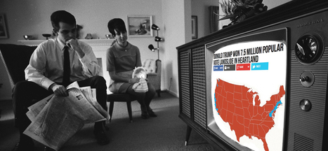
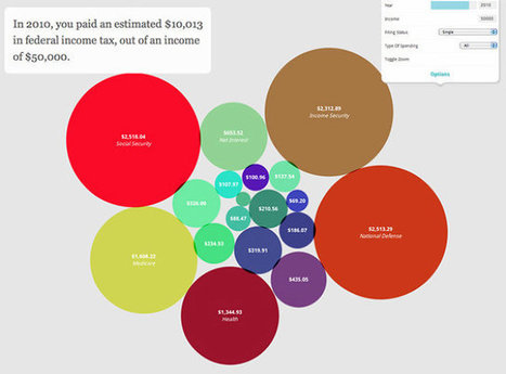
For the most part, fake news stories are still relatively crude and unsophisticated, with nothing more than text, a photo grabbed off the internet, and hyper-partisan, attention-grabbing headlines to lure clicks and shares. But fake news creators might begin to include one thing that journalists and researchers already know works to increase engagement: data visualizations. Readers Believe Data Visualizations The mere inclusion of a simple data visualization, like a chart or map, has shown to significantly increase a story’s believability, whether true or not. Researchers from Cornell University tested readers with two articles on a scientific claim, both identical except in one regard. One included a graph and the other did not. While only 68 percent of readers believed the claim in the article without a graph, nearly all –97 percent– of readers believed the same claim with the graph included. Similar effects were seen when a chemical formula was included, suggesting that the persuasive effects are based on the association of a graph with what the researchers call the “prestige of science.” The researchers conclude that “graphs signal a scientific basis for claims, which grants them greater credibility.” While their conclusions pertain to science stories in particular, it’s just one step to the applicability to news in general to infuse them with an aura of scientific backing....
What is a Graphiq Visualization?Pre-Designed: 10 billion visualizations at your fingertips Authoritative: built upon the world's deepest knowledge graph Live-updating: as the data changes, so will the visualization Embeddable: simple integration with leading content management systems Responsive: on any device and browser There are more than 10 billion visualizations in our library, from President Obama's approval rating to Apple's stock performance over time, and thousands get added every day. Graphiq Visualizations enrich editorial content, augment third-party applications, and power our own leading research sites. To find the right visualization, enter a term on Graphiq Search to see all matching results. When you've found the right visualization, copy and paste the embed code onto the page where you'd like it to appear. It's that simple....
Whether you’re looking to wow your audience at your next presentation or you are a developer looking for a practical way to visualize large sets of data, there are amazing tools out there for both parties. So many that it’s hard to find the right tool for your project.
Want to know the best part?
We made everything easy for you and prepared a series of reviews that cover all the features of the best data visualization tools out there. And we divided our reviews in two sections: data visualization tools for presentations and data visualization tools for developers.
Here are reviews of our 20 best tools for Big Data visualization....
Data can be very powerful. If you can actually understand what it's telling you, that is.
It's not easy to get clear takeaways by looking at a slew of numbers and stats. You've got to have the data presented in a logical, easy-to-understand way.
Enter data visualization. The human brain processes visual information better than it processes text -- so using charts, graphs, and design elements, data visualization can help you explain trends and stats much more easily.
But not all data visualization is created equal. (Just check out “Why Most People’s Charts and Graphs Look Like Crap” to see what I mean.)
So, how do organize data in a way that's both compelling and easy to digest? Get inspired by the following 16 examples of data visualization that communicate interesting information with both style and substance....
The best infographics are like good novels: They grab you by the collar, transport you to another world and refuse to let go until the real world steps in and gives you a rude awakening.
This is how I felt when I picked up Gareth Cook’s The Best American Infographics 2015, the third volume in a series of infographic compilations.
Like an avid reader absorbed in a gripping tale, I found myself poring over these visual stories, eager to distill the meaning contained within each of them.
From breath-taking illustrations to ingenious visualizations, these beautiful data worlds introduced me, in each case, to a reality I didn’t know existed. At first glance, they might seem like abstract eye candy, but if you take the time to delve into each of them, they can change your perspective of the world like nothing else can....
We’re literally drowning in data. Everyday, 2.5 quintillion bytes of data are created. This is the equivalent of 90% of the world’s information–created in the last two years alone. Now this is what we call “big data.”
But where does it come from? Everywhere, from sensors and social media sites to digital images and videos. We have more data than we know what to do with, so it’s time now to organize and make sense of it all.
This is where data visualization comes into the picture. In the seismic shift awaiting us, referred by some as the Industrial Revolution of Data, we have to get better and more efficient at creating innovative data visualization that make the complex easy to understand.
In the hopes of inspiring your own work, we’ve compiled 15 data visualizations that will not only blow your mind, they will also give you a clearer understanding of what makes a good visualization–and what makes a bad one....
The following infographic, created by Zhenia Vasiliev, breaks down the basics of data visualization. It shows how beginners can merge form and function, and design meaningful infographics.
Key highlights: - Analyse your data: Analysis is the key. Before we can visualize the data we need to understand it. - Come up with a story: Story is finding a single strand of meaning in an endless sea of information. It has a beginning, middle and end. - Make it visible: Visualization is a creative act of making. Making the data visually elegant evident and engaging. - Entertain to educate: Good data design need to illuminate and inform the viewer, elucidate and illustrate the facts and stats....
There have never been more technologies available to collect, examine, and render data. Here are 30 different notable pieces of data visualization software good for any designer's repertoire. They're not just powerful; they're easy to use.
In fact, most of these tools feature simple, point-and-click interfaces, and don’t require that you possess any particular coding knowledge or invest in any significant training. Let the software do the hard work for you. Your client will never know....
Tired of showcasing the same old boring tables to your management? A spice of colors and layout brings life to data representation. If you need to understand million rows of data and you are short on time. The data might be coming from different sources and you may need to compile it to get a holistic view to make a decision on it. In order to make the meaning of the information effectively,
Data Visualization is an important answer.Data Visualization is an art for visual communication which enhances the expression of data in to one collective graphic for anyone to digest and action upon....
Hundreds of tools are now available to chart, create dashboards, and better measure and manage data. They range in sophistication from “drag and drop,” plug-ins and widgets to JavaScript that is likely to involve a web developer; prices range from open source to thousands of dollars per year.
Data visualization adds a narrative element to your data, and can be a great way for a business to tell their story.
Which tools are best to tell your story?Here are 14 of the best data visualization tools. They are grouped by categories to help determine how you tell better stories with data....
This land was not our land.
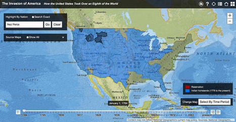
As late as 1750—some 150 years after Britain established Jamestown and fully 250 years after Europeans first set foot in the continent—[Native Americans] constituted a majority of the population in North America, a fact not adequately reflected in textbooks," Claudio Saunt writes in an accompanying article. "Even a century later, in 1850, they still retained formal possession of much of the western half of the continent."
With Saunt's map, you can watch the shift occur. Each part is clickable, with information on the treaties that were used to negotiate cessions available via links in pop-up boxes. You can also search for a location or any Native American nation, such as Cherokee or Sioux, to see the land they once possessed. Color coding distinguishes between native lands (blue) and reservations (orange). The latter have dwindled significantly since their creation....
You could sift through piles of dense data sets in an attempt to understand the trends and discoveries that emerged in history, psychology, current events, and even fictional dragons in 2014. Or you could look at these infographics, which visualize otherwise overwhelming data as beautiful charts, graphs, and maps.
Co.Design's Infographic of the Day series regularly showcases the best in data visualization, and this past year saw many stellar examples of the power of the well-designed visualization to illuminate information about nearly any subject, from the serious (the daily activities of Congress) to the frivolous (a visual compendium of the world's best dogs).
We couldn't resist promoting Co.Design's own in-house data visualizations: the Great Wheel of Food Mashups and a map of each U.S. state's weirdest eating patterns (we're a bit food-fixated, apparently). Here, our favorite infographics from the past year.
Months back we came up with the superb collection of nice, visually appealing infographics (Creative Infographics for Designers and Developers) witnessing which designers and developers would easily relate as each one of them was visual graphics talking about designers and developers.Here is our latest compilation 40 creative infographics for designers and developers. Hit a jump to take the glimpse of each....
|
It’s expected that only 6% of all data (read: information) comes from books and printed materials – the other 94% is digital. 90% of all data has been created and stored digitally within just the past 3 years, which is striking considering human recordkeeping dates back thousands of years! To top that off, we’re generating about 2.5 quintillion bytes of data daily, which just adds to the amount of data we have available to us. But the question is – what do we do with the data we collect? Many people (entrepreneurs, business owners, and data scientists) are beginning to visualize it....
Not a web designer or developer? You may prefer free tools for creating infographics.
As author, data journalist and information designer David McCandless said in his TED talk: “By visualizing information, we turn it into a landscape that you can explore with your eyes, a sort of information map. And when you’re lost in information, an information map is kind of useful.”
There are many different ways of telling a story, but everything starts with an idea. So to help you get started we’ve rounded up some of the most awesome data visualization tools available on the web....
An infographic illustrating sufferers of infectious diseases by state took the top prize at the 2015 Kantar Information is Beautiful Awards.
Launched four years ago by data visualizer David McCandless, author ofInformation is Beautiful, and Kantar creative director Aziz Cami, the Kantar Information is Beautiful Awards is a platform to promote global best practice for a nascent design form that is now big business.
This year’s other Gold Winners include:Dear Data, an experiment in creating and sending data visualizations relating to life as it happens around us using analogue instead of digital means, by Giorgia Lupi and Stefanie Posavec won Gold in the Data Visualization Project category....
Data presentation should be elegant, detailed and beautiful. There are different ways to show the data that can be a pie charts, tables, histograms, and bar graph. However, to send a clear and effective message to your readers, you just need more than just a simple table or histogram, etc.
There are some data visualization techniques that present your data much better than expected, intelligent, beautiful, original and in an excellent way. We have gathered some of the most attractive and unique ideas of data visualization examples....
The success of infographics has evolved since that time. Just a few years ago, infographics became extremely popular with the eruption of digital marketing and search engine optimization.
With their popularity came several changes in the way they were presented. Only the best of the best were shared on social media, resulting in higher brand awareness and consumer engagement.
As the traditional infographic evolved to keep up with consumers’ changing tastes, it brought the world the interactive infographic, which is becoming the most sought after form of data representation to date, even rendering some static infographics as outdated and irrelevant.
To help you stay ahead of the game with your graphic design and create an infographic with the potential to go viral, take a look at this list of awesome interactive infographics....
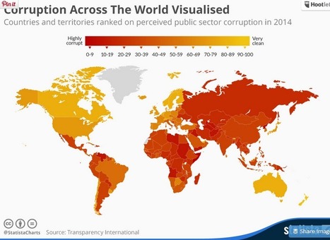
Poorly equipped schools, counterfit medicine and elections decided by bribes are just some of the consequences of public sector corruption. According to Transparency International, nowhere on earth is deemed totally free of corruption. Somalia and North Korea in particular stand out on this map - both scored only 8 out of a potential perfect score of 100. Denmark, New Zealand, Finland and Sweden were rated the least corrupt nations worldwide, according to Transparency International....
Blogging is one of the oldest tricks journalists have utilized on the Web to express their opinions and ideas. Even though social networks have been strong competitors, blogs have managed to survive. Are there any good data journalism blogs on the internet? The answer is yes. Here, we give you a list of the blogs you should keep up with in the data realm.
Not a web designer or developer? You may prefer free tools for creating infographics.
As author, data journalist and information designer David McCandless said in his TED talk: “By visualizing information, we turn it into a landscape that you can explore with your eyes, a sort of information map. And when you’re lost in information, an information map is kind of useful.”
There are many different ways of telling a story, but everything starts with an idea. So to help you get started we’ve rounded up some of the most awesome data visualization tools available on the web....
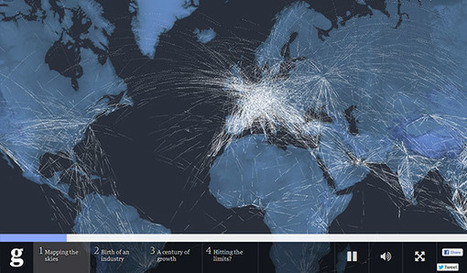
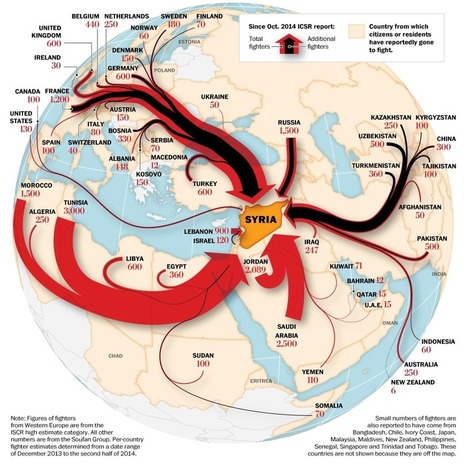
This fascinating data visualisation by @washingtonpost.shows the origin of where fighters have come from and raises some intriguing questions.
It's always tough to pick my favorite visualization projects. I mean, it's a challenge to pick and rank your favorite anything really. So much depends on what you feel like at the time, and there's a lot of good work out there. Nevertheless, I gave it a go.
These are my favorites for the year, roughly in order of favorite on down and based on use of data, design, and being useful. Mostly though, my picks are based on gut.
One unintentional theme: All of my picks are interactive or animated or both. Telling for where we're headed, I guess....
We live in an age of Big: Big Computers, Big Data, and Big Lies.
Faced with an unprecedented torrent of information, data scientists have turned to the visual arts to make sense of big data. The result of this unlikely marriage—often called "data visualizations" or "infographics"—has repeatedly provided us with new and insightful perspectives on the world around us.
However, time and time again we have seen that data visualizations can easily be manipulated to lie. By misrepresenting, altering, or faking the data they visualize, data scientists can twist public opinion to their benefit and even profit at our expense.
We have a natural tendency to trust images more than text. As a result, we’re easily fooled by data visualizations. But fortunately, there are three easy steps we can follow to save ourselves from getting duped in the data deluge....
Given the popularity and effectiveness of visual content for marketing, it's no surprise that today's marketers are creating more and more infographics. They're a more enjoyable way of digesting statistics, data sets, and timelines, and they can drive more traffic and engagement than plain text.
Even though there are a lot of good infographics out there, there are still a ton of bad infographics out there, too. You usually know one when you see one: Either it's jam-packed with information, or it hardly shows any useful information at all. Sometimes it's loud with clashing colors; other times, it's plain and boring.
But "knowing it when you see it" doesn't help you prevent from making a bad infographic. Here to dissect what a bad infographic looks like is an infographic from Vertical Measures. Check it out below.
|


This is a powerful post. It shows the power of visuals in content and points to the future risk of fake data visualizations in news, politics and communication. Recommended reading! 10/10