Public Relations & Social Marketing Insight
443.4K views | +2 today
Follow
Public Relations & Social Marketing Insight
Social marketing, PR insight & thought leadership - from The PR Coach
Curated by Jeff Domansky
Your new post is loading...
Scooped by Jeff Domansky
Scoop.it!

7 Amazing Data Journalism Blogs you Should Read | Infogr.am

7 Amazing Data Journalism Blogs you Should Read | Infogr.am | Public Relations & Social Marketing Insight | Scoop.it
Blogging is one of the oldest tricks journalists have utilized on the Web to express their opinions and ideas. Even though social networks have been strong competitors, blogs have managed to survive. Are there any good data journalism blogs on the internet? The answer is yes. Here, we give you a list of the blogs you should keep up with in the data realm.
Jeff Domansky's insight:
Terrific resources for tips on data storytelling and marketing.
No comment yet.
Scooped by Jeff Domansky
Scoop.it!

Meet Dadaviz: Curated, YouTube-Style Distribution Platform for Data Visualizations

Meet Dadaviz: Curated, YouTube-Style Distribution Platform for Data Visualizations | Public Relations & Social Marketing Insight | Scoop.it

“If I read news without dataviz I get a bit nauseous, I don’t have patience for words alone anymore. Nor infographics”. This helps explain why marketing expert and consultant León Markovitz co-founded Dadaviz, nicknamed by some as “the YouTube of data visualizations“. Online since June 11th, it’s a collection of the best dataviz selected from different sources by an invite-only community.


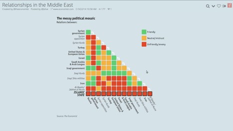
Want to learn the Who’s Who of political relationships in the Middle East, what’s the average commute time in the U.S. or where do the visitors of the Oktoberfest come from? This is the place to go.


Most of the published material is “curated” from external sources (the Middle East dataviz was taken from the Economist), but there’s also a certain amount of original work. Every visualization shared on Dadaviz links to the author, original link and data source, when available, so people can find out more and get more context if they wish. If someone wants to use a dataviz, they can reach directly the creators, or type “/embed” at the end of any Dadaviz link -which gives them an embed of the image with all the attribution already in place. Or they can simply share it on social media....

Jeff Domansky's insight:

Dadaviz is an awesome resource for anyone looking to add visuals to their content, marketing or communications. Highly recommended.   9.5/10

No comment yet.
Scooped by Jeff Domansky
Scoop.it!

Silk Makes it Easier to Explore and Visualize Online Data

Silk Makes it Easier to Explore and Visualize Online Data | Public Relations & Social Marketing Insight | Scoop.it

Silk is a beautiful website building platform for people who want to create and manage a specialized database online. Now, it’s rolling out a new ‘Explore’ page format so that visitors can easily search and filter the information that they’ve published online.


When you hit the Explore tab on the homepage of any website built using Silk, you’ll see the new design shown below. By selecting the Filter button at the top, you can start setting new filters based on the categories, fields or values that the creator has defined for each entry in their directory....

Jeff Domansky's insight:

Silk is a cool tool for blogging and data visualisation and it allows visitors to search and filter through large amounts of data on a site.

No comment yet.
Scooped by Jeff Domansky
Scoop.it!

What Does Big Data Look Like? Visualization Is Key for Humans | Innovation Insights | Wired.com

What Does Big Data Look Like? Visualization Is Key for Humans | Innovation Insights | Wired.com | Public Relations & Social Marketing Insight | Scoop.it

One of the most valuable means through which to make sense of big data, and thus make it more approachable to most people, is through data visualization. Data visualization is wayfinding, both literally, like the street signs that direct you to a highway, and figuratively, where colors, size, or position of abstract elements convey information. In either sense, the visual, when correctly aligned, can offer a shorter route to help guide decision making and become a tool to convey information critical in all data analysis. However, to be truly actionable, data visualizations should contain the right amount of interactivity. They have to be well designed, easy to use, understandable, meaningful, and approachable....

Jeff Domansky's insight:

Data visualisation will help readers get the picture big data.

Chris Farrance's curator insight, January 12, 2014 3:24 AM

I see big data as being at the crossroads of the art and science of building a growing and sustainable business in today's global marketplace.

Scooped by Jeff Domansky
Scoop.it!

The 37 best tools for data visualization

The 37 best tools for data visualization | Public Relations & Social Marketing Insight | Scoop.it

Not a web designer or developer? You may prefer free tools for creating infographics.


As author, data journalist and information designer David McCandless said in his TED talk: “By visualizing information, we turn it into a landscape that you can explore with your eyes, a sort of information map. And when you’re lost in information, an information map is kind of useful.”


There are many different ways of telling a story, but everything starts with an idea. So to help you get started we’ve rounded up some of the most awesome data visualization tools available on the web....

Jeff Domansky's insight:

This great list of valuable data visualization tools is recommended reading. 9/10

Winners Education's curator insight, March 26, 2015 12:24 PM

Adressing the visula part of the learning brain with easy-to-use, web-dased tools 

Vinicius Vinny Araujo's curator insight, April 17, 2015 12:55 AM

#data

Nora Morton's curator insight, April 22, 2015 6:23 PM

Colorful charts/graphs/maps are my type of eye candy!  This site illustrates the vast ways you can visually present data.  Among the many: iChart, Polymaps, Google Charts, Many Eyes, Leaflet, Exhibit, and Zing Chart. 

Scooped by Jeff Domansky
Scoop.it!

30 thought leaders in Data Visualization | Big Data Made Simple

30 thought leaders in Data Visualization | Big Data Made Simple | Public Relations & Social Marketing Insight | Scoop.it
This list of top 30 thought leaders in Data Visualization is based on recommendations and opinions by visualization experts in various social media channels. The names are listed alphabetically....
Jeff Domansky's insight:
Searching for big data visualization best practices and ideas? Here's a great place to start.
No comment yet.
Scooped by Jeff Domansky
Scoop.it!

The State of Information Visualization, 2014

The State of Information Visualization, 2014 | Public Relations & Social Marketing Insight | Scoop.it

2013 was another exciting year for visualization. Between many new developments in data storytelling, a new wave of news graphics, new visualization blogs, better automated infographics, and visuals designed to hit you hard, it is difficult to decide what was most important. Here is a look back, and some ideas about where we’re going....

Jeff Domansky's insight:

Robert Korsara's excellent overview of data storytelling and visualization is a must read for content marketers, bloggers, PR and marketing pros.

laura mata's curator insight, January 19, 2014 11:56 AM

Presentación y análisis, entender las diferencias permite establecer buenos criterios de presentación y narración