 Your new post is loading...
What is a Graphiq Visualization?Pre-Designed: 10 billion visualizations at your fingertips Authoritative: built upon the world's deepest knowledge graph Live-updating: as the data changes, so will the visualization Embeddable: simple integration with leading content management systems Responsive: on any device and browser There are more than 10 billion visualizations in our library, from President Obama's approval rating to Apple's stock performance over time, and thousands get added every day. Graphiq Visualizations enrich editorial content, augment third-party applications, and power our own leading research sites. To find the right visualization, enter a term on Graphiq Search to see all matching results. When you've found the right visualization, copy and paste the embed code onto the page where you'd like it to appear. It's that simple....
Not a web designer or developer? You may prefer free tools for creating infographics.
As author, data journalist and information designer David McCandless said in his TED talk: “By visualizing information, we turn it into a landscape that you can explore with your eyes, a sort of information map. And when you’re lost in information, an information map is kind of useful.”
There are many different ways of telling a story, but everything starts with an idea. So to help you get started we’ve rounded up some of the most awesome data visualization tools available on the web....
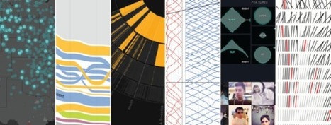
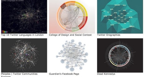
It's always tough to pick my favorite visualization projects. I mean, it's a challenge to pick and rank your favorite anything really. So much depends on what you feel like at the time, and there's a lot of good work out there. Nevertheless, I gave it a go.
These are my favorites for the year, roughly in order of favorite on down and based on use of data, design, and being useful. Mostly though, my picks are based on gut.
One unintentional theme: All of my picks are interactive or animated or both. Telling for where we're headed, I guess....
Months back we came up with the superb collection of nice, visually appealing infographics (Creative Infographics for Designers and Developers) witnessing which designers and developers would easily relate as each one of them was visual graphics talking about designers and developers.Here is our latest compilation 40 creative infographics for designers and developers. Hit a jump to take the glimpse of each....
Every designer knows the problem: where to look for inspiration and new forms of visualization? As available data and visualization tools evolve, this question is becoming increasingly relevant for data journalists as well. Shall we choose a bar chart or a map? What are the best practices out there? Who has done what already? These five data visualization catalogs feature and categorize the best projects out there...
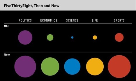
FiveThirtyEight is a data journalism organization. Let me explain what we mean by that, and why we think the intersection of data and journalism is so important.
If you’re a casual reader of FiveThirtyEight, you may associate us with election forecasting, and in particular with the 2012 presidential election, when our election model “called” 50 out of 50 states right.
Certainly we had a good night. But this was and remains a tremendously overrated accomplishment....
The other reason I say our election forecasts were overrated is because they didn’t represent the totality, or even the most important part, of our journalism at FiveThirtyEight. We also covered topics ranging from the increasing acceptance of gay marriage to the election of the new pope, along with subjects in sports, science, lifestyle and economics. Relatively little of this coverage entailed making predictions. Instead, it usually involved more preliminary steps in the data journalism process: collecting data, organizing data, exploring data for meaningful relationships, and so forth.
Data journalists have the potential to add value in each of these ways, just as other types of journalists can add value by gathering evidence and writing stories....
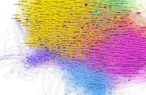
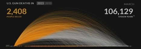
2013 was another exciting year for visualization. Between many new developments in data storytelling, a new wave of news graphics, new visualization blogs, better automated infographics, and visuals designed to hit you hard, it is difficult to decide what was most important. Here is a look back, and some ideas about where we’re going....
Our goal as savvy email marketers is to look beyond the lure of the one-time conversion and strive to build an ongoing relationship between consumers and our brands. Why is this goal so important? Because it’s been proven through many a marketing study that engaged customers become loyal customers and loyal customers are the most valuable segment in any list or database. This type of highly engaged, loyal customer typically has higher overall lifetime value than the casual consumer. They’re also more likely to be an evangelist, introducing new customers to your brand in a very personal way and building the next layer of loyal customers. But, how can you help to build a stronger bond with your customer base? In my last article, I outlined ways to stimulate an unengaged audience by increasing the relevancy of your email creative by including more dynamic content. Sharing relevant content demonstrates to customers that we know them as individuals and are dedicated to providing them with useful information, products or services. Using historical and behavior data is a great way to present content that’s tailored to their individual needs and preferences, but you also need to engage with your audience on an emotional level in order to achieve the goal of creating a true brand-loyal customer.... Let’s explore four creative ways in which email marketers have used data as a platform to build creative that forms a bond between their customers and their brand....
Over the past year, I’ve been investigating data journalism. In that work, I’ve found no better source for understanding the who, where, what, how and why of what’s happening in this area than the journalists who are using and even building the tools needed to make sense of the exabyte age. Yesterday, I hosted a Google Hangout with several notable practitioners of data journalism. Video of the discussion is embedded below: Over the course of the discussion, we talked about what data journalism is, how journalists are using it, the importance of storytelling, ethics, the role of open source and “showing your work” and much more....
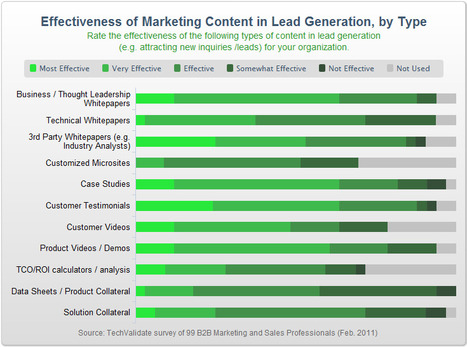
In today’s “content-age,” the creation of data is as simple as hitting “submit” on a blog entry or uploading a video to YouTube – anyone can do it, and practically everyone is doing it, causing content growth to increase at astonishing rates. In fact, just last year, there was enough digital data created to fill a stack of DVDs that would stretch all the way to the moon and back! In light of this, companies are realizing the importance of creating increasingly strong and engaging content that will rise above the waffle and hopefully have some kind of tangible impact. But what kind of content are companies finding most impactful?...
|
We’re literally drowning in data. Everyday, 2.5 quintillion bytes of data are created. This is the equivalent of 90% of the world’s information–created in the last two years alone. Now this is what we call “big data.”
But where does it come from? Everywhere, from sensors and social media sites to digital images and videos. We have more data than we know what to do with, so it’s time now to organize and make sense of it all.
This is where data visualization comes into the picture. In the seismic shift awaiting us, referred by some as the Industrial Revolution of Data, we have to get better and more efficient at creating innovative data visualization that make the complex easy to understand.
In the hopes of inspiring your own work, we’ve compiled 15 data visualizations that will not only blow your mind, they will also give you a clearer understanding of what makes a good visualization–and what makes a bad one....
Tired of showcasing the same old boring tables to your management? A spice of colors and layout brings life to data representation. If you need to understand million rows of data and you are short on time. The data might be coming from different sources and you may need to compile it to get a holistic view to make a decision on it. In order to make the meaning of the information effectively,
Data Visualization is an important answer.Data Visualization is an art for visual communication which enhances the expression of data in to one collective graphic for anyone to digest and action upon....
We live in an age of Big: Big Computers, Big Data, and Big Lies.
Faced with an unprecedented torrent of information, data scientists have turned to the visual arts to make sense of big data. The result of this unlikely marriage—often called "data visualizations" or "infographics"—has repeatedly provided us with new and insightful perspectives on the world around us.
However, time and time again we have seen that data visualizations can easily be manipulated to lie. By misrepresenting, altering, or faking the data they visualize, data scientists can twist public opinion to their benefit and even profit at our expense.
We have a natural tendency to trust images more than text. As a result, we’re easily fooled by data visualizations. But fortunately, there are three easy steps we can follow to save ourselves from getting duped in the data deluge....
In a recent article on Vox, Ezra Klein declared that his generation of Washington journalists had discovered political science, and it is like the hottest thing on wheels. In the old days, he writes, journalists “dealt with political science episodically and condescendingly.” But now, Klein declares, “Washington is listening to political scientists, in large part because it’s stopped trusting itself.” Klein finds that political scientists give better answers to his questions than politicians themselves, because politicians are evasive but scientists are scientists, you know, they deal in “structural explanations” for political events. So the “young political journalists” who are roaring around town in their white lab coats frightening the local bourgeoisie “know a lot more about political science and how to use it” than their elders did.
Hence Klein’s title: “How Political Science Conquered Washington.”
Nearly every aspect of this argument annoyed me. To suggest, for starters, that people in Washington are—or were, until recently—ignorant or contemptuous of academic expertise is like saying the people of Tulsa have not yet heard about this amazing stuff called oil. Not only does Washington routinely fill the No. 1 spot on those “most educated cities” articles, but the town positively seethes with academic experts. Indeed, it is the only city I know of that actually boasts a sizable population of fake experts, handing out free-market wisdom to passers-by from their subsidized seats at Cato and Heritage....
Storytelling with data is having its moment in the journalism world. After leaving The New York Times last year, Nate Silver has launched his new data journalism venture with ESPN, former Washington Post blogger and columnist Ezra Klein is expanding his chart-filled approach beyond public policy at Vox.com, and both the Times and the Post are starting their own data-driven sites to replace their departed stars.
While none of these ventures rely solely on charts and data to serve readers, The Post’s is explicitly betting that data on its own isn’t enough. Its forthcoming policy-focused website is premised on the notion that data and narrative go best together. The lesson for anyone looking to communicate or persuade using data is that the addition of human drama goes a long way....
Silk is a beautiful website building platform for people who want to create and manage a specialized database online. Now, it’s rolling out a new ‘Explore’ page format so that visitors can easily search and filter the information that they’ve published online.
When you hit the Explore tab on the homepage of any website built using Silk, you’ll see the new design shown below. By selecting the Filter button at the top, you can start setting new filters based on the categories, fields or values that the creator has defined for each entry in their directory....
Over 300 applications from all over the world, and the winners were just announced
The Data Journalism Awards (DJA) is the prime international competition recognizing outstanding work in the field of data journalism. Sponsored by Google, the DJA 2013 received over 300 applications from all over the world, ranging from major media groups, regional newspapers, and research groups, and the winners were just announced at the award ceremony held at the Global Editors Network News Summit.
This year, the DTJ had four categories: Data-driven investigative journalism, Data-driven applications, Storytelling with data, and Data journalism website or section, as well as a special “Public Choice Award”. And here are the winners, as they were announced on Twitter by the organization (@EditorsNet)...
When we think of traditional news gatherers, we might conjure up the image of an obstreperous character brazenly hassling a slimy official for the real story -- or hovering paparazzi harassing a poor celebrity innocently shopping for handbags... ...Today, your jaded, hard-drinking, courtroom-loitering newsman could just as well be represented on the silver-screen by an enthusiastic bookworm-like computer geek. This is thanks to a new form of reporting known as "data journalism." Data journalism crept into modern media through the back door. You may not even have noticed. ...Even if it's not neatly stored in databases, it's often regurgitated into paper-based or PDF reports that can be accessed, sometimes through Freedom of Information Act requests. The data can then be cleaned, scanned, and converted into organized databases. Then it can be sorted into usable intelligence about a particular subject, limited only by the analyst's -- or data journalist's -- creativity....
Data editor Reg Chua wants the company to rethink what the news story looks like (and how it's delivered). A fascinating read for media watchers...
|


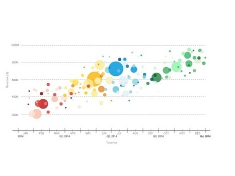


Access more than 10 billion authoritative, live-updating, and embeddable Graphiq Visualizations. Free.