 Your new post is loading...
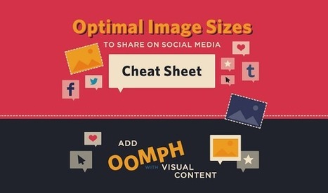
When it comes to social media, it’s a pretty well-known fact that images automatically do well. Users are attracted to visuals much more than they are plain text. However, sharing an image that isn’t the right size can be terrible for you or your brand.
SurePayroll has created an infographic (featured below), giving you the inside scoop on making sure your image is perfect, no matter where you choose to share it.
From Twitter and Facebook, to Pinterest and Tumblr, this infographic has guidelines for getting your image sizing right on the seven most popular social media sites. The next time you have an image you’d like to share, double check the size before posting to ensure that your picture isn’t too big – or too small – to make an impact....
Using the WYSIWYG Website Builders has manifold advantages. Here we have listed down a few of them, to help you understand the benefits of depending on these website building applications.
1. These are easy, do-it-yourself website creating methods. Anybody with basic internet and computer skills can design a professional looking website using these readymade template designs. No longer do you have to depend on professional coders or website developers in case you want to create the perfect website for your business.
2. For those of you with dynamic websites such as a blog or an article directory, WYSIWYG editors are the way to go. External users can also easily use these editors to easily enter and modify their content, leading to better and more effective online interaction and participation....
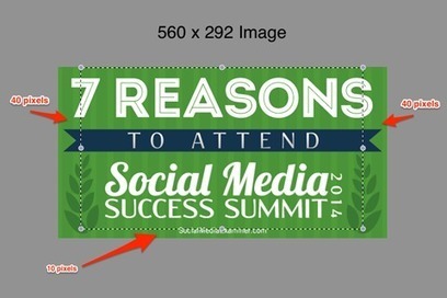
Do your images look good on all social platforms?
Are you making different images for each type of social share?
Creating one image that looks good on several networks saves time, money and improves your visibility.
In this article you’ll discover how to create one image to share across three social channels–Facebook, Twitter and LinkedIn....
By combining scientific studies on color with some design principles, you can create a great call-to-action button for your website and improve its conversion rate drastically.
A CTA-button has 4 important tools to achieve this: placement,shape (and size), message and color. In this article I will talk about the aspect of color. But first things first…
Responsive web design is the process of creating websites that provide an optimal viewing experience across a wide range of devices, including mobile.
...Responsive web design is vital for businesses in 2014. As of May 2013, 63% of adult cell owners use their phones to go online. Mobile browsing is expected to outpace desktop-based access within three to five years. It’s important for your website to be accessible to these people, and it’s impossible to do so it if your website looks jumbled, tiny and impossible to read on an iPhone ...
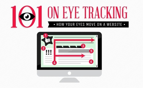
At EyeQuant, we do a lot of eye-tracking as part of our mission to teach computers to see the web like humans do. The main purpose of our studies is to find the statistical patterns that power our attention models (which you can use to instantly test your websites!)
Today, we’re sharing 3 of the most surprising insights we found. A lot of you have asked us about general rules of thumb around what drives (and doesn’t drive) attention – in this post you’ll learn why rules of thumb are difficult to establish and how a lot of the common ideas we have about human attention are more complicated than they seem. In fact, what you’re about to read is going to be rather surprising and we’re hoping to dispel some common myths about attention and web design with data. :)...
If you're a small business owner and you run your own website with Wordpress, check out this list of common errors and how to avoid them.Wordpress has made it easy for anybody to set up a site and blog, but there are a number of pitfalls that you can easily avoid by following these tips!
If you’re looking for examples of niche, it’s difficult to imagine a slimmer area of focus than one page websites. It sounds obvious, but you’re building a site for an audience — so why wouldn’t you consider their experience and ways to communicate with them?
Hope explained that he personally contacted the teams behind the first 500 sites he found to let them know they’d been featured and ask if they thought their work had been presented in the best way possible.
They then visited his site and shared the fact that they’d been featured with their followers on social media, forming the foundation of One Page Love’s own following. When they asked if he could make an award banner for their own sites so they could show thatthey’d been featured, he did it — now they’re passively sending him traffic.
Hope suggested that you focus on your users’ experience – don’t make them jump through hoops to find the content, enter a gallery, or navigate around. Don’t have unnecessary clutter, ugly ads or, as he puts it a “social Christmas tree of sharing buttons” if they don’t add any value. Make it easy for visitors to follow you and subscribe to your site, and try out new features often to see what works best for them...
Takeaway.
Done right, your blog introduces you to your audience so they will WANT to do business with you.
Your small business blog and website are tools. Done right, your blog introduces you to your audience so they will want to do business with you.
Set the foundation and make it easy for your audience to make the buying decision. You can do that by giving them the information they need in well-crafted pages that tell a story and set you apart....
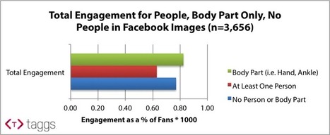
Marketers often spend hours selecting and producing visual content to post on Facebook brand pages. Creatives, strategists, and managers can go round-and-around debating which images work and which don’t for a brand. Sometimes they debate over whether or not the brand should show people in brand images, and everyone has their differing opinions.
At Taggs, we decided to bring data to help settle the debate – Do people pictured in brand images help or hurt Facebook engagement?
...One of the latest trends (or fads..depending on how you look at it) to come about within the past few years is the “single page” or “one page” website.
What is a Single Page Website? A single page website is comprised of a single HTML or dynamically generated page with a horizontal navigation that leads you to different sections of the page instead of your traditional navigation buttons that when clicked would take you to a new page. The user just scrolls down the one page to that particular content’s section or clicks a link and “jumps” to the correct section. The effect is pretty cool, kind of like being on an elevator and whizzing past the other site sections to arrive at your destination....
Back in January we showed you some Creative Techniques for Single-Page Websites, and since the single page design trend is getting more and more attention from designers, today we decided to show you some inspiring examples of websites that have all their content in a single page....
|
Accelerate positive outcomes with premium WordPress themes. As long as you work with the right ones, these themes can help you create E-commerce, business, portfolio, blog and event pages. It’s a lot better and a lot faster than designing websites from ground up. So, join me in unveiling a dozen or so accomplished themes that really make the grade in 2015....
Single page designs can be an excellent technique for tackling smaller websites, even those that you might not think could ever be done without multiple pages. There are tons of great reasons for using a single page site, from ease of maintenance to reduced bandwidth needs.
If you’re tackling a shorter site, one that would normally have a handful of pages, consider using a single page, and see if it will make the project easier and more user friendly. Read on for more information on the benefits, when (and when not) to use them, and some best practices you should follow....
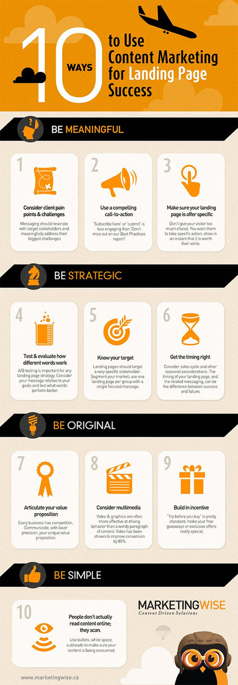
The success of your landing pages will largely be determined by the information your present to your visitors. A load of hard to read paragraphs of text about nothing in particular probably isn’t going to have the desired effect.
To make your content work harder for you and to start converting more visitors into customers follow the 10 tips in this infographic from Marketing Wise....
Creating a successful website involves more than just a visually appealing design. The most effective websites create a satisfying user experience based on how consumers track and read the information on the page.
French company founded in 2012, has just launched an all-in-one website creation platform that allows users to build and launch sites that automatically adapt to a range of devices without needing to know any code at all.
While drag-and-drop website tools are nothing new, they often take a bit of manual tweaking – or you later find that a subsequent update has broken part of the site, or certain elements don’t play nicely together. Pikock claims, however, that it doesn’t just focus on being easy to use.....
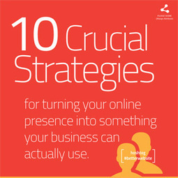
Is your business website really built to generate leads... or is it just an expensive, online version of your company's brochure?
... In the short e-book this infographic is based upon, I share 10 of the most important strategies with you. These aren't just concepts or techniques that we’ve dreamed up over coffee, but proven tactics we've used again and again to produce extraordinary results. What kinds of results am I talking about? A 500% increase in new leads over a six-month time period hasn't been unusual, once we get all the components in place and working in harmony.It's just as important to note that these don't just create new sales opportunities, but potentially better ones, with more lifetime value from each account.
That's because, when new buyers are voluntarily coming to you for answers and requesting information from your company rather than responding to your sales or advertising efforts, the relationship starts off on a significantly better foot. There is more trust on both sides, with fewer negotiations over price, making it easier for a healthy long-term partnership to develop....
Is your homepage cluttered with funky features that actually undermine its effectiveness? Get ready to dump the junk and enjoy the results!
We are all on a quest for a great homepage that represents our brand and serves our goals.
Unfortunately, we fall into the trap of overcrowding our home pages with features and elements that drive visitors away.Here are 5 major homepage mistakes that we all see everyday – and some tips on how you can easily avoid them...
So often, small business owners come across this issue…they build the website, optimize the content and wonder why they don’t have droves of clients visiting the site.
Or worse, they build a website knowing that the only traffic they’re likely to attract is from current clients who refer their friends; making their website nothing more than a very expensive business card.Online marketing can be a boon to your business if you know how to work it.In this post, I’m going to give you the secret sauce to making your website a lead and capture center, not just a billboard of your services...
Today’s websites have changed when compared to those of even three years ago. Advancements in technology combined with wiser consumers have made closing sales harder for those businesses stuck in a more traditional marketing mindset. For instance, a recent study concluded that before the consumer picks up the phone to talk to a sales person, they're already 57% through the buying cycle. Every business needs to start paying attention to how the buying process has changed.
What does this mean, practically? This means that we have to become the authority in our space, and provide relevant, helpful information to delight our prospects and guide them to become customers and evangelists. If we don't, we risk losing the race with our competitors.
Many businesses get caught up in the "look" of a website design or redesign, but we find that almost all of our clients need to pay more attention to “how inbound their website is.” For this to be achieved, we always ensure we've hit these 8 key steps that result in good inbound website design. We recommend to always check for the following to transition over to an inbound-friendly website....
Complete guide to auditing the content of a site, including a spreadsheet content audit template that puts data into perspective for better analysis....You can spend a few hours perusing the site, reading some product descriptions and blog posts, and form an opinion based on what stood out to you. But a loosely structured audit won’t give you the whole picture. To really understand the quality of the entire site, you need to assess each page* on the site with standard metrics, so that they can be combined to describe the site as a whole....
The crystal clear message: Creating good content results in good residual traffic, sometimes known as the long tail. When traffic is purchased (think adwords) or pushed via social networks and social bookmarking sites (think referral traffic from other sites) traffic will come as long as it is pushed, driven. But when the buying and pushing stops, so does the traffic. Not so with good content that is on topic and created at the home site. It’s the content that keeps on giving, um, pulling. Content marketing is inbound marketing. And it can’t be beat long term....
|


![Starting a website? Tips on going niche, working smart and growing fast [WCCT] | Public Relations & Social Marketing Insight | Scoop.it](https://img.scoop.it/4TpVOxjwv_F9OS5pp7yvEDl72eJkfbmt4t8yenImKBVvK0kTmF0xjctABnaLJIm9)


Where was this when I needed it and was taking screenshots of websites and Photoshopping to get it JUST RIGHT? Sheesh!
But srsly, this is helpful.
I rely on stock image websites to give me great graphics quickly. It enhances the overall appearance of our district social media pages.