 Your new post is loading...
Incorporating the use of infographics into your content marketing is a great way to boost social media engagement, conversions, and your brand’s credibility as an information source. However, it’s not a “magic bullet” that can be implemented with no strategy whatsoever.
Remember that customers, influencers, and competitors will judge your brand quality by the kind of visual content you publish. Apart from understanding the different types of infographics, you also need to know the essential parts that make an infographic shareworthy. You also need to execute a well-planned promotion strategy to fully leverage the infographic.
Of course, hiring an infographic design specialist and a content marketing expert for promotion purposes is one way to go. But if you have a DIY-style infographic strategy here are the components you shouldn’t forget:
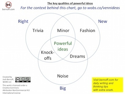
A good infographic is a graphical story. It basically says “Here is a quick way to understand something important.” If it is a story about something that people care about, it will spread. Here’s what happens in the reader’s mind when they see an infographic worth spreading: “What’s this? Oh, it’s about [topic I care about]. Wow, this is everything I agree with in one place. It explains it so simply. I’m going to print this out/post this on Facebook/email it to the whole department, because maybe then people will understand.” Unless you can imagine a lot of readers saying something like this, you’ve probably got the wrong topic for an infographic....
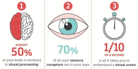
Think back to your first memory: Can you still see the watermelon pink dress you wore? Do you remember the unique checkered pattern of your father's jacket?
Our memories are often linked to visual and sensory elements, while the words spoken or read can be more hazy. That's because our brains have a high capacity for storing visuals in our long-term memory, while text enters our working memory, which is limited.
This contributes to why infographics and the inclusion of visual content in online information has been so successful. Readers crave visual breaks from the overload of text-based information that floods our daily browsing and work-related activities.
NeoMam Studios studied how people process visual information, how visuals affect the way we read, and why graphics are so appealing. Discover the science behind why our brains crave infographics....
Do you want to improve the quality of the infographics you create? Want more people to share and link to your work?
Infographics are a great way of showing the world (especially Google) that you’re an expert in your field, but only if the design is of a sufficient standard. Graphics that are hard to read or poorly designed simply won’t generate the desired results.
For help improving your infographic design skills take a read of this infographic from Venngage....
Data presentation should be elegant, detailed and beautiful. There are different ways to show the data that can be a pie charts, tables, histograms, and bar graph. However, to send a clear and effective message to your readers, you just need more than just a simple table or histogram, etc.
There are some data visualization techniques that present your data much better than expected, intelligent, beautiful, original and in an excellent way. We have gathered some of the most attractive and unique ideas of data visualization examples....
Do you want to make your infographics iconic? Okay, so we don’t mean “iconic” in the usual sense. We mean using icons in your infographic design. Icons are those little illustrative graphic images/clip art that represent an object, action or idea. They are often stylized and simplified designs. N
Using icons can make your infographic design more cohesive and more professional. With Venngage you can choose from over 10,000 icons in our icon library and stylize them to your preference by editing their colors, sizes and positions. Here are some tips for how to use icons in your infographics....
How much more memorable are visuals compared to text?
One oft-referenced answer is that people remember visuals 6 times better than text—an answer referenced in Buffer’s article on the anatomy of a perfect blog post and an answer that led to a lot of great discussion. After reviewing the original research, it’s clear that pictures are more memorable than words. So the next question became:
People remember visuals better than text. But which visuals exactly?
I’ve spent some time collecting the best research and science on pictures, images, infographics, and more, and I’m excited to share with you what I’ve found—along with some specific ways to use these insights in your marketing!
Infographics have become the design darling of visual marketing.
It’s no wonder organizations and individuals are taking advantage of them as a communication tool. We’ve scoured the web to compile a collection of 45 inspiring infographics that show what’s possible in this design category. Browse through them to get some ideas for your next project....
Creativity and great ideas can be dosed in a masterly way of aninfographic. Those 14 infographics is proof of that. They are tremendously useful information, it does so with full creativity and originality. Although most of them are about web design, some of those is also for SEO professionals or graphic designers themselves. I recommend you take a look at them because from the visual and composition view are very well developed....
Wouldn't it be great if creating infographics was just as simple as writing regular ole text-based blog posts? Unfortunately, the reality is that making visual content like this usually takes a lot more time, effort, and let's face it -- skill -- than the written word.
Usually.But considering the popularity and effectiveness of visual content in marketing today, you can't just afford to throw in the towel. That's why we decided to take all the pain and suffering out of infographic creation.
Seriously -- don't throw in the towel just yet. You, too, can create professional-looking, high-quality infographics ... quickly! And I'm going to prove it. First things first ...
Well, I’m here to tell you that it’s definitely possible to create some awesome infographics in any category that you choose, EVEN if you’re not a designer. In this blog post, I’m going to introduce you to three awesome tools to create the best infographics, tell you how to use them AND how you can share your infographics in different channels all over the web. So, let’s get started!..
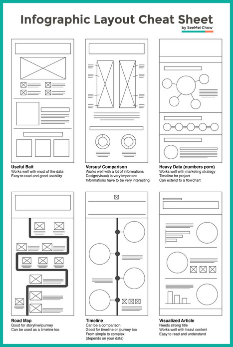
Infographic layouts refer to the arrangement of your visual elements and your content. When you begin working on a piece of infographic, you should have a story to tell hence, you will need to select a layout that best suits your story. Using the right layout will ensure good readability and convey your message well.
We have put together a cheat sheet for your quick reference to the right arrangement to use, here are six common ones you can quickly work with....
The increase in the number of easy-to-use digital tools has made the creation of infographics widely available to everyone. Social media sites allow for individual infographics to be shared and spread around the world.
Visual.ly and Piktochart are two companies that offer great platforms for creating infographics. We, at BarnRaisers, are big believers in the value of infographics for our clients. Here’s a recent one we did for the Interactive Advertising Bureau (IAB) on Eight Reasons Why Digital Advertising Works for Brands.
What makes infographics so effective. Infographics tell stories that are in sync with way we like to learn and retain information as human being.Here are 20 powerful reasons to use infographics....
|
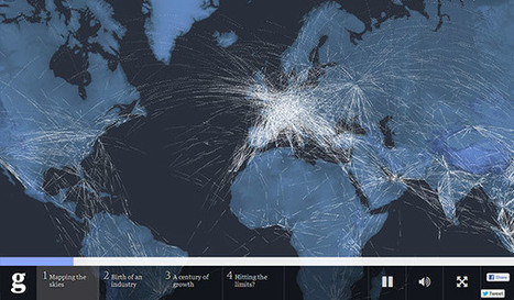
If you have a ton of data and you want to tell a good story, interactive infographics are a fantastic tool. They entice your audience to explore the content, whether it’s a data set or a guided storytelling experience, and they can provide far more information than a static infographic. So, what makes a good interactive infographic? Whether it’s super simple or incredibly complex, it comes down to good design, engaging interactivity, and an interesting subject. The options are pretty much endless. If you’re thinking about experimenting with interactive infographics or looking for some serious inspiration for your next project, we’ve rounded up our favorites. Scroll through the whole list (they’re listed, not ranked), and click on the images to visit the interactive infographic....
Infographics are used heavily in just about every niche now, and vary from deadly boring to downright amazing.
But what makes the difference between the two?
It all boils down to this: infographics go viral because they catch the attention of the audience they are intended for. If the person or organization creating the infographic doesn’t know their audience and doesn’t know what that audience wants or needs, the infographic is going to be dead in the water. Before you ever sit down to create an infographic, take a good long look at hat
Before you ever sit down to create an infographic, take a good long look at who you’re creating it for and why....
When the worlds of content and data meet, infographics are born. That means 2015 was a pretty great year.
At Visually, we don’t believe in wasting time, so we’ve pulled together all the best and brightest infographics in one place. To give the search for the best a little direction, we tried to select infographics that: - Use design to succinctly tell a story that images, data, or words couldn’t have conveyed on their ownInclude a narrative that keeps the viewer engaged (as opposed to a list of facts or data points) - Require little or no additional context to be understood - Create an emotional connection to the information that’s being shared.
Mull over these fine specimens to get fired up for some awesome content creation in 2016. Or if you want to dig deeper, check out the complete list of our staff picks from the Visually Community. You know you want to!...
Creating a really cool, memorable and–above all–shareable infographic comes down to investing the necessary time and attention in all the steps that lead up to an awesome data visualization.
In a previous series of posts, we discussed the steps to creating your own infographic. One of the key elements in this process is understanding that information can be categorized in one of five ways: - Chronologically
- Alphabetically
- Geographically
- Categorically
- Hierarchically
The visual format you choose will depend on how you want to organize your information. To help you identify which type of infographic will best serve your purpose and audience, we’ve compiled a list of the most-used types, along with advice on when to use them and examples of each....
The success of infographics has evolved since that time. Just a few years ago, infographics became extremely popular with the eruption of digital marketing and search engine optimization.
With their popularity came several changes in the way they were presented. Only the best of the best were shared on social media, resulting in higher brand awareness and consumer engagement.
As the traditional infographic evolved to keep up with consumers’ changing tastes, it brought the world the interactive infographic, which is becoming the most sought after form of data representation to date, even rendering some static infographics as outdated and irrelevant.
To help you stay ahead of the game with your graphic design and create an infographic with the potential to go viral, take a look at this list of awesome interactive infographics....
Infographics are a powerful tool for capturing the attention of your target audiences. In fact, businesses that publish infographics grow their traffic an average of 12% more than those that don't.
The hard part, of course, is finding the time and resources to create these infographics.That's why we've created ten fully customizable infographic templates that will give you the inspiration and foundation you need to build your own infographics right in PowerPoint....
A 2013 study by Louis Alfieri published on Educational Psychologist suggested that case comparison activities commonly led to greater learning outcomes over other forms of case study including sequential, single case, and non-analogous, as well as traditional instruction.
Today, we are going to learn how to take advantage of this concept and apply it to design an excellent educational infographic.Keep reading!...
It’s only August, but voting is already underway for the March 2016 South By Southwest (SxSW) Interactive conference. Long thought of as the breeding ground for new ideas and creative technologies, we can gleam industry insights from the SXSW Interactive Festival. This year, I decided not to wait until the conference to delve into the veritable buffet of groundbreaking panels vying for festival space. This year’s PanelPicker interface received more than 4,000 proposals, which is an all-time record!
While a quick search of infographics yields only 11 results, a mere TWO actually have the word “Infographics” in the title. The industry discourse has shifted away from “how-to” models to “how to do it right.” Infographics have become a key format of the larger conversation: Visual Storytelling.
A quick search for “Visual Storytelling” yields over 200 talks in PanelPicker, along with hundreds more for “data visualization” and “visual content”. Infographics are now used as one of many effective tools in the Marketer’s toolbox, and an accepted part of the larger conversation happening in the content marketing industry.
Visual storytelling is vital to content marketing success. The following types of visual content are at the forefront of the proposals for next year’s SXSW Interactive Festival.
The main reason why infographics are so successful is that they transpose written data into a visual representation of the ideas that information contains. Visual data is absorbed much more quickly and easily, which leads to faster understanding. The majority of the population learns best through visual stimuli as shown in research undertaken into Individual learning styles, which is why for advertising companies, such as those involved in ecig marketing, relevant information is delivered in a visually interesting, coherent and direct way.
Infographics are a fun way to present information on the internet. The random visitor might just click the x sign at the right corner of the page and contribute to your bounce rate if he encounters a business blog that has annals of text. But give him an infographic and he stays. Simple, he thinks (and he’s right there) that it’s easier to lift information off an infographic than from a text post. Information, numbers, ideas, statistics and conclusions pop out in an infographic. It is tough to miss important information in an infographic presentation. But write a well researched article on a Word document and publish that on your blog- well, the results might not quite match up to an infographic built from the same data. Less is more. Indeed!...
Data is crucial. However, displaying a chunk of plain data can be monotonous. Infographics visualize plain data and make it visually more appealing. Data turned into infographic has a higher potential to go viral and be effective. While many of us are designers who can design amazing infographs, Infographic Generators can come in handy to Designers and non-designers alike. They can be a time saving resource. So here is a list of 17 fantastic Infographic Generators I compiled together:...
Crafting excellent social media posts and calendars is vital if you want your social stay to be a powerful and successful one. However, you might be hitting the proverbial brick wall with your posts, and might not be sure just how to go about crafting great posts all the time. Fret no more; I have gathered several great templates that can help you begin planning excellent social posts and content!
Throughout this post, I will be focusing on a great resource from Content Marketing Institute with a great list of awesome templates. Take a look and see which will be perfect for you and your brand....
|


![How to Create an Infographic in Under an Hour [+10 Free Templates] | Public Relations & Social Marketing Insight | Scoop.it](https://img.scoop.it/jKldflV4zNqvqJirZoFfwTl72eJkfbmt4t8yenImKBVvK0kTmF0xjctABnaLJIm9)


Simple ways to create a winning infographic.