Public Relations & Social Marketing Insight
443.4K views | +2 today
Follow
Public Relations & Social Marketing Insight
Social marketing, PR insight & thought leadership - from The PR Coach
Curated by Jeff Domansky
Your new post is loading...
Scooped by Jeff Domansky
Scoop.it!

Drawing Attention Through Color in Web Design - Designmodo

Drawing Attention Through Color in Web Design - Designmodo | Public Relations & Social Marketing Insight | Scoop.it

Working with color can be so much fun. Color can set the mood and tone of a design. Color can make a design appear clean or messy. Another thing we can use color for is to draw attention to a desired piece of content or element.


In this post, we’ll go over the various way in which color can be manipulated to draw attention to something. Some of the examples will talk about repetitiveness, some about photography and others about how a lack of color can be a strategic thing too.


Let’s get started in analyzing how to draw attention through color....

Jeff Domansky's insight:

Paula Borowska shows how  to use color to spark your web design.

No comment yet.
Scooped by Jeff Domansky
Scoop.it!

The impact of Color in Consumer Behavior

Consumers give great consideration to color and visual appearance, and it influences their decision-making when it comes to purchases. When making snap judgments in shopping, customers place visual appearance and color over everything else. The following are the best colors for different contexts (for North American markets)....

Jeff Domansky's insight:

The psychology of color and visual appearance with regards to persuasion and influence is one of the most fascinating and sometimes even controversial, aspects of marketing to consumers.

No comment yet.
Scooped by Jeff Domansky
Scoop.it!

The Psychology of Color: How to Use Colors to Increase Conversion Rate

The Psychology of Color: How to Use Colors to Increase Conversion Rate | Public Relations & Social Marketing Insight | Scoop.it
When it comes to your business website, your customers may not even register how specific colors of your product package, website elements, or overall site design are influencing them. That’s why it can be difficult to get accurate customer feedback on your color scheme.


But we can draw some general conclusions about colors and their psychological effects. For instance, green suggests wealth, while blue builds trust, which is one of the reasons why you’ll see a lot of blue-based headers on professional services websites (lawyers, etc.).

Jeff Domansky's insight:

Neil Patel explores the psychology of colors and why they matter in marketing.

GulfToBayWeb's curator insight, May 15, 2015 10:39 AM

Once again, here is one of THE MOST IMPORTANT things to understand in order to create a successful marketing campaign

Scooped by Jeff Domansky
Scoop.it!

The Psychology of Colors in Content Marketing

The Psychology of Colors in Content Marketing | Public Relations & Social Marketing Insight | Scoop.it

Design plays an important part in content marketing. An interesting looking site is more likely to retain the attention of visitors than something boring or simply average.


In turn, sites that rely on content marketing tactics like blogging need to use images to help break up the text and give their readers’ eyes a break. But there is another way to utilize images to make your content strategy even more effective, through the psychology of colors. If you are looking to boost your conversions, here some tactics for using images to do so....

Jeff Domansky's insight:

How color in Content Marketing works.

No comment yet.
Scooped by Jeff Domansky
Scoop.it!

10 Color Inspiration Secrets Only Designers Know About | Canva

10 Color Inspiration Secrets Only Designers Know About | Canva | Public Relations & Social Marketing Insight | Scoop.it

“Color: what a deep and mysterious language!”


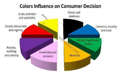
[1] Specific hues can provoke different emotions, associations, and responses that affect how your brand is perceived. Put simply, color choices can make or break a design. In fact, research has shown that color can increase brand recognition (by up to 80%), memory, engagement with a design piece, text comprehension, among many others.


Fortunately, we are far from the times when our color choices were limited to a small batch of natural pigments. Our options are no longer whatever colors minerals, animals, and plants had to offer. Synthetic pigments and the screen have made our lives increasingly easier, while making deciding infinitely more complex.


With such an overwhelming amount of color options, selecting a palette for a design project has become excruciating, to say the least. The Colourlovers community has indexed nearly 8 million user-named colors, while there are over 16 million possible hexadecimal color combinations.


Overwhelmed yet? No need to worry. We asked top designers from the Creative Market community to share their best tricks & advice for creating stunning color combinations. Take note of these 10 insider secrets and bring them into your next Canva project....

Jeff Domansky's insight:

Here's how to choose beautiful color palettes for your next design.

No comment yet.