


 Your new post is loading...

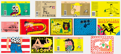

When the weather warms up, the arctic length of the supermarket beer aisle starts to beckon. And every year, when we venture over, we are amazed by the amount of design talent on display. Moreover, it is clear that the trends in beer label design are always changing.
The growth of the craft beer (a.k.a. artisanal, a.k.a. micro-brewed, a.k.a. small batch, whatever) industry appears to be unstoppable. In fact, there are so many bottles to choose from now, almost all of them thoughtfully designed, that it has become rather difficult for any one to stand out. Is it still possible to do so on the basis of a particularly good beer label design alone?
We think so.Here is our trend observation: the best examples of beer label design today do not take the middle road. They are either distinctly maximal (colorful, visually loud, eclectic and full of attitude) or minimal (confidently spare, geometric, typography-oriented, exuding elegance). Below we’ve rounded up our favorite recent examples of each type...


With beer label design, the best way to stand out is often a super maximal approach or a very minimal one. Here 99 Designs rounds up great examples of each.