Public Relations & Social Marketing Insight
443.4K views | +0 today
Follow
Public Relations & Social Marketing Insight
Social marketing, PR insight & thought leadership - from The PR Coach
Curated by Jeff Domansky
Your new post is loading...
Scooped by Jeff Domansky
Scoop.it!

And the 2017 Pantone Color of the Year is... - 99designs Blog

And the 2017 Pantone Color of the Year is... - 99designs Blog | Public Relations & Social Marketing Insight | Scoop.it

Every year the world waits with baited breath for Pantone’s big color announcement, which sets the creative stage for industries like fashion, home decor and (of course) graphic design.


The annual selection is meant not only to predict aesthetic trends, but take our global temperature. The chosen color is a cultural representation of the world’s current mood and attitude, which is why Greenery seems so fitting for the 2017 Pantone Color of the Year.


Greenery is a continuation of 2016’s soothing Rose Quartz and Serenity, responding to another tumultuous year with hope and resilience. Drawing on universal qualities like the emergence of spring foliage and the lush outdoors, the color is meant as a symbol of new beginnings....

Jeff Domansky's insight:

Drawing on universal qualities like the emergence of spring foliage and the lush outdoors, the 2017 Pantone Color of the Year - Greenery - symbolizes new beginnings.

No comment yet.
Scooped by Jeff Domansky
Scoop.it!

World's Ugliest Color Examined By Graphic Design Experts

World's Ugliest Color Examined By Graphic Design Experts | Public Relations & Social Marketing Insight | Scoop.it

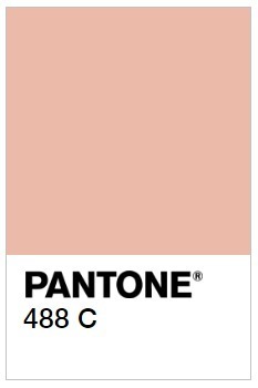
When market research firm Gfk was hired by the Australian government to consider how cigarette packs could be designed to prevent smoking, the firm came up with a colorful solution: Make the packs as unappealing as possible by wrapping them in an earthy "dark brown," or what would be matched to Pantone color 448C.


The color was found least appealing to prospective cigarette buyers in tests, and it has since been proclaimed "the world’s ugliest color" by the blogosphere.


But in the interest of fairness to all colors, we talked to designers Milton Glaser and Debbie Millman, along with Pantone VP Laurie Pressman, to get their professional take on this cancerous, baby poop, lung brown....

Jeff Domansky's insight:

Researchers found Pantone 448C to be highly unappealing, and chose it for cigarette packaging in Australia to deter smokers. Do you agree? They'll have to change the color of milk chocolate. :-)